Grand Theft Auto 3: Definitive Edition - the good, the bad and the ugly
Massive disappointment.
We had concerns about Rockstar's remastering of the PS2-era Grand Theft Auto Trilogy - worries that didn't abate when it was discovered that all three games would be drawing upon the flawed mobile ports, remasters shoehorned into Unreal Engine 4. We'll be looking at all three games in the pack, but we wanted to start with Grand Theft Auto 3. It's the oldest title in the line-up and we imagined that it would be the one with most to gain in the remastering process. Taking a step back from the controversy, it's fair to say that Grove Street Games' work is not without merit, but there are a lot of problems here - issues that are so blatant and jarring and ridiculous, it's hard to understand how the game made its way through quality control.
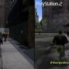
Let's start by talking about how the remaster compares to the original PlayStation 2 release - which we would imagine is the way that most console players coming to the Definitive Edition would have first experienced the game. In its original form, GTA3 on PlayStation 2 was built using RenderWare - a popular middleware solution from Criterion that was used in a huge range of games during that era, including all three GTA titles. Let's be clear here: GTA3 wasn't a visual masterpiece. Compared to contemporaries such as Metal Gear Solid 2 and Gran Turismo 3, it fares badly. However, it was ambitious, with a full time of day system, weather simulation and of course, 'open world'-style free-form exploration of Liberty City. Many of these concepts had existed in the original GTA games but this was the first time it could be experienced in full 3D and the resulting sense of freedom is precisely what made it unique and special in 2001.
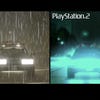
But RenderWare is obsolete and porting to today's hardware would not be the right choice, while Unreal Engine 4 is a good choice as a base platform to work from. Unfortunately, the mobile ports are well known for numerous bugs and gameplay issues not to mention missing features - the original's hazy look using an accumulation-style blur effect is gone. This is not necessarily a bad thing, it's just different. However, it's clear that some effects are just flat-out poor. The rain effect itself is presented in an astonishingly poor way. Essentially, you get the impression that the developers have attached a blindingly bright rain material to a post-process volume around the player camera and just let it rip. The issue is that it's too brightly contrasted, especially in HDR where its brightness value is too high, and it doesn't sort correctly against bodies of water leading to a glitchy appearance. Basically - rain is not good in this remaster. The original PS2 version may not match the quality of the effect seen in MGS2, but it's still a good deal better than what's delivered in the Definitive Edition.
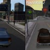
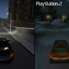
Beyond that, I would say that the updated car models aren't too bad in the remake and the addition of cube-map driven reflections is a nice touch. However, aspects of the rendering still feel a little off. The way the headlight beams intersect with the road surface, for instance, results in visible lines just in front of your car that never look quite right. The effect is more pleasing on PlayStation 2, I might argue. Of course, thanks to Unreal Engine, the dynamic lights in the world do cast actual shadows now - this includes your headlight beams and even the interior dome lights in addition to the street lamps and the sun. It's an improvement over PS2, but the range of changes and the variation in quality is strange.
At its best (and when it's not raining!) the Definitive Edition looks OK but it loses its sense of style. You feel that many of the decisions made around the presentation on PlayStation 2 were deliberate - not just limitations of the hardware but artistic decisions made within those constraints. The new version seems to just utilise standard Unreal Engine features which do not necessarily gel with the visual design the game is aiming for.
We also need to talk about character designs. These were never super-detailed on PS2: they had to exist in a larger world, so polygon and texture budgets were necessarily limited. However, what we did get was the sense that the artists carefully utilised what resources they did have to great effect - and creating a nice looking model with a low polygon count is an art form. In his original form, Claude uses fewer than 2000 polygons but his design is distinctive. In the remaster, he doesn't look half-bad but there's still a sense that something is off and that something becomes clearer the deeper you go. Basically, the update seems to try and retain aspects of the original design but you wind up with characters that look more like toy figurines. I believe this comes down to a combination of the rounding-off of character features and the nature of Unreal's PBR materials system as it interacts with the light - the specular highlights sometimes visible really give the impression they're made of plastic.
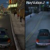
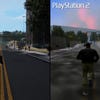
Environments exhibit significant differences but the basic idea seems to have been to use the basic geometric layout of the city while replacing textures with higher resolution Unreal-compatible materials, while adding in new models for objects. This mismatch of old and new doesn't work, whether it's down to texture alignment issues or simply the fact that the combination of old and new assets produces a sense of discontinuity. The textures on PS2 are certainly much lower in quality but they are suitable for the geometric level of detail. Shoehorning realistic, PBR materials and modern visual effects, such as screen-space reflections, into the world gives you this impression of viewing the raw map files through an editor rather than playing them in a game.
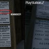
The world also now features real-time shadows - which means, as the time of day changes, you'll see the shadows move along with the sun position. This wasn't feasible on PlayStation 2 for obvious reasons. That said, areas in shadow can sometimes appear overly dark - it feels more systems-driven rather than artist-driven. I also find the use of screen-space ambient occlusion to be somewhat distasteful due to the large, flat structures that define the city - you end up with black outlines around anything near a wall and it doesn't look great. And that's really the key issue: the more you explore, the more you start to feel that things don't mesh - small details are often wrong, like the AI upscaled sign textures where you'll spot typos that were missed due to the upscaling process.

Honestly, I'm only really scratching the surface here - you could likely spend days combing over the game and finding examples of things that look strange or out of place. At the same time, I don't feel that the results are completely bad either - it falls short stylistically, but driving around at dusk can look pretty nice at times. It's just not what you would expect from a remaster of one of the most successful game series of all time.
This analysis and commentary are coloured by which version you may choose to play. There are some bizarre decisions made in how the remaster is deployed to both current and last-gen systems. When I jumped at the chance to cover this game, I naively assumed that the game would be relatively comparable across every machine, owing to the relatively simplistic nature of the source material. I was wrong. Let's begin by looking at the current-gen consoles: PS5, Xbox Series X and Series S. These represent the most feature-rich version of the game, with each of them offering a fidelity mode and a performance mode, with the default set to fidelity. This is capped at 30 frames per second and features a few visual improvements - the most obvious being volumetric clouds and tweaks to element like shadows, but even this isn't straightforward.
So, for example, both modes on PS5 feature reflective puddles and surfaces, but this is only present on Series X in fidelity mode, with the feature completely omitted on Series S in both modes. PS5 and Xbox Series X both seem to operate with similar resolution metrics too. Both fidelity and performance mode seem to hang around 1800p - there is evidence that dynamic resolution scaling can occur but, nine times out of 10, the pixel counts come back with a 50 out of 60 count sample suggesting it doesn't really scale often and perhaps could stand to be a little more aggressive in performance mode. Series S, however, sits lower with fidelity mode coming in around 1440p while performance mode is in the realm of 1080p instead. Honestly, though, image quality and pixel count are unimportant in this case - image quality is not really an issue and it looks clean enough on all three machines.
The real problem lies in performance. Xbox Series X is pretty much the only solid version available for 60fps gaming, and even that isn't perfect. Frame-rates can drop hard when the action heats up, dipping beneath 40fps - which simply isn't acceptable for a remaster of a 20-year-old game. VRR can help to some degree but even that isn't enough to fully eliminate the sensation of judder. So, how about dropping to fidelity mode with a locked 30fps? Performance is indeed capped at 30fps, but inconsistent frame-pacing makes it look like it's running with significant issues. In fact, every 30fps version of the Definitive Edition has this problem. It's ridiculous. This problem was solved in UE4 years ago.
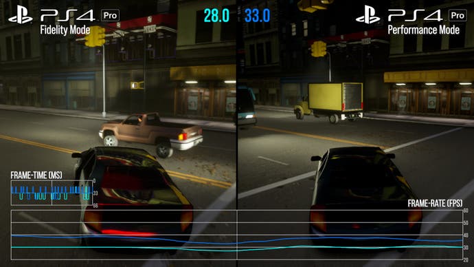
On PlayStation 5 using performance mode, initial impressions suggest that performance is worse than Xbox Series X and it's true - the frame-rate is less consistent. Then I went back to gather more frame-rate analysis footage and found that it was reasonably stable leading me to wonder what's going on... then it started raining and it hit me. The PS5 version, in performance mode, retains visual features reserved for fidelity mode. Reflections on wet surfaces and improved cloud rendering both seem to remain active when using performance mode on PS5 and it has dire consequences when it comes to frame-rate. So, it's almost like performance mode is the same as fidelity mode but with the frame-rate cap removed. As a result, this mode feels pretty terrible to play - it's just not smooth enough in my experience. 30fps fidelity mode? Frame-pacing issues. The route to a locked 60fps is simply to download the PS4 version. Running the PS4 Pro codebase solves the problem, but it results in a hit to visual features and a cut to resolution - with pixel-counting results often coming in at just 864p.
Series S? Performance mode isn't smooth. In fact, it's like PS5's performance mode just at 1080p instead of 1800p and without the extra visual effects. It has similar severe dips and a general lack of fluidity, and in some cases, we've even logged performance dips under 30fps. Fidelity mode, of course, suffers the same fate as the other versions - inconsistent frame-pacing in random spurts, though this is probably the best way to play it on Series S hardware.
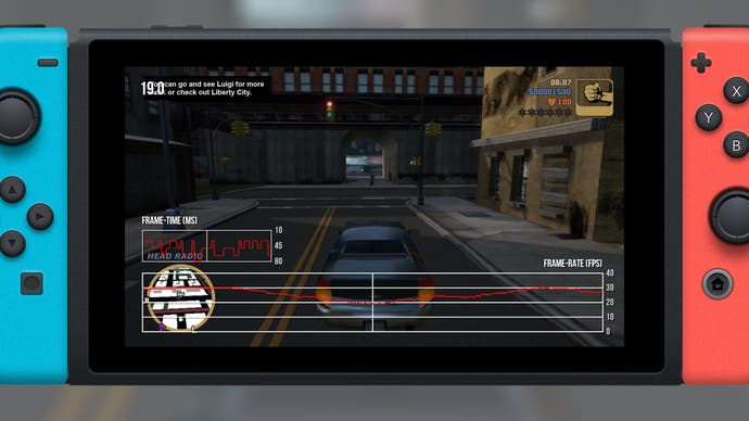
Nintendo Switch is not a good option. For starters, in docked mode, the game seems to average around 648p or thereabouts - it's very low-res but it's the visual changes that really stick out. Firstly, ambient occlusion, while ugly on newer consoles, does at least help ground objects in the world. With this feature absent on Switch, you get the impression that objects and cars just sort of float in the scene - it looks atrocious. It's also missing some of the more advanced effects like reflections as well as post-processing like motion blur and components like lens flares. It's basically just blurry and lacking in detail... and it still runs poorly. There's a 30fps cap (with inconsistent frame-pacing, of course) but it also drops beneath the target regularly. In some ways, I would argue this runs and feels worse than the original PlayStation 2 version. I mean, when you see games like Dying Light or The Witcher 3 humming along on the Switch, this just winds up feeling even less acceptable. It's a mess. Portable mode? Expect the same thing but with a circa 480p resolution.
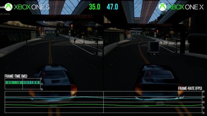
Let's talk last-gen machines, where there are some baffling issues. Xbox One and One X are strange, running at circa 1728p and 864p respectively, with some evidence of dynamic resolution scaling. There are no visual modes on these consoles and elements such as the improved cloud rendering and rainy reflections are not available. It basically looks roughly the same on both machines but you get four times the resolution on Xbox One X. It does, however, make for an interesting comparison when it comes to performance. For reasons unknown, the developer opted to leave the frame-rate uncapped on both machines. So, on Xbox One X there's really no hope of reaching 60 frames per second which again, feels absurd considering the visuals. It generally averages out in the mid-40s - it can go both above and below but this is roughly where it will sit. Anyone that has followed Digital Foundry will likely know that we don't much care for unstable, uncapped frame-rates like this but I'm not sure 30fps with incorrect frame pacing is much better either. However, that isn't even an option for last-gen Xbox users.
Xbox One S, though, is fascinating - we know that it typically renders just one quarter of the pixels as Xbox One X yet the performance is noticeably worse. While One X hangs around 45fps, Xbox One S is typically below 40 leading to an even less stable experience. It can even dip below 30 fps. This is with visual quality comparable to other console's performance modes, really, but with lower average performance. Ultimately, neither Xbox One version of the game is very good. Unstable frame-rates and a lack of visual features are the primary issues here.
Finally, things look up just a touch for PlayStation 4, which does feature 'higher end' features like water reflections and puddles in the rain, absent from Xbox One consoles. Base PS4 seems to hit the same 864p range as Xbox One, but is capped to 30fps - again, with inconsistent frame delivery. Curiously, PS4 Pro features the fidelity and performances modes that Xbox One X lacks. The former gives you the water reflections and other more challenging features, but you don't get the volumetric cloud system, while the latter disables those and unlocks frame-rate. Both modes tend to sit below 1080p but performance mode is definitely blurrier with all counts coming in at 864p. You can guess the story with performance here: it's a choice between a wildly unlocked performance level and a compromised 30fps experience. Ultimately, my conclusion is that the only versions that run reasonably OK most of the time are Xbox Series X and the PS4 Pro code running on PS5.
During my time with the game, I ran across numerous issues that were both comical and disappointing - but I'll leave those for the video embedded at the top of this page. The bottom line is that it's impossible to believe that this remaster was properly tested - and if it was, it seems that the bugs were not addressed by the developer. The end result is simply not good enough and this is such a shame. This is a landmark game and a genuinely important work. It also arrives in the wake of the original releases being unceremoniously delisted and attempts to preserve and improve them resulting in legal action from Take Two. Arguably superior and more authentic experiences are in the process of being deleted in favour of substandard work. GTA3, Vice City and San Andreas simply deserve better.
Grand Theft Auto 3 is a fascinating time capsule: it's the granddaddy of the modern open world game, and it's interesting to see that its design doesn't feature many of the issues and pitfalls prevalent in today's sandbox games. Liberty City is a relatively small place, making traversal less of a time sink - plus actually driving around the city is fun. The missions are all very basic, without the complex scripting that would appear later in the series, but it's freeform in how you complete them. You're handed an objective and some tools - how you accomplish it is up to you and it feels pure in that sense. It's a game that doesn't railroad you into doing things a specific way. Of course, it's 20 years old and so dated in many aspects, but it's such an important game and one still worth playing today. But not like this.


