Nintendo Switch OLED Model review: an excellent premium upgrade
The new display is a game-changer for handheld play.
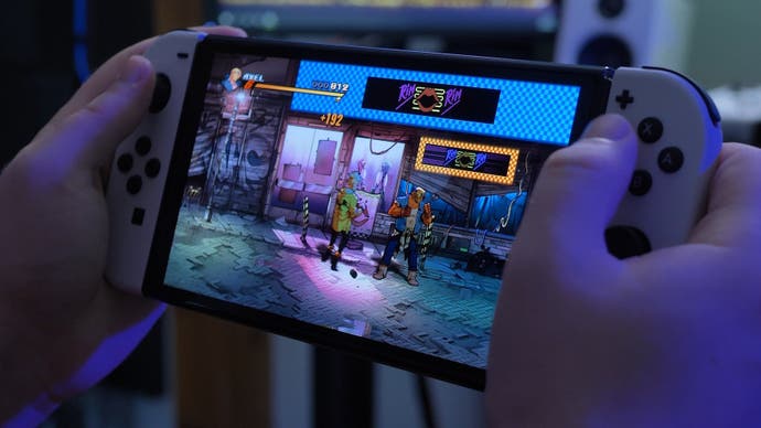
When Nintendo finally unveiled the Switch OLED Model, impressions were mixed - it wasn't a more powerful system, it was not the mythical 'Switch Pro'. Instead, we were looking at a more incremental upgrade: the existing model improved via a larger, OLED panel along with quality of life improvements including a more robust kickstand. On the face of it then, perhaps not a big deal. However, the truth is that the Switch OLED Model will live or die according to the quality of its screen - and as an OLED enthusiast, I was really looking forward to checking it out. And the truth is, it's a big, big upgrade to the handheld gaming experience.
The first thing you'll notice when you take the Switch OLED out of the package is the quality of the new materials. The screen is now glossy, as is the bezel around it. The rail system that holds the Joycons in place feels more solid with less wobble and the whole device simply feels like a more premium design. Along the top, numerous changes are made to core elements: the power and volume buttons are different in shape and feel while the game card slot now uses a slimmer cover, which is slightly trickier to open than the original Switch.
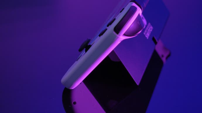
Around the back you'll find significant changes. Firstly, the legal information that adorns the back of the original Switch has been shunted beneath the new kickstand, leading to a sleeker design but it's this revised feature that is one of the biggest physical changes. The original kickstand on Switch is, quite frankly, terrible - a flimsy piece of plastic that barely functions. The Switch OLED uses a solution more in line with the excellent Microsoft Surface products: it covers the width of the unit, it's made of a stronger material and allows for a wide range of angles without the wobble of the original.
All told, the overall feel of the materials and the build quality is a surprising step up from the rather cheap-feeling original Switch. It's a more premium take on the concept, but obviously, the improved build quality isn't the main draw. That's down to the new OLED panel, which is the main reason to consider upgrading to the new system. And put simply, I consider it to be the best panel in any dedicated handheld gaming console. Before you even power on the unit, it makes a good first impression - the screen area itself is completely black. This might not sound particularly interesting, but it actually addresses an issue I've always had with the original Switch, where the screen material itself appears greyish even when powered off. This means whether you're in the dark, where IPS backlight glow becomes a serious issue, or in a lit room, where the panel material washes out the image, the original Switch never had particularly impressive contrast, something that the move to the OLED panel completely solves.
Once you power on, the key differences become clear. The big advantage of OLED over LCD is that each individual pixel element is self-lit - this allows for perfect ANSI and absolute contrast. Black areas of the screen appear completely black with zero luminance, while bright areas can exist next to it without any halos or other artefacts. The IPS LCD used in prior Switch consoles is incapable of this as it uses a full backlit without local dimming (a method used by higher end LCDs to improve black levels). When the original Switch displays a black image, it glows brightly as a result of the backlight. You'll notice this when playing darker content such as Doom 3 - this game has a lot of pure black areas designed for CRT displays - it never looks right on an LCD as these negative spaces glow.
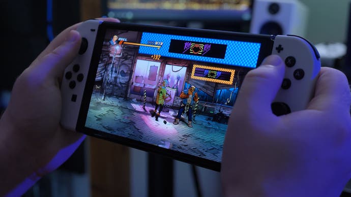
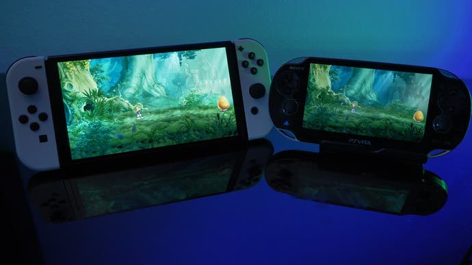
On Switch OLED, the display is capable of absolute black which means dark areas show no light leaking, meaning that the contrast between lit and unlit areas is striking. Doom 3 is a game that absolutely shines on a screen like this and the original Switch LCD doesn't come remotely close. Of course, the new Nintendo handheld is not the first gaming portable to have an OLED screen. Prior to Switch, however, Sony released the original PS Vita that used similar technology. However, this is older OLED technology - well regarded for its time, but not as impressive as today's displays, particularly in terms of brightness. Unlike modern OLED panels, the Vita display cannot display absolute black either; there is a very slight glow when displaying black like a high-end plasma TV. So, the Switch OLED offers a significant improvement over Vita in this regard.
Having established that OLED's signature absolute black is delivered by the new Switch, we should consider brightness next, where I used an i1 Display Pro colorimeter to measure each device with brightness maxed out, while displaying a full white screen. First, I measured a Switch with an IPS panel and found that the colorimeter returned a value of around 370 nits max. That's typical for a non-HDR LCD. I also tested the PS Vita launch model with the OLED screen and this returned a result of 147 nits - clearly much dimmer.
To the eye, Switch OLED appears brighter, but the measurement it returned was around 343 nits, actually slightly less bright than the LCD on the 2019 model. Still, due to the much deeper contrast, the OLED model looks brighter and more vibrant to the eye. Unlike larger OLED TV panels, the Switch does not appear to use automatic brightness limiting, so the screen does not lose brightness when displaying full white, according to measurements - a small white square measures basically the same. This has a huge impact on games with darker colours. Metroid Dread turned out to be a perfect game to launch alongside the new system as its punchy contrast and deep blacks illustrate the advantages of the new display, delivers strong colours, lots of contrast and deep shadowed regions.
There's been a lot of debate about the extent to which developing the Switch OLED model was justified, and whether Nintendo should have concentrated on improving the quality of docked play on a living room display instead, where low resolution visuals often fail to impressive. This new Switch actually does the opposite, doubling down on what it does best - handheld gaming - and for me, the upgrade is a profound one. The best comparison I can come up with is that the original Switch display feels like an outdated $99 Android tablet while the Switch OLED screen feels suitably premium and more in line with a mid to higher-end smartphone.
There is one curious new feature, though - hidden in the system menu is the option to cycle between a more vibrant colour mode and a standard mode, which essentially increases colour saturation when enabled. It does not impact overall brightness or contrast so it's more of a personal preference. I must admit, while it's perhaps less accurate, I do think it looks good in most games and is worth experimenting with. Then there's the panel structure - Switch OLED appears to use a proper RGB sub-pixel arrangement rather than a pentile matrix common in cheaper OLED displays. Pentile screens tend to exhibit edge artefacts around text and other fine elements, and it would have been awful at Switch's native 720p but the good news is that Nintendo has not gone for the cheaper approach here.
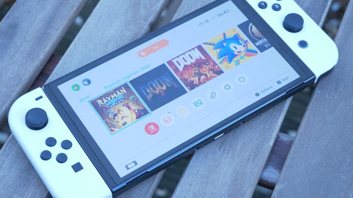
And when it comes to displays, bigger is indeed better, certainly in this case. I was worried that the new 7-inch screen would magnify games already struggling with low resolutions but thankfully, it holds up well with all content. In fact, shrinking the bezels while increasing screen size has a really nice impact on most games - it has more presence and feels more substantial without increasing actual unit size. Even sub-native games such as Doom 2016 or Mortal Kombat 11 look great. The improved characteristics of the panel still elevate this style of content over the IPS panels used in older models. The next area of improvement is motion persistence. Nintendo is not using any sort of black frame insertion here, as you'd expect, so there is still persistence motion blur inherent in sample and hold displays but OLED pixel response is superior to LCD and as a result, games appear clearer in motion. Check out the video embedded above to see what this means.
Ultimately, the Switch OLED model's signature improvement is a big win: the new screen delivers a significant boost in overall quality across the board here - it's more vibrant, it has deeper contrast and superior motion handling. It is such a huge leap over the rather unimpressive LCD panels used in older Switch consoles that it makes it difficult to go back - but beyond the screen and the improved kickstand, there are some other improvements added to the mix.
Firstly, the new speaker setup is slightly better. The unit sounds ever so slightly louder and more refined compared to the original model. This is only applicable if you like to play in portable mode without headphones, of course, but it's a nice improvement nonetheless. Internally, Nintendo is still using the 16nm 'Mariko' version of the Tegra X1 processor and having put the system through the same tests as we did with the 2019 revision, performance is identical. In prior testing, we found the Mariko machine to deliver a very, very slight improvement in performance in edge cases like Mortal Kombat 11 and Zelda: Breath of the Wild compared to the launch Switch, when games couldn't quite match their performance targets. Perhaps unsurprisingly, the Switch OLED model is exactly the same.
Ultimately, the Switch OLED model really is all about the screen and while some may be disappointed with Nintendo's approach to this machine, the new machine delivers the premium quality I've always wanted. It addresses every major weakness in the physical design of the existing unit while greatly enhancing the screen. It looks so much better that it makes me want to use the system in portable mode more often - especially when you see just how beautiful a game like Metroid Dread looks running on the revised system. But of course, if you only play in docked mode, you will not see any real differences. Yes, it has a new modified dock with a more pleasing design and an actual LAN port, but beyond that, this is truly is the same system as before.
We don't know when Nintendo will deliver a next-generation Switch console but until that time, the new OLED Model is the absolute best way to enjoy the machine's excellent library of games. If you don't own a Switch and you're looking to buy one, this is the one to get. And if you're already a Switch owner and display quality in portable mode is important to you, this is a must-have upgrade.
