The Legend of Zelda: Skyward Sword HD is more than just a remaster
Improved graphics are welcome, but it's the gameplay tweaks that make the difference.
A controversial release - even at launch - The Legend of Zelda: Skyward Sword first released on Wii, arriving at the tail-end of the firm's contentious motion control period. Many believed the game was stuck in the past, a derivative of the Ocarina of Time formula, and the new waggle controls failed to push the series forward. 10 years on, Skyward Sword HD is an opportunity to re-evaluate the game - and for me at least, it has finally clicked. The graphics are improved but really, it's the quality of life improvements that strip out the frustrations and frictions with the original game, letting the core design shine.
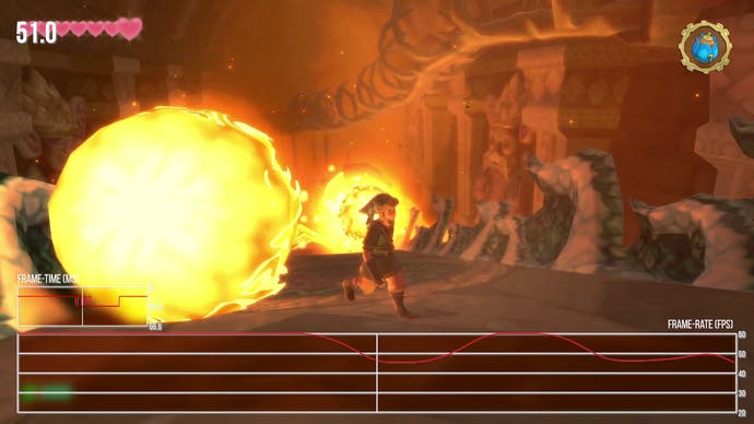
In bringing Skyward Sword to the Switch, Nintendo has opted to maintain the look and feel of the original game while introducing visual tweaks and changes where it makes sense. Some assets have been re-worked, the entire UI is new and image quality is hugely improved. On Wii, Skyward Sword is limited by its 480p output and reduced colour depth, leading to obvious dithering artefacts throughout. For Switch, we're running at a fixed 1080p resolution (720p while docked) with a virtually flawless 60fps performance level, marred only by heavy alpha effects - explosions and particles - that only present very rarely.
The Wii's colour dithering is eliminated entirely and overall image quality is hugely improved. Anti-aliasing is not used, however, but due to the nature of the texture work, shimmering is kept to a minimum. It's not a cutting-edge game but it looks visually pleasing. And here's where things get interesting: Switch tinkerer OatmealDome and others have been examining the game closely and it turns out, there are some neat techniques in play here. Specifically, Nintendo seems to have developed a plug-in that translates the Wii's GX Graphics API calls, mapping them to the new NVN API on Switch. Clearly the idea here is to accurately simulate the visual effects created for the original game - and I feel they've succeeded.
Between this and other information that has been discovered, it seems this isn't entirely just an emulation solution but it does seem to utilise the Wii's original data formats for assets. Much of the game code runs natively on the Switch CPU and, obviously, the frame-rate has been doubled but this solution suggests that we could see future Wii games appear on Switch with similar improvements. This solution is not the same as that used in Super Mario Galaxy, it should be noted.
Visual improvements move beyond resolution, however. One of the most interesting things about the visuals in this game is the painterly effect used to give it a watercolour-style appearance. Both textures and the way distant objects are handled play into this. In the distance, objects use small bokeh-like shapes eliminating the harsh pixel edges you would normally see in a game like this. It's a beautiful look and one influenced by the rendering resolution as the size of the shapes and way it interacts with distance objects varies between Switch and the original. So, while the general look of the game is very similar, things like distant rendering and the blending of light bloom differ noticeably and, in my opinion, look better overall.
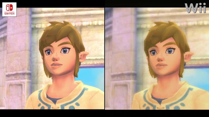
What's perhaps more transformative is the improvements in texture quality. While it's clear that Nintendo wanted to maintain the original look of the assets, the actual resolution is higher. Due to the painterly nature of these textures, it's not entirely clear if they used hand crafted new assets or relied on AI upscaling, but, there is more fine detail if you look closely. It doesn't appear as if every texture has been updated, but surfaces look clean and fit the style of the visuals. While the emulation community has crafted texture packs for this game, I don't feel that simply increasing the visible detail in these textures makes sense given the art direction. Nintendo's approach here is the best solution. On top of that, the entire UI is given a higher resolution boost, while loading is also dramatically faster too.
The graphics upgrade is a given, but it's tweaks to the flow of the game that truly hit home. My biggest problem with the original release is the constant barrage of text boxes, tutorial text and helper information. There's so much friction in its original release - it's almost as if everyone wants to talk to Link or share information with him, stopping him in his tracks and slowing down progress through the adventure. On Switch, however, a lot of this is now optional - you have the choice of whether to speak to characters, as opposed to them stopping you in your tracks. The speed of text delivery in dialogue boxes can also be sped up, further reducing friction.
The same courtesy extends to item description dialogues, which can now be accelerated and which don't appear again when you return to the game - something that was infuriating in the original release. In addition, the game now has both auto-saves and the option to save your game in one of three slots from any save point adding more flexibility. Also key to the more user-friendly experience is how you have full access to a right-stick camera when using the joy-con in its motion control configuration - something that's standard in modern games, but wasn't included in the original Wii U release, as it just wasn't possible on the Wiimote. This simple addition has a huge impact on the gameplay experience - it's much more enjoyable exploring the world with this option. Alongside the higher resolution, this feature makes it a lot easier to parse dungeons.
On the surface, these changes may not seem like a huge deal, but I can assure you they have a dramatic impact on the overall pacing of the game. It completely changed my view on the experience, allowing you to enjoy the good stuff while keeping these constant annoyances completely in the background.
The next question concerns how the original motion controls have mapped to the Switch. If you use the joy-con in a two handed configuration, the original Wii control scheme is mostly replicated, only you get access to a right stick camera. There have been tweaks made to the button layout as well and I feel it works better overall, though the gyro mechanisms (which lack augmentation from the Wii sensor bar) now feel less precise, necessitating more use of the re-centre function.
Gamepad controls are also available - and they're essential for Switch Lite users. The idea here is that many functions previously relying on motion control are now mapped to analogue sticks. For instance, flying around on your bird is analogue stick driven now. Many gestures are now completely free of the need to move your controller around - the shield, for instance, is tied to clicking the left stick in. It almost works but there's an issue and it ties directly to the sword. At any point, the right stick basically serves as your sword - move the stick and the sword swings. This by itself works, though it's slightly fiddly to use, but it makes camera control difficult. You see, to use the camera you have to hold the L button and, at least in my case, this means holding the L button all the time except during combat. I feel you're more likely to want to use the camera versus the sword so reversing this would have helped a lot - but no such option is available.
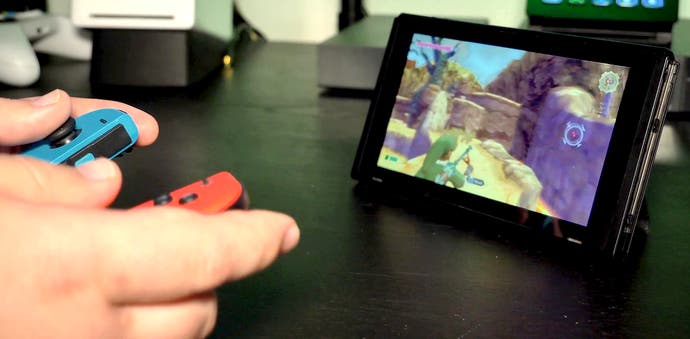
Fundamentally, that's my biggest issue with this remaster. I don't find the gamepad controls comfortable to use as a result and I can't recommend them. It's probably the only major thing I don't like in this new conversion - and it makes mobile play problematic for Lite users, while owners of the standard Switch may prefer to play in table top mode, in order to use the superior motion control option. Thankfully, the motion controls work better than expected and have grown on me and, ultimately, I've really enjoyed my time with the game now. The quality of life improvements, updated visuals and smoother frame-rate all help smooth over complaints I had with the initial release. I can still see where some folks might struggle - the tear drop challenges, for instance - but all in all, I'm hooked.
I should also mention the sound. Despite its roots on Wii, Skyward HD includes full surround sound audio support with actual rear channel usage... something not possible on the original platform - and it sounds wonderful. Beyond that, the music still holds up extremely well. The music adds a lot to the mood in a way that I feel is a step above both Twilight Princess and Wind Waker before it.
In summary, this remaster works - not just in dramatically improving the quality of the graphics, but in streamlining the game, stripping out the vast majority of the annoyances and basically allowing the design of the actual game to shine through. The Legend of Zelda: Skyward Sword HD is a game with excellent dungeon designs and features a beautiful world and fun mechanics that somehow feels fresher 10 years after its initial release than it did at the time. It is not without its flaws but I can solidly recommend it.
