Face-Off: MultiVersus vs Super Smash Bros Ultimate
How does Warner's Bros.' PS5 and Series X brawler compare to Nintendo's classic?
The Super Smash Bros series is a near-impossible act to follow, but that's exactly the challenge MultiVersus faces as a new, free to play Smash-like from developer Player First Games. Now in open beta on PS5, Xbox Series X, last-gen and PC, it's a 5GB download that lets anyone hop in. It's admittedly light on options - as you may expect from an open beta - but you do get to tinker with 17 characters - all fully voice-acted. Crucially, MultiVersus also launches with robust online play, built from the ground up with rollback netcode - right away giving it an edge over Super Smash Bros Ultimate's online play on Switch. It's off to a good start. Speaking purely on MultiVersus' visual design as an Unreal Engine 4 title though, how much does it get right next to Nintendo's heavyweight? And where does it seem to fall short in its open beta state?
So, what's actually contained in the 5GB package? Entire modes are blocked off with a 'coming soon' descriptor, but you do get a practise mode to test out everything. MultiVersus' character line-up alone is fascinating enough to warrant giving it a try. Rather than pitting the mascots of the video gaming world against one another - as is the remit of Smash - here, it's famous faces from Warner Bros' properties. Between comics, movie franchises, and TV shows, it's a wider net being cast. Honestly, the result is as eclectic as it sounds: from Batman to Bugs Bunny, and from Arya Stark to LeBron James (in his Space Jam get-up). Fortunately the game is mechanically sound at its core. Smash fans will feel right at home with its 1v1 or 2v2 melee-battling; standard and special attacks, double jumping, dodging - it's all here. Even if the movement take a bit of adapting to - and my preference remains with Smash Bros Ultimate in this spot - it's impressive how much MultiVersus gets right.
MultiVersus' technical make-up on console is strong. In a nutshell you get a native 4K at 60fps on PS5 and Xbox Series X, while Series S targets 1440p at 60fps. Dynamic scaling might be in use, given it's an Unreal Engine title, but frame-rates are typically rock-solid at 60fps on all three machines - barring unique small drops on PS5 during the Sky Arena stage. All of this is a superb foundation to build on for a contender to Smash Bros. In fact, to compare the two, I tracked down the nearest-best match map in Smash Bros Ultimate to the small selection in MultiVersus. Hands up here, some side-by-sides are a bit of a stretch, I realise. Even so, you can see in the shots below that some maps - like the colosseum - have a direct equivalence.
The first point of comparison is in image quality. To Multiversus' credit it sports a pristine, almost aliasing-free image owing to its 4K resolution on premium consoles. It looks clean in a way Smash Ultimate simply cannot compete with on Switch, being stuck at 1080p. Regardless, Nintendo's brawler still scales well to a modern 4K display overall, where the bold character designs make the action legible even in huge, eight player games. There's a sharpness to the look of Smash Bros overall, which helps, while MultiVersus opts for a clean, pristine, post-processed image. Also, oddly, MultiVersus by default enables bold coloured outlines on characters to help make action easier to tack. It's an unusual choice, especially given Nintendo's approach is clear to read without any such visual assist - but they can be disabled.
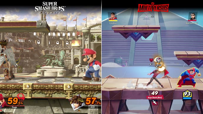
Next up are the stages themselves. Stage detail in Smash Bros is simply much higher, more inventive, and more busy. Taking the colosseum levels in each game as an example, the seats to the distance in Smash Bros Ultimate are filled with crowds, flags, bonfires and finer stone brickwork - it's packed out. As for MultiVersus? We instead get a simple, barren array of seats: no background crowds, and little movement. There's some physics destruction, at least, with deforming platforms on the Batcave changing the field of play. Overall MultiVersus' stage designs are very functional, readable, but too often static by comparison. I'd dare say more should be possible here in terms of their spectacle. Each should be a celebration of a theme, especially looking at brands as vibrant as Looney Tunes. Turning back to Smash Bros Ultimate for reference, each stage is treated like a character in itself, moving like a fairground ride, and tapping into any nostalgia you might have for a game.
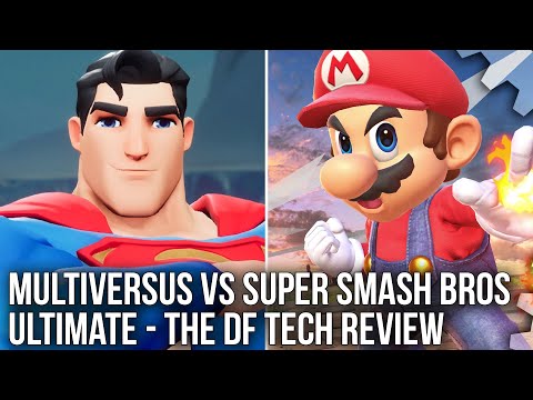
Finally, there are the character designs. Again Multiversus uses highly stylised character models, a Saturday morning cartoon style fused with full 3D rendering. The result often works too: all characters - regardless of their origin - land in a similar aesthetic space. It's an almost cel-shaded look devoid of the high frequency texture work seen in Smash characters. Materials take advantage of Unreal Engine 4's toolset, with hair, skin, and metals each reflecting and diffusing oncoming light. There's also detailed shadows, and gradients of shade added with ambient occlusion. A huge highlight is animations though. These are excellent all round; authentically realised in a 3D space with a smooth flow to each character's start-up pose, bolstered by hair physics. Again, it's not always spectacular, but it all feels authentic to the source material.
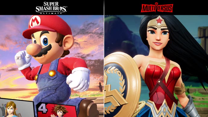
As for Smash Ultimate, Nintendo's approach to character design is in some ways more ambitious, and in others less so. Most of its roster sport proper texture maps, to start - which gives the impression of higher detail. Fox McCloud for example uses an actual fur texture map, as opposed to the flat texture on Taz in MultiVersus, being the closest parallel. The texture resolution isn't flattering up close of course, but it works from afar during Smash's gameplay. Likewise, Mario's denim dungarees show a striking texture, while Wonder Woman - to pick an example - is built on a cleaner design. The examples go on and on. The benefit in MultiVersus is of course the lighting, shading and physics, even if materials are quite simplistic. Comparisons really vary by the character, too, but for most cases, the style of MultiVersus is a great fit for its material - and distinguishes it from Nintendo's work.
This isn't a final word on MultiVersus given it's very much work-in-progress. We need to see more maps, characters, modes - where the current showing is fairly barebones in terms of features. What's here is still surprisingly robust though. The rollback netcode is excellent, the character animations are authentic, and generally the mechanics are in a good place. Still, it's surprising to see MultiVersus isn't more ambitious in its use of higher-end machines like PS5 and Series X. Despite Smash Bros Ultimate being a Switch exclusive, Nintendo's console still pushes bigger eight-player battles, and more dynamic, detailed maps. The most notable visual benefit for MultiVersus is its 4K image on PS5 and Series X - plus better overall material lighting and shading. That aside, MultiVersus remains a fascinating project. It feels like a clean slate. A fresh break for another developer to put a spin on a well-known gaming staple in the Smash Bros mould, and I'm looking forward to seeing how it grows.


.jpg?width=291&height=164&fit=crop&quality=80&format=jpg&auto=webp)


