Mario Kart 8's new Booster Course Pass tracks betray their mobile origins
An in-depth look at how Nintendo 'remastered' its old circuits for Switch.
Mario Kart 8 is a stunningly successful game with over 50 million copies sold across Wii U and Switch - so it's not surprising that Nintendo has returned with a content expansion for its blockbuster kart racer. Dubbed the Booster Course Pass, this expansion includes a whopping 48 courses split over six waves of course releases, with the last drop scheduled for late 2023. So far, 16 courses have been delivered but players and press alike have complained about basic layouts and graphical downgrades. At the heart of the issue is that the bulk of these tracks have been ported from Mario Kart Tour, a mobile game with simplified graphics and gameplay. So how do these new Booster Course tracks stack up - are they a good fit or is the distance from mobile just too large?
While Mario Kart 8 has semi-stylised artwork, cartoonish characters and exaggerated lighting, Nintendo took a slightly different approach with the game's original race tracks. These feature plenty of texture detail and elaborate buildings, backdrops and interiors. Aiming for high framerates on the original Wii U hardware meant technical concessions, of course, like a heavy reliance on normal mapping to enhance modest polygon counts, but these tracks packed a lot of detail and visual splendour for the player to enjoy. Compared with the new Booster Course tracks ported from mobile, there just isn't common ground technically between the old tracks and the new.
To start with, the textures look completely different. The Booster Course tracks have flat, low-detail textures in general, particularly on trackside geometry and foliage. The new tracks have a clay-like appearance as a result, with minimal surface detail in most areas. If you get close to certain materials, you'll notice some grime and roughness has been blended in with overlaid detail textures - textures that contain repeated high-frequency detail. Depending on the lighting conditions, this can look okay, though it doesn't match the look of the original tracks at all. Most of the time however, objects look almost flat-shaded, which is particularly jarring on grass and other foliage elements. Some of those simpler textures also appear to exhibit some compression artifacts.
Model geometry is also handled very differently between the two groups of tracks. While Mario Kart 8 had to keep its polygon budget in check to keep performance high, Nintendo managed to craft some intricate-looking trackside flourishes. Interior spaces in particular were a real treat, with enough geometric detail and texturing tricks to convincingly realise Nintendo's artistic visions. The Booster Courses look much simpler. Trackside buildings, for instance, look flat, boxy, and visibly low-poly. There are plenty of egregious-looking boxes, tubes, and other small trackside details that lack the nicely-rounded appearance of geometry from the base game. Moreover, the intricate modeling featured in Mario Kart 8 is essentially absent, with far simpler and more generic artwork and fewer complex structures.
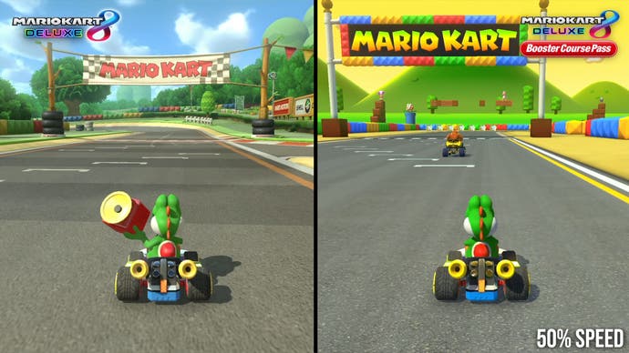
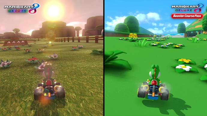
There are a handful of other modeling differences worth mentioning as well. In the base game, trees and shrubs are handled with a mix of geometry and alpha textures, which looks quite attractive. In the Booster Courses, these have been swapped with simple plastic-like models, without any alpha textures. The base tracks also feature fully 3D crowds except in large stadiums, whereas medium sized crowds in the Booster Courses are represented by 2D sprites with jerky "flipbook" style animations.
Mario Kart 8 takes some rendering shortcuts to improve performance - like baking out shadowmaps across environments. One of the largest performance gains, however, likely comes from baked ambient occlusion. Instead of rendering ambient occlusion at runtime with a screen-space technique, Mario Kart 8 appears to rely on baked ambient occlusion maps. In the base game, this generally looks fine but it does appear a bit strong in the Booster Courses. Perhaps this has been done intentionally to add a bit more depth to the tracks, given the lack of texture detail. This is going to come down to a matter of preference ultimately but the thicker AO does have some conspicuous and unpleasant interactions with the bilinear texture filtering at times, creating blocky black smudges along the edges of certain tracks.
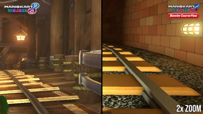
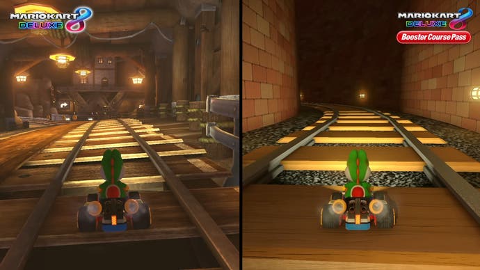
More annoying is the implementation of cubemaps for reflections. Now, cubemaps were used for reflections on some tracks in Mario Kart 8 already, most prominently in Neo Bowser City. But these were relatively subtle and importantly, those tracks are full of fast turns, making the static nature of the reflections less obvious. The Booster Courses use cubemaps in a much less tactful way. For example, Waluigi Pinball has an ugly low-resolution cubemap for a long straight section that exposes the limitations of this technique, something that's repeated in areas like the court in Coconut Mall and the finish-line straight in Sky-High Sundae.
My final complaint here comes down to track design. The Booster Course tracks are less dynamic than the base tracks in Mario Kart 8 - there are fewer boost pads, no underwater sections and limited glider sections. The track layouts are simpler, with fewer corners, wider roads, and shorter circuit lengths. The best MK8 tracks combine challenging sets of fast corners with extended anti-gravity sections, multiple viable routes, and track hazards. Most of the new tracks are sedate in comparison, with laid-back layouts, less interesting track features, and little in the way of vehicle transformations. Simply porting mobile tracks over without major modifications means they don't match the gameplay concepts in Mario Kart 8 especially well.
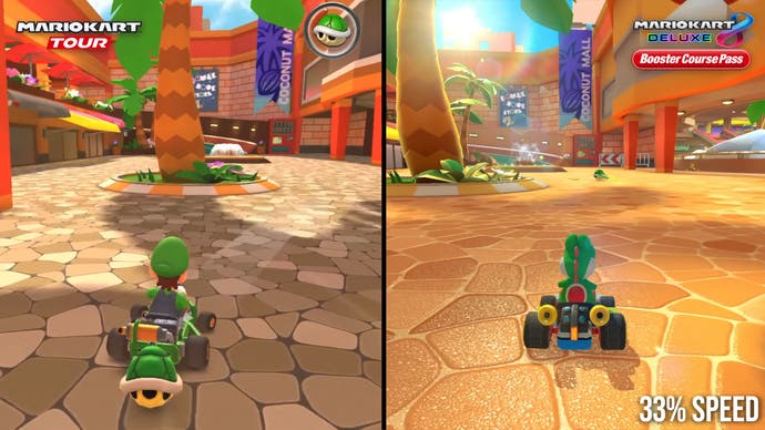
It's fascinating to see how these new tracks differ between Mario Kart 8 and their original implementation in Mario Kart Tour on mobile, where the largest difference lies in the textures. Some have been completely redrawn, most prominently the textures for roads and other track surfaces, with higher-resolution textures, normal maps, and cubemap-based reflections in some cases. For most textures, however, the differences are more subtle. Detail textures seem to have been blended in over the very simple base texture, to give the impression of a higher-quality and more natural-looking asset. Again, this helps a bit but doesn't come particularly close to matching the texture work in the base tracks.
The other major changes are derived from the fact that these games use different engines, with Tour being a relatively basic Unity game and Mario Kart 8 using a proprietary Nintendo engine with more sophisticated lighting with bloom and specular highlights. Surface lighting in general has a more dynamic appearance in MK8 than in Tour, while baked shadowing is also more diffuse to better align with other Mario Kart 8 tracks. Dynamic objects cast sharp real-time shadows onto the track as well, instead of the baked shadows that seem to be used exclusively in Tour. The differences from Tour are fairly modest but the changes do manage to bring the tracks more in line with the base game's courses. The texture improvements here are critical and in some cases work quite well, though overall they don't go nearly far enough.
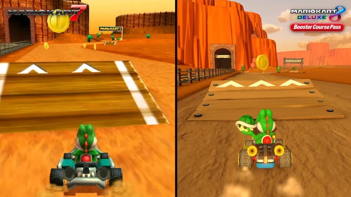
Lastly, let's take a quick look at the Booster Course tracks measured against their predecessors on prior Mario Kart releases on older consoles. These new tracks seem to have been fully redone rather than being simple ports. Comparing the Booster Course tracks up against emulated 3DS and Wii versions running at high resolutions, the artwork bears very little resemblance to the older tracks, although the layouts are largely unchanged. That's probably for the best, given the limited polygon budget of prior Mario Kart titles. Comparing them here does expose some of the cruder techniques in some of these new conversions - like the cubemap-based reflections in Waluigi Pinball, which look better in Mario Kart 7. And of course, the artistic mismatch between these courses and the other courses in Mario Kart 8 is still a major lingering issue.
Now, don't get me wrong - Mario Kart Tour is a decent mobile game and I can understand its appeal. Tour wraps popular characters and colourful, basic graphics around a simplified variant of Mario Kart, something that works perfectly well on mobile - but its tracks simply don't mesh well with the Switch originals. As it stands, players are left with courses that largely don't play like Mario Kart 8 tracks, don't look like Mario Kart 8 tracks, and don't feel like Mario Kart 8 tracks.
There is a silver lining here. Mario Kart 8 Deluxe on Switch has 48 courses, 16 of which were originally DLC on the Wii U version of the game. The Booster Course content expansion is set to include 48 new courses by the end of next year, doubling the number of tracks available to a whopping 96 in total - and that's a massive amount of new content for a beloved game. Despite issues with track designs, the new levels are still good fun to play and there are at least a handful of standout tracks here like Coconut Mall and Ninja Hideaway. For £22.49/$24.99 or the cost of a Nintendo Switch Online Expansion Pack subscription, the Booster Course Pass is still worthwhile purchase for Mario Kart fans - just keep your expectations in check.
