Mario + Rabbids Sparks of Hope: a much improved game - at a price
The sequel falls short of matching Kingdom Battle's brilliant visuals.
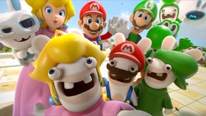
Mario + Rabbids Kingdom Battle was a genuine delight when it launched some five years ago. This Switch-exclusive title combined X-COM style tactical gameplay with beautiful graphics and animation. It was made by Ubisoft, but had all of the polish you'd expect from a Nintendo first-party title - and arrived just a few months after the Switch debuted.
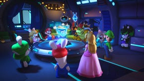
Now, finally, the sequel is here, promising a substantially expanded scope alongside a reworked, more flexible combat system. Tech-wise, we're looking at another outing for Ubisoft's Snowdrop game engine, the toolset best-known for powering The Division and its sequel. Gameplay is solid, but it comes at a cost: Mario + Rabbids Sparks of Hope lacks the same level of visual accomplishment as its predecessor.
It's all about the gameplay enhancements with this one, which are substantial. Sparks of Hope radically reworks the first title's combat. Gone are the movement grids, which have been replaced with a fully analogue traversal system. It's less contemplative, and feels like a more natural fit for a console controller. Critically, you can move a character as much as you like within certain boundaries without using a turn, which makes lining up abilities less stressful. Other actions, like throwing bombs and executing team jumps, are now fully unmoored from turns as well and require a bit of real-time dexterity to pull off.
In general Sparks of Hope feels much more engaging than the first outing. And that doesn't just come from the mechanical tweaks - the game actually requires some serious strategy at times. Kingdom Battle was painfully easy and most of the game's systems could be ignored if you felt so inclined. But Sparks of Hope demands tactical play, even on its default difficulty setting, as enemies can punish you with massive damage if you make a mistake.
The player experience outside of combat is overhauled as well. Kingdom Battle structured its overworld like an old-school Mario title, with larger worlds broken up into individual combat levels on a linear path, with a fixed-angle camera system that typically showed an isometric gameplay view. In contrast, Sparks of Hope has large, RPG-style worlds with NPCs, quests, and a conventional right-stick third-person camera. Some of the novelty of the first game has been stripped away - the combat areas are now totally separate, for instance, and the game's visual language bears less resemblance to classic Mario titles. But it seems like a worthwhile tradeoff for its flexible, Mario Odyssey-style structure.
Visually speaking, Sparks of Hope initially seems to share a lot of DNA with its predecessor. Simple, low-density textures combine with capable rendering tech to create a pleasing, cartoony visual signature. On the surface, not much seems to have changed - but the more I played, the more I got the sense that something unexpected had happened - and not necessarily for the better. Mario + Rabbids Kingdom Battle packed a ton of polygonal detail into just about every asset onscreen. Anything from a wooden bridge to a brick barrier to a storefront was perfectly rounded off with plenty of triangles. It gave the impression of a game running on a more powerful system, with model quality well ahead of other contemporary Switch software.
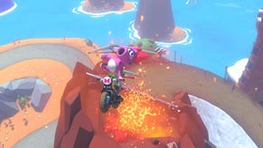
Sparks of Hope tends to use a much more angular look. Most of the environmental assets have been rendered with fewer polygons. Objects like rocks that used to be loaded with geometry are reduced to a series of simple flat faces. This does have implications for lighting as well: the soft, smoothly-lit look of Kingdom Battle is rendered a little more harshly here, with a tendency to look more flat-shaded. Texture art can look very different as well. Kingdom Battle tended towards texture art with lower-frequency detail and used techniques, like normal mapping, to give an impression of height and more complex shading. Sparks of Hope has broad brushstroke-style patterns drawn into certain environmental textures, which now appear very flat and lack the incidental geometric and normal mapped detail featured in the original title.
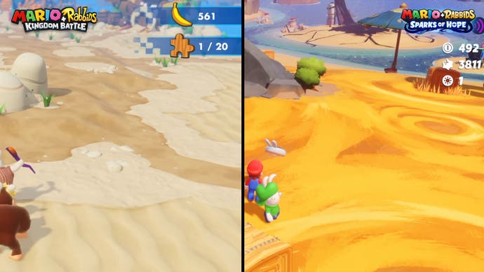
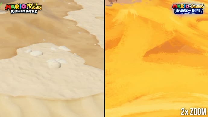
Speaking of textures, the high-polygon geometric foliage from the original game has been swapped out for the typical alpha-tested foliage textures. In other areas, foliage has been altered or stripped back as well - Kingdom Battle's shader effect for high-density grass is absent here, for instance.
The key thing here is that the new visual style works well on its own terms. Take the water, for instance. Sparks of Hope has flat, relatively opaque water with cartoon-style ripples. It looks perfectly fine and blends well with geometry. The undulating, translucent Super Mario Sunshine-style water from the original was luscious, but the new water looks good too. The same could be said of the foliage - it looks good and fits well within a lower-density style, even if certain elements were more complex in Kingdom Battle.
I think the game's expanded scope probably pushed the developer in this direction. With a free camera system and larger levels, there's simply a much greater amount of variation in what the player can see at any given time. Before, the environment could be carefully crafted to stay within a frame-time budget and to look good from a specific angle. This worked wonders for Kingdom Battle and has paid dividends in other games on Switch, most notably Luigi's Mansion 3, which leveraged a fixed-perspective viewport to crank up asset quality as well. But now those factors are harder to control.
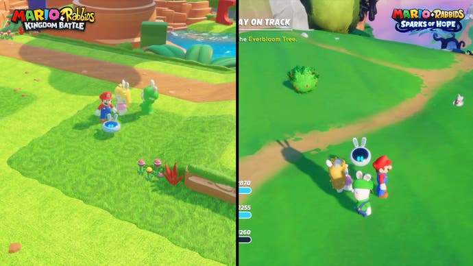
Taken in isolation, Sparks of Hope is still a visually pleasing game. However, head-to-head with its five year old predecessor, this seems more like a sidegrade than a step forward. That's a totally fair trade-off for more interesting world design and larger combat arenas, if that is indeed what's occurred. But this doesn't come across as a technical evolution of the art and style showcased so brilliantly in Kingdom Battle - and I can't help but feel a little disappointed.
In terms of the technical basics, there's not much movement from the first game: you're getting a 900p docked presentation, dropping down to 600p in portable mode. In both cases, there's no image reconstruction or TAA in place, with the developers sticking with what presents like a fairly basic post-process anti-aliasing solution. Despite the relatively basic techniques in play, image quality is decent for the most part. The resolutions are sensible for a Switch game and the low-density art style upscales without much artifacting, though edge aliasing is a bit of an issue. But more advanced Switch software has embraced sophisticated image treatment tech to boost image quality and lower rendering load and none of that seems to be active here.
And that's really too bad, because Mario + Rabbids Sparks of Hope could definitely use some extra performance. The game targets 30fps and does manage to hit that target most of the time, without frame-pacing issues. There's no motion blur or anything to make it feel smoother but in general play the game is usually a pretty solid 30fps. However, there are plenty of scenarios where frame-rates can momentarily suffer. Navigating the various worlds can chug at times, causing dips to the mid-20s, even with little of consequence happening on-screen. Cutscenes are pretty messy, often hanging in the 20s for long period, and sometimes suffering from frame-time spikes. Kingdom Battle could drop frames in similar scenarios also, though it was typically much better behaved.
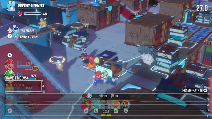
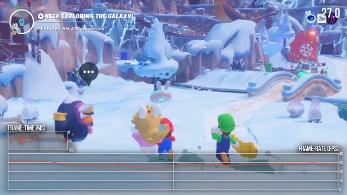
Combat is problematic as well. The typical culprits cause issues: big alpha effects and zoom-ins for certain abilities. Frame-rates take a hit and can drop pretty hard, although usually the game will return to 30fps within a few seconds. Some of the larger combat arenas can suffer from extended performance problems however, just while navigating the environment or lining up abilities. The silver lining is that Sparks of Hope is mostly turn-based. These issues have little to no effect on playability most of the time, although they would have serious impacts on a more fast-paced title. I definitely found the deviations frustrating but they didn't detract too much from my enjoyment of the game.
As a final complaint, I did notice a handful of issues with compressed seeming texture art at times. There are a fair number of in-engine pre-encoded cutscenes in the game as well, which suffer from pronounced macroblocking and artifacting. Sparks of Hope occupies just 5.8GB as a digital download which is probably a cut too far given its size and scope - a couple of extra gigabytes could have largely eliminated these occasional problems.
I'm of two minds about Mario + Rabbids Sparks of Hope. On the one hand, the game is an excellent evolution of the first game that confidently reworks X-COM style combat around flexible, controller-centric mechanics. It has hugely broadened scope, more interesting levels, and a modernised game structure. The isometric retro stylings of Kingdom Battle are gone, replaced with a keenly designed wide-open adventure that stands on its own. If the first game was Super Mario 3D World, this is Super Mario Odyssey.
On the other hand, I loved the way Kingdom Battle looked. In 2017 it was perhaps the best-looking game available on Switch, with stunning environments and beautiful art. I was hoping for a reprise of the same style, expanded with new technology. Instead, Sparks of Hope takes a left turn for a different graphical look that makes significant compromises on environmental density. The new game still looks reasonable, but I wish that the style of the original title had been more closely matched here. Ultimately though, Sparks of Hope is a bigger, broader, and better adventure than the original game. It's not the same kind of system-exclusive technical stunner, but its gameplay and design are much improved.


