Pikmin 4 delivers an Unreal improvement over its predecessors
How Nintendo exploits Epic's engine for its latest first-party showcase.
Hot off the heels of the Pikmin 1 and 2 HD remasters on Switch, we have a completely new series entry in Pikmin 4. It's been a decade-long wait, but in that time Nintendo has jettisoned its in-house engine in favour of Unreal Engine 4, which provides some of the most striking visuals seen on Switch to date. But how much of a graphical leap is it over the Wii U release of Pikmin 3, what new visual features have been added and how does performance hold up?
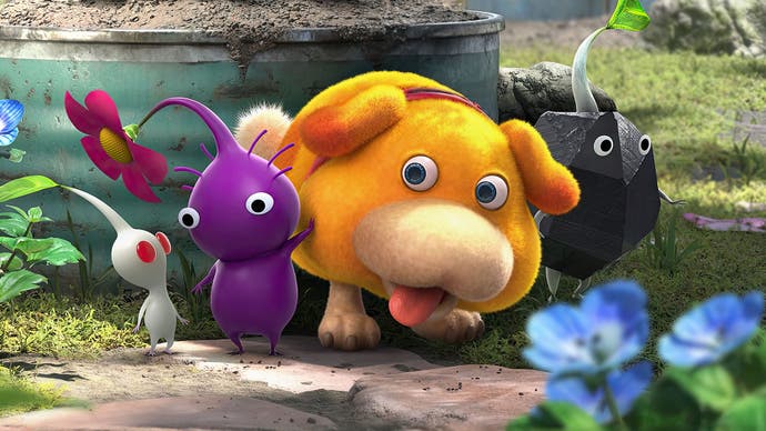
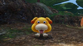
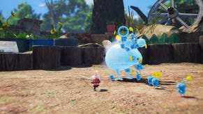
The extent of Pikmin 4's reinvention runs deeper than its visuals of course. As well as higher-fidelity graphics, the game's long development has seen major overhauls to its mechanics, UI and quality-of-life features too. The cursor has a lock-on, for a start, while a rewind feature is there in case all of your Pikmin perish. And adding an extra dimension to the series' combat, resource-gathering and puzzles, Pikmin 4 of course also features the Oatchi, a space dog sidekick. This photogenic canine is capable of jumping, swimming and charging through obstacles, providing more variety to Pikmin's usual gameplay loop. It's a risk that pays off, and if you've never played a Pikmin game before, there's never been a better time to jump in; it's the most streamlined it's ever been.
On a technical level, Pikmin 4 benefits hugely from the move to Unreal Engine. Of course, we've already seen Nintendo-published games use Epic's middleware tech, notably Yoshi's Crafted World on Switch. And while proprietary engines are something to cherish in this day and age, Unreal does at least give developers a shortcut to top-end rendering features - and at its core, Pikmin 4 still feels like Pikmin, with the same DNA and design ethos, just with a stark upgrade in its presentation.
It can be instructive to look back to Pikmin 3 on Wii U for a little perspective. This title had noticeably better visuals than the two GameCube originals, jumping to a native 720p (albeit with no anti-alising) with higher-res textures, improved model quality on the Pikmin, enemies and pilots, while effects like depth of field and screen-space reflections on water were also implemented. Despite being developed for Wii originally, the game ended up taking great advantage of Wii U as an HD console and looked superb for a 2013 release.
As well as this bump to fidelity, Pikmin 3 also debuted a gameplay and usability overhaul, with an always-on map screen on the Wii U GamePad screen, multiple pilots to switch between and more Pikmin types to play into the game's puzzles. Despite running at just 30fps, a stable frame-time presentation meant that the game felt good to play too. The only real downside was that lack of AA, and perhaps a slightly too inflexible camera with no height control.
Jump forward ten years, then, and Pikmin 4 on Switch is a clear upgrade in several aspects. Firstly, resolution is boosted to a dynamic 900p while docked (normally 810p while adventuring outdoors), while portable play runs at a dynamic 720p (normally 600p). Dynamic resolution scaling in response to GPU load wasn't a part of Nintendo's in-house engine, so the switch to UE4 allows the game to achieve a better blend of performance and resolution than a fixed resolution would allow. As an added bonus, Nintendo makes use of anti-aliasing for the first time in the series history here, a luxury not even seen on the recent Pikmin 1+2 HD remasters on Switch.
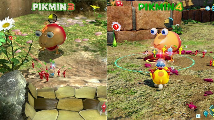
We get a lot of benefits with Unreal Engine then, and it doesn't end there. Pikmin 4 pushes for a much improved depth of field effect for a start, adding a bokeh pattern to areas just out of focus, while chromatic aberration is also added to the screen's edges. And yet, Pikmin 4 doesn't present a perfect picture - especially with regards to image quality. While the base native resolutions are now much higher than Pikmin 3's 720p and we get a more advanced rendering pipeline via Unreal Engine, the game still suffers from a degree of pixel shimmer, aliasing and visual noise. In part, this is an effect of the dynamic resolution setup adjusting the pixel structure on the fly. It's possible to see the pixels shift on the horizon, especially in big open areas like the Sun Speckled Terrace, while the new bokeh depth of field effect runs at a lower resolution buffer to the main image, meaning aliasing is visible where a background element hits an in-focus foreground element. So, while Pikmin 4 offers a big improvement over Pikmin 3's no-AA 720p picture, there are still obvious limits to Switch's end result.
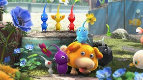
Looking at the actual 'Pikmin' model quality over the years, from the original right up to Pikmin 4, there's only so much Nintendo really needed to do to push up detail levels on its main star. Geometry detail is boosted and material lighting gets an Unreal overhaul, but the genius here is in the simplistic design of the Pikmin to begin with. This allowed even modest hardware - like the GameCube - to render the Pikmin in huge numbers and view them as a swarm from a far, a concept Nintendo first pioneered with the Super Mario 128 demo.
The bigger upgrade over Pikmin 3 comes in world detail. From the opening tutorial around the house to flourishing garden areas, Nintendo fills the Pikmin universe with beautiful touches. Right away, we get new decorative elements like falling petals plus volumetric fog on the horizon. Each adds a sense of weight and energy to the air that previous games were missing. Combined with the game's rolling time of day system, and the dynamic shadows which have been part of the graphical makeup of the game since the GameCube original, there's a genuine sense of a lived-in garden environment now.
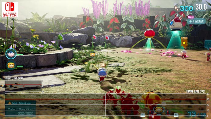
Needless to say, the lighting and geometry of Pikmin 4 are a huge step up over what came before. Material variety is bolstered with the Unreal toolset; notably on Oatchi there's a fuzzier, fur-like material which diffuses oncoming light, while spacesuit helmets and the chitin shells of insectoid enemies have a glossy porcelain finish. Terrain reacts beautifully with light too, from the mossy undergrowth of the opening garden to the rocks in the sublevels. There's even a convincing reflective sheen to scratched metals and treasures. One extra nice touch is seeing the details beyond the garden. Even filtered by the bokeh depth of field, we now see the house and scrapped tyres looming over. Again, all of this helps create this sense of Pikmin 4's action within a miniature-scale world.
Last up is performance, and thankfully we can report that the game runs at a locked 30fps throughout whether you're playing in docked or portable modes. There are minor single-frame dips as you pan the camera quickly around the garden, but these drops are likely to coincide with dynamic resolution adjustments. On the whole, it's not too intrusive, though it's a slight step back from the watertight 30fps lock we see in the other Pikmin games. As an aside here, Pikmin 4 also drops at points momentarily where transparent elements fill the screen. Otherwise? This is an absolutely rock-solid experience at that 30fps line.
Pikmin 4 is easily the biggest leap forward graphically for the series - and for Nintendo it's a visual tour de force on Switch. Parts of it look almost like a CG animation in presentation, especially the lighting and character models which benefit from a simple-but-effective design. Other aspects though, such as the noisy image quality, do show the limits of Switch's ability to push for higher resolutions. Given all the features Switch is pushing though, such as the dynamic time of day, screen-space reflections and the much-improved lighting, shadows, materials, and character models, it's inevitable that resolution would be the trade-off.
All of this amounts to Pikmin 4 ranking among the very best-looking first-party Switch titles. Based on the results here, Nintendo and Unreal Engine is a pairing I hope we see more often.
