Luigi's Mansion 2 HD is a smart, clean remake of the 3DS classic
With some of the best image quality we've seen on Switch.
Released alongside the GameCube in 2001, Luigi's Mansion was judged warily by Nintendo fans before launch, but has become a bona fide classic - one that saw two eventual sequels, on 3DS in 2013 and Switch in 2019. With Switch 2 on the horizon and relatively few games in the pipeline, Nintendo has decided to release an enhanced conversion of the second game, Dark Moon, with HD visuals and other quality of life changes. The package is certainly intriguing, but how does the game hold up and what's changed in terms of its presentation?
As an enhanced 3DS game, I wasn't initially sure what to expect from Luigi's Mansion 2 HD. After all, 3DS games occupy a curious space: suitably modern in some respects, but with significant texture and geometry constraints designed around a relatively weak processor and small, low-resolution screen. Dark Moon is an interesting example though, as it stands as one of the more visually impressive games on 3DS - something special that perfectly leverages the system's capabilities.
Luigi's Mansion 2 has also a fundamentally different design to the original, with mission-based gameplay that makes sense for short spots of handheld play. The core of the action, however, remains decidedly Luigi's Mansion: you're solving puzzles, battling ghosts and generally causing havoc along the way.
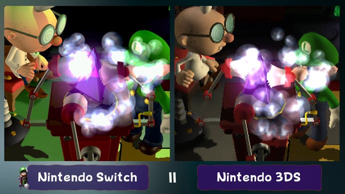
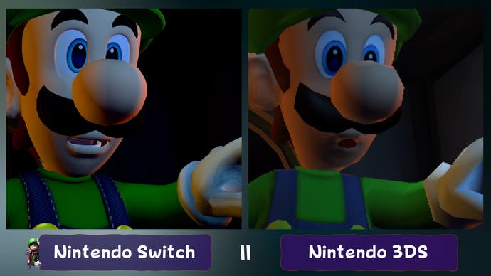
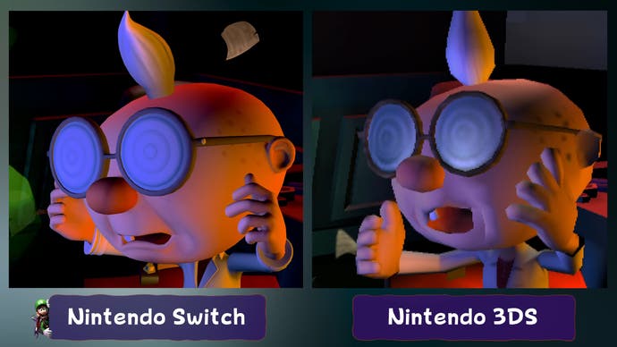
As a 3DS game, remake developers Tantalus were faced with updating the visuals to suit Switch without completely changing the look of the game. From a tech standpoint, the result is no match for Luigi's Mansion 3, but it's still a handsome update of the original visuals. Characters and environments use more geometric detail, textures and shadows are higher resolution, and lighting has been upgraded significantly - even the clouds are fluffier. Overall, scene geometry matches the original game, but the improvements - especially to the lighting - are significant and elevate the game's visuals.
It's the kind of thing where, when you first lay eyes on the Switch version, your memory will tell you that this is how the game always looked. It's only when you go back to the 3DS original that you can really see the effort poured into enhancing the presentation.
I haven't had a chance to play through the entire game, but the first mansion tells you everything you need to know about the game's upgrade from 3DS. I would ultimately describe this as a very smart, clean enhancement, one that perfectly retains the original look of Luigi's Mansion Dark Moon but introduces enough improvements that it winds up feeling like a proper definitive release. The developers have done a great job with this version of the game.
Image quality is perhaps the remake's strongest point. Luigi's Mansion 2 HD targets native 1080p in docked mode and 720p in portable mode, with each mode also offering great anti-aliasing. As a result, the image quality is among the best I've ever seen on Switch. It's just a super-sharp, clean looking game from top to bottom. This is a perfect example of how you can leverage good image quality with sharp art design to create something that looks attractive even on low-end hardware. The same is true of the game's user interface elements which were entirely reworked with 1080p in mind, resulting in crisp, clean fonts and menus throughout.
Of course, there's also frame-rate to consider and this is perhaps more interesting than you'd expect. You see, in its original form, Luigi's Mansion Dark Moon on 3DS runs with an uncapped frame-rate - but even with overclocking, this frame-rate is largely unstable and normally lies around 30fps. Switch doesn't offer a 60fps mode, despite its more powerful hardware, but instead offers a locked 30fps - a decision that makes sense given the nature of the gameplay. In my experience, the game retains this 30fps target flawlessly with zero hiccups or issues.
When you get right down to it, then, I would say that this iteration of Luigi's Mansion 2 is better in basically every way. The only thing you really lose out on, obviously, is support for stereoscopic 3D - which did work well on 3DS but isn't supported on Switch.


The other aspect of presentation then is the audio - as a conversion of a handheld game, I didn't have high hopes that the development team would rework the audio to support surround sound, and they didn't - this is a stereo experience. In fact, I'd say that audio in general is not a high point for this game. It's serviceable, but I feel like it just doesn't have the same draw as the original Luigi's Mansion on GameCube which has a unique soundtrack.
So, what about the game itself? On the surface, I would say it's my least favorite of the three Luigi Mansion games yet, given the quality of the trilogy, that's hardly an indictment - all three games are solid. So even being my least favorite, I still think the experience is quite enjoyable and worth playing. The mansion designs, missions and core mechanics are all a lot of fun and this new coat of paint holds up well under scrutiny.


