Persona 3 Reload brings the genre-defining RPG to PS5 and Series X at 4K 60fps with RT
The Digital Foundry tech review.
Persona 3 is a genre-defining RPG that blazed a trail for all other modern Persona titles and inspired countless other RPGs. Its original incarnation was stranded on the PS2 for over 15 years, but now Persona 3: Reload offers a top-to-bottom remake for modern consoles and PC - including 4K 60Hz gameplay with RT on PS5 and Series X. The 2024 release aims to revitalise and revamp the title for contemporary expectations - but is it the fully actualised remake that fans have been waiting for? And are the graphics an evolution beyond other recent Atlus efforts?
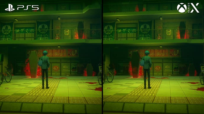
I'm going to work through the console comparisons quickly, because Persona 3 Reload runs with only minor differences to distinguish the Series X and PS5 versions. Both run at what appears to be a native 4K without anti-aliasing, although some UI elements appear lower-res, with only minor lighting differences between the two versions.
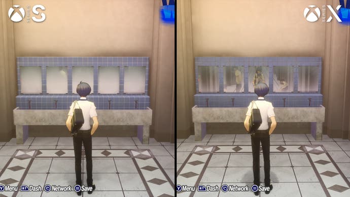
Series S looks similar but renders at just 1080p, again without obvious AA. It doesn't feature RT reflections, like Series X and PS5, while shadow resolution has also been reduced. This turnout is a little disappointing, but from a typical TV viewing distance it doesn't look bad - just softer than the Series X and PS5 versions.
All three consoles target and hit a full 60fps in typical play. I didn't notice any particular frame-rate issues on any platform in my experience, except for a few moments on the Series X which feature heavy RT effects. It's possible the same dips could recur on the PS5 or Series S, but in the material I played on that platform the game stuck to 60. Pre-encoded cutscenes - including the anime cutscenes and 3D sequences - are encoded at 30fps, and play back without frame-pacing issues. There are very few titles that achieve a 60fps update at 4K with RT features on consoles, but the restrained environment rendering makes that target more realistic here.
Now that we've run through the platform comparisons, I want to mention the elements common to all versions, starting with the UI design. The game's menus and interfaces are genuinely incredible, with beautiful transitions between submenus and striking designs centred around the main character, animated as if he is immersed in water, with the background still visible behind the blue UI elements. The fonts and shapes are very reminiscent of Persona 3, but infused with a more adventurous design sensibility like Persona 5 - perfect.
The UI elements in other areas of the game are up to the same high standard. The battle menus mix 2D seamlessly with 3D elements, with some fluid animation work. A lot of shapes and visual elements from Persona 3 are represented here, but the new UI is more visually exciting. All the various interstitial screens, cutaways, and dialogue scenes all exhibit the same high-calibre UI work. It's engaging without being at all overwhelming or hard to read, and the reliance on simple blue-and-white tones keeps the UI looking clean. Persona 3 Reload has some of the most inventive and confident UI work I've seen in video games.
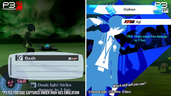
Reload backs up its UI design with some very compelling animation in its 3D content as well. The battle sequences in particular often look stunning, with great-looking attacks and special abilities. The new "Theurgy" moves added for Reload are probably the biggest highlight here, serving as elaborate show-stopping finishing moves like the Showtime attacks in Persona 5 Royal. I think this game has the best combat animation of any Persona series entry to date, and this keeps the turn-based battles engaging.
Character models are another high point. The main cast's outfits are as stylish as ever, and each character sports a healthy amount of model detail. Unlike the original Persona 3, which relied on Chibi-style 3D models with large heads, the characters are rendered with normal proportions here. That means the updated character portraits blend seamlessly with the 3D art, always matching the onscreen models. The lighting generally gives them a bit of a cel-shaded appearance with bright edge highlights, which keeps them crisp, clean, and easily distinguishable against the environment.
The models for enemy characters are a little less detailed, but they still animate effectively and have distinctive looks. Longtime SMT and Persona fans will feel a bit of familiarity here though, as the models from Persona 5, SMT 5 and Soul Hackers 2 have been reused here again. There's nothing wrong with a bit of asset reuse, and there are new enemies to fight as well, but a lot of these foes were designed around the constraints of the PS3, which is a bit evident in close-ups.
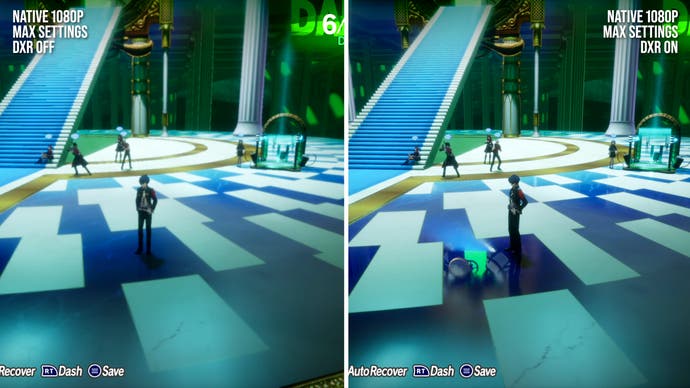
Another strong point - and a highly unexpected one - is the game's use of ray-traced reflections. I originally thought we might be looking at a planar reflection technique, but the noise patterns and variable glossiness that are sometimes visible in the reflections seemed to suggest RT. Testing the PC build with the Nvidia Profile Inspector tool, it's possible to disable DXR... which reveals a different-looking SSR fallback, thus confirming the RT diagnosis. It's weird that the PC version doesn't offer users an option over which reflections are used, but the inclusion of RT reflections at all is still a welcome surprise.
The RT reflections are fairly conservative for what it's worth - I didn't spot them on any curved surfaces, and they're often present in scenes with limited camera control. They still give the game a certain sense of depth on surfaces like mirrors and windows that we otherwise don't see, and their quality level is fairly high. In one in-game sequence where reflections are gameplay-critical, I believe Persona 3 Reload is using planar reflections, but elsewhere I couldn't find evidence of the technique.
Some reflections also seem to rely on screen-space techniques, which work fine most of the time but suffer from disocclusion issues. The game's post-processing in general - including bloom lighting, depth of field, SSR, and motion blur - all looks suitably modern and smooth. Atlus used Unreal Engine 4 for this effort, whereas other mainline Persona titles were built on RenderWare or in-house tech, and the post-processing here provides the clearest evidence of UE4's advantages. Atlus is being somewhat restrained though - motion blur is only present during gameplay while the protagonist is sprinting, while depth of field isn't featured in gameplay or dialogue sequences.
Finally, the game's cutscenes are worth discussion too. These mostly take the form of anime-style sequences, just like the original game, although these cutscenes seem to be fully re-animated. They lend the game a certain characteristic Persona flair, although these do tend to be slower-paced sequences. For the more action-packed stuff, we sometimes see bombastic in-engine cutscenes, which are used sparingly but look terrific. Unlike prior Atlus games though, these do appear to be pre-rendered and display at a fixed 30fps.
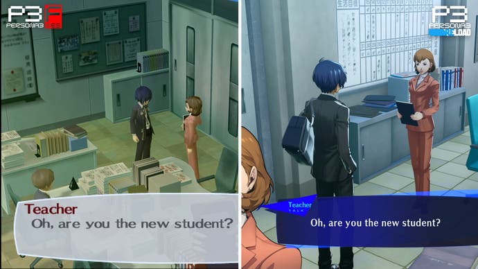
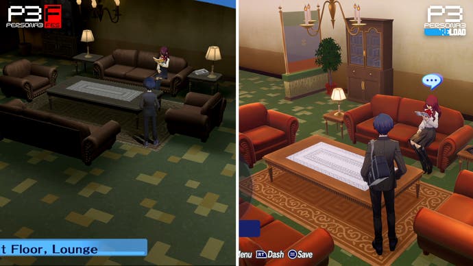
So that's what works - so what doesn't? The game's environmental lighting is probably its biggest flaw. We see a lot of very flat-looking environments without much colour differentiation, with regions lacking any sort of large-scale occlusion. We still have shadowmaps, which look fine, and there is a subtle form of ambient occlusion, but we don't see the high-quality baked lighting that we see in some other UE4 titles. If you look closely, you can sometimes spot a mismatch between the dynamic lighting in the game and the environmental lighting, which looks especially bizarre in the dormitory. The in-game light sources really suggest the room should be much darker, with a more contrasty and vibrant lighting presentation.
That said, some environments do look better than others. The school area generally looks reasonable enough - and some of the segments set in the Dark Hour, which feature dramatic colour shifts, look sharp and striking - but the general lighting presentation is a disappointment. The original Persona 3 notably didn't suffer from these issues, and I really don't know why Atlus wanted to make the lighting presentation so uniform now. Other areas do capture the spirit of the original more effectively, but it still often looks off relative to the PS2 title.
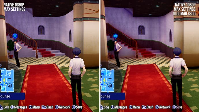
Even though it's ultimately just a bit of screen-space trickery, I think changing the SSAO parameters or method might improve the game's visual presentation quite a bit. I tried injecting the SSDO technique in GloomAO into the PC version of the game using ReShade, which can give the game a more grounded and dynamic look. It's not perfect by any means - there are some obvious errors when RT is onscreen, and the SSDO can cause some inappropriate-looking colour contribution from some object - but I think something like this would be a step in the right direction.
It would be interesting to see if the community can come up with a better SSAO injection for Persona 3 Reload, or a mod to improve things further. Of course, the ideal intervention would be if Atlus themselves improved the SSAO, which is exactly what we saw with Forspoken last year. That game had a very flat lighting presentation in its original guise on both PS5 and PC, but was later updated with a more intense SSAO that filled in a lot of the lighting flaws in the original. Persona 3 Reload might be able to enjoy a similar graphical uplift with some extra effort.
The other key issue is that the environments tend to be quite plain, lacking geometric detail. There's very little environmental adornment, with a lot of flat surfaces, simple objects, and occasionally awkward-looking normal maps. At its best, the game can look very clean and clear as a result, but most of the time the environments just look overly simple.
If we step back to Persona 5, the environmental density isn't outstanding, but it does display denser and more complex outdoor areas - and that game was originally developed for PS3 hardware. I think a lot of these problems would be easier to overlook if the lighting quality in Reload was better, but as it stands a lot of the environments tend to look very stark and flat. Reload is still a cross-gen title, but last-gen machines are more than capable of producing complex and exciting environments, at least relative to what we're seeing here.
Those two issues do annoy, and it took a while to get used to the way the environments look in typical play. The combat arenas look decent enough, and there are areas, like the school, where the aesthetic comes together reasonably well, but I would say the game does have a deficit in environmental rendering relative to expectations.
There are some other occasional issues that players might come across too. Third-person camera control can be a touch awkward, with the right stick sometimes not responding immediately to a change in direction. There are some other little camera oddities when the camera is semi-fixed, such as when exploring most of the game's environments. There are other occasional bits of production weirdness too, like how most of the crowd in the nightclub here doesn't animate.
Overall, I think Persona 3 Reload is a good-looking game when enjoyed on its own terms - but here are some areas that aren't quite up to the standards we'd expect from a release in 2024.
As an actual remake, I think Persona 3 Reload is a very accomplished effort. Persona 3 defined the modern Persona game formula, with the main character alternating between building social links and exploring dungeons, all organised around an in-game calendar with a fixed amount of time. Reload brings in some conveniences and quality of life improvements from Persona 5, like the use of an (era-appropriate) in-game cellphone to trigger social links.
There's also some additional content, like extra evening social link activities to enjoy with the members of SEES. All social links are now fully voice-acted, which is a nice touch and an improvement over the text-based conversations featured in prior Persona titles. The dialogue is partially rewritten too, most notably with characters now addressing each other by their last names.
Combat enjoys the biggest changes. Unlike Persona 3 and Persona 3 FES, all party members are fully controllable at all times, which greatly expands the strategic options available to the player. Characters can Shift, which hands off their current turn to another party member after striking a critical hit, making it easy to chain combos together. The aforementioned Theurgy attacks have been added too, which take a while to build up but prove very satisfying. The fatigue system is also gone, which I think detracted somewhat from the original game. Essentially, the combat looks and feels closer to something like Persona 5 Royal now, making the game a lot more polished.
As an entry point into the Persona series, I think Persona 5 Royal is probably a better game to start with than Persona 3 Reload. But for players who like this style of game already, Persona 3 Reload has a lot to offer. It's still the same great Persona 3 experience, updated with new graphics, a better and clearer interface, and revised turn-based gameplay. Plus, the new voice acting is very good and the soundtrack - which has been completely re-recorded, and features new songs as well - is excellent. There's a lot to love here for sure.
From a visual perspective, the game has its ups and downs, but I think it looks reasonable enough for the most part. With some lighting tweaks, I think it could be a substantially better experience though, and I would like to see some improvement - either player-led, or from Atlus themselves - on that front. Current-gen console performance is solid at least, with the game combining ray tracing, 4K rendering, and a 60fps update on PS5 and Series X.
I really liked Persona 3 Reload. It's not going to suit everyone's tastes, but I think a lot of players will really enjoy what it has to offer.



.png?width=291&height=164&fit=crop&quality=80&format=jpg&auto=webp)
