Skull and Bones: the good, the bad, the ugly - and the utterly bizarre
We've got a range of issues with Ubisoft's 'quadruple-A' game.
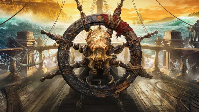
Some say that Skull and Bones has spent over a decade in development, so just how good is the final release? Well, Ubisoft says it's a game of quadruple-A quality no less, but in our opinion it's very much a mixed bag. There are elements to commend it from a technical point of view, but equally, it falls short in so many ways. Originally conceived as an off-shoot of the naval battles in Assassin's Creed 4: Black Flag, the lineage is clear - but for all the technological advances seen in the last decade, Skull and Bones is arguably worse than AC4 in some regards. Meanwhile, beyond the technology, we've got issues with the core game design - not to mention its bugginess and lack of consistency and polish.
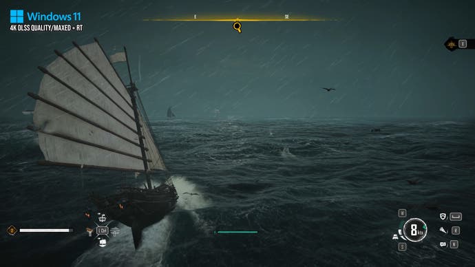
Let's talk about the positives first. The PC version of the game is competently put together and doesn't suffer from the usual array of issues that blight many releases: there's no shader compilation or traversal stutters, the menus and options all make sense (as they should, based on the standard Ubi template). There's also access to a range of upscaling options and I'm reasonably confident in saying that the PC version is the best way to play the game.
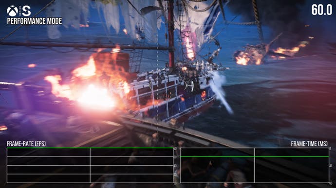
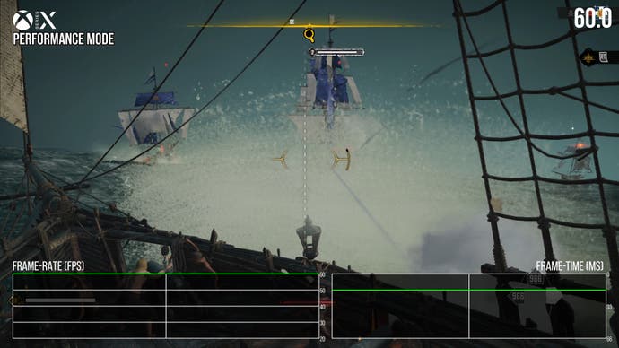
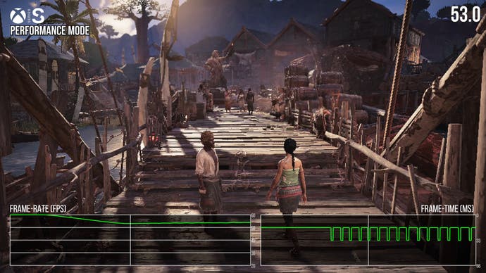
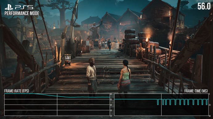
There are positives on consoles too: PlayStation 5, Series X and Series S all possess 30fps quality and performance modes, targeting 30fps and 60fps respectively. There can be some minor performance drops on PS5 and Series S, but ultimately, these are minor issues and the majority of gameplay runs smoothly. The game's early hub area does seem somewhat heavy on the CPU based on the PC version, which may be the root cause of the issues on consoles but overall, it runs nicely.
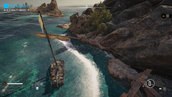
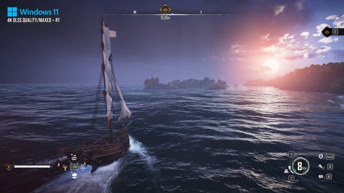
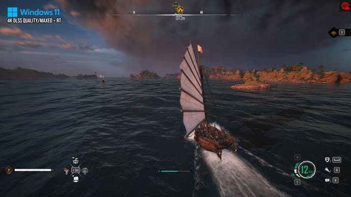
In its best light on PC, there are some graphical niceties here to call out. The water simulation is impressive, with nice spray as waves interact with your boat, as well as some obvious subsurface scattering, varying the colour of the water based on how thick it is when backlit by the sun. The particle system developed for near-shore waves cresting is neat: a white swarm of particles interacts with whatever it collides with, giving the waves a suitably realistic look as they near beaches and rocks. The issue here is that much of the game's post-processing runs at quarter-resolution, which presents issues for the console performance modes, which already operate at very low pixel counts.
The skies also present very nicely - as they should, bearing in mind that the Anvil Next engine has had this nailed for some time now, with competent volumetric cloud rendering. In fact, all of the things that Skull and Bones does well from a visual standpoint tend to be the things that have impressed for the last half-decade in various Assassin's Creed titles - but to be blunt, that's where the praise comes to an end. Otherwise, the game bears much evidence of its complicated history and even after so many years in development, lacks polish.
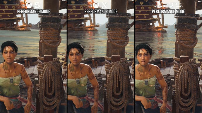
For example, the wave simulation is nice, but reflections on water are primarily achieved with screen-space reflections. This means that reflections lacking screen-space data to draw from are effectively broken, leading to reflections disappearing or else having holes in them. On lower spec PCs and on console performance modes, another issue with the SSR is the lack of resolution, meaning reflections are unstable, grainy. They present with lots of flicker as the camera moves. Both Xbox Series X and PS5 suffer from this issue in their performance modes, and also have it to a degree in the quality mode as well.
Series S is even worse as water reflections are of such a low resolution that they are almost unrecognisable as such. SSR in this scenario is a bad idea. RT reflections or SSR mixed with some form of projected real-time cubemaps or planar reflections would deliver better results. In fact, Assassin's Creed 4: Black Flag has better reflection consistency than Skull and Bones as it seems to rely extensively on planar reflections which lack the issues found in the new game.
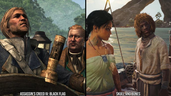
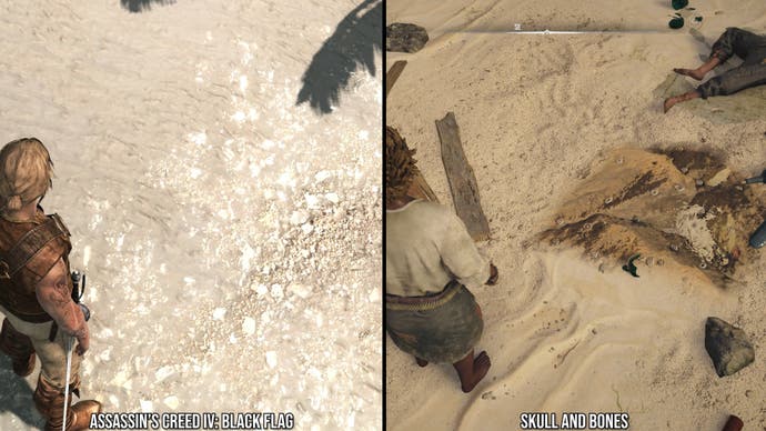
In fact, comparing Black Flag to Skull and Bones is a very interesting exercise, because while the new release benefits from many of the enhancements made to the Anvil Next engine over the years, I'd say that there are key areas where Black Flag is better. Seriously. Black Flag came out before physically-based rendering was added to Anvil, and it shows: looking at AC4, materials and characters in the game have a particular sheen that I would consider inferior to material quality as seen in Skull and Bones.
However, the older game's character animations and expressions are superior. In Skull and Bones, every character has a weirdly stilted look to them when they move their mouths and eyes with obvious transitions from resting and movement. Perhaps it is unfair to critique a multiplayer game for its cutscene animation quality, but Ubisoft is saying it is quadruple-A quality here and this title has a surprising amount of NPC dialogue you have to wade through. In spite of that, Skull and Bones is notably falling short in its character animation in comparison to a previous title from the same developer that is 10 years old at this point.
Perhaps more damning is the uneven quality of textures and geometry in Skull and Bones - a mish-mash of high and low quality textures, which you just don't see in Black Flag. There are bugs related to this too as it seems that some higher quality textures simply never load at all - even on the most powerful of PCs. When you couple the very uneven texture quality with the variable geometric quality, you have many areas in the game that look more than a decade old - or worse if you happen to see a bug or a particularly unfavourable level of detail model. Level of detail is also not great when it comes to the islands you sail near, with objects popping into view close to the camera, or with very unflattering mipmap levels manifesting dangerously close to the camera. If this game was early access on Steam, that may be forgivable - but it's not for a self-proclaimed quadruple-A release targeting modern hardware.
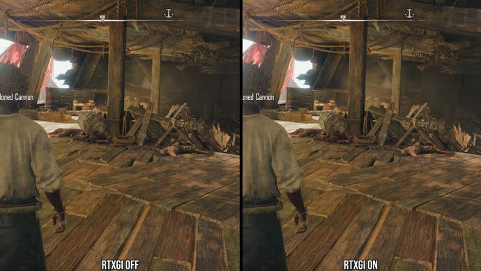
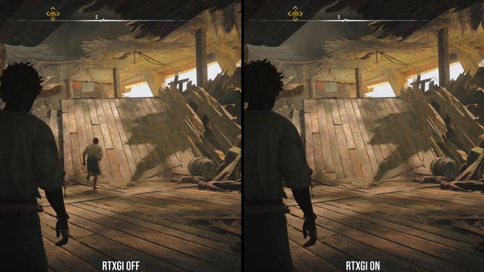
Another issue is lighting quality. Skull and Bones has a dynamic time of day but is still using last generation lighting techniques. So, areas in shadow look flat with just screen-space ambient occlusion giving them shade. RTXGI is there on PC in the menu and on the console quality modes, but remarkably, it barely impacts lighting at all - in stark contrast to the global illumination seen in, say, The Witcher 3's next-gen remaster. In Skull and Bones, RTXGI only affects the shading of the ship and nothing else. All of the areas on land or in the distance are completely unaffected by the technology - just the ship - and the RTXGI simply adds better ambient occlusion. This is one of the most bizarrely limited ray tracing implementations I have ever seen.
We've got to go into more depth on the post-processing quality and particle effects. Firstly, many of the particle systems only update at 30fps or perhaps even lower, giving the game a low frame-rate look even when performance is at 60fps or higher on PC. Particles rendered at quarter resolution look hideous in console 60fps modes because the base resolution is already so low - 720p on PS5 and Xbox Series X, 540p on Series S. Particles look like low res blobs upscaled with a blocky, nearest-neighbour effect.
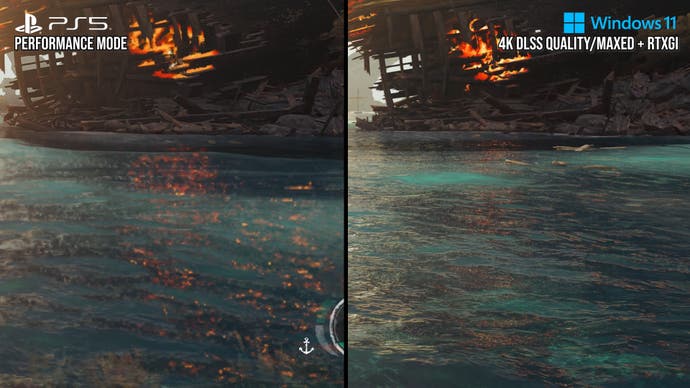
Another baffling aspect of the game is the massive disparity between quality and performance modes. On PS5 and Series X, native 720p at 60fps becomes native 4K in the 30fps mode - a 9x resolution multiplier (!). Yes, the premium consoles at 60fps have the same internal resolution as Black Flag on Xbox 360, which came out in 2013. Series S, of course, will be lower than that. Performance modes on PS5 and Series X then use FSR 2 to upscale to 1440p (or 1080p on Series S), with disastrous results to image quality.
In fact, I'd say that FSR 2 is more of a detriment to quality than any kind of boon. You have particle ghosting nearly everywhere, while any moving object is surrounded by a motion blur made entirely out of large pixel edges. Object disocclusion issues fizzle out massive pixels, lacking any real anti-aliasing on the move. In console performance mode, Skull and Bones never ever looks stable, well anti-aliased or of a particularly high resolution. Put simply, image quality completely falls apart in motion. This is then coupled with the quarter resolution particles which have pixels that are just huge in screen-space. On something like Series S, particle resolution is just a little bit higher than an old Super NES game.
So, the price of good performance in the 60fps mode is dire image quality. Only PC users can get a better result, as DLSS or temporal AA upscaling solutions with dynamic resolution scaling are available, which is also the case in many Anvil Next titles. There's no DRS on consoles, by the way, just very low, flat resolutions in performance mode with an FSR 2 solution that should never have been deployed on this game. However, quality mode is native 4K (!) and looks so much better - it's one of the largest image quality disparities between modes I've ever seen.
This leads us on to more general gameplay issues. In Black Flag you can freely walk about your ship, but in Skull and Bones you are the ship, only 'becoming' a character on land. Ships in this game control with inertia and have large swooping movements. They are not particularly responsive and that is OK, given they are wind-powered vessels, and this is a pirate game, after all. This lack of responsiveness also carries over to character movement on land, which has some very heavy animation.
There is an inherent latency in the response of movement per default built into the game. At 60fps and higher, this is tolerable, but at 30fps, I found myself often overshooting or understeering or not accelerating and decelerating as I wanted to. It made piloting my ship harder and I think many people will feel this way. So, effectively, you have the choice between good image quality with bad controls, or very bad image quality with good controls. These are not great choices.
As for the game itself, this was another area where I struggled. You would think this would be a merry and exciting pirate adventure, but the game's structure is based around fetch-questing. As an example, you go to one NPC who gives you a quest to go to another NPC, who then sends you on a quest to get something out in the world to return to them to get bonuses for the game's RPG systems. You are constantly doing small errands and none of it feels particularly pirate-like. The RPG systems grafted on to the game seem patently at odds with the pirate concept. The game is packed with random items that exist simply to speed up the chores you do - false and inflated progression.
There are also some very strange 'crafting and gather' gameplay mechanics, where your ship is constantly running over items you have to tap a button for to bring into your inventory, or more embarrassingly, a harvest mini game that seems to be from an entirely different game altogether. My biggest issue with Skull and Bones is that it fails to communicate or deliver the pirate concept in its core gameplay as you are not a pirate, you are the ship with a land-based avatar that purely exists for cutscene purposes, crafting and NPC quest-giving.
As a result of this disconnect, you don't actually spend much time doing more interesting pirate-like things. For example, boarding and taking another ship should be very exciting, right? In Skull and Bones, this is reduced to showing a cutscene and getting some loot. That's it.
On top of the boring gameplay, I encountered many bugs while playing. Some of them were purely visual, like the time the St Anne hub presented with a purely mirror-like water shader applied to the ground, causing massive levels of specular shine and lens flares. Others were genuine showstoppers, like a disembarkation prompt never appearing during the tutorial section, meaning I couldn't progress any further.
I thought of using the game's chat system to ask other players for some advice, but the chat system didn't work for me at all throughout my time with the game on any platform. If you're interested, only by rebooting the game would the required prompt appear, meaning I could continue through the tutorial.
Ultimately, this just isn't good enough. While some of the technical execution works fine (in particular on PC), the visuals are inconsistent, especially on console performances modes, while gameplay is bogged down by concepts that simply aren't a good fit for the pirate theme. Is the game of a quadruple-A standard? Well, give it a go for yourself. You can download and play for free for eight hours on any system.
However, when the introductory pre-rendered FMV video doesn't even play smoothly, doubts will arise about the quality of this endeavour before you've even played it. This sequence also reveals that a vast array of Ubisoft studios contributed to the game, so the budget was clearly there and obviously, there was no shortage of time spent on the project either, and yet that 'quadruple-A' investment has not delivered anything like a polished or even enjoyable end product.
