Face-Off: Call of Juarez: The Cartel
Mexcian stand-off.
| - | Xbox 360 | PlayStation 3 |
|---|---|---|
| Disc Size | 6.2GB | 5.45GB |
| Install | 6.2GB (optional) | - |
| Surround Support | Dolby Digital | Dolby Digital, DTS, 5.1LPCM, 7.1LPCM |
Developer Techland has taken something of a gamble with new offering Call of Juarez: The Cartel. The series has turned its back on the era of the cowboy, relocating the first person shooter action to modern day Los Angeles, opening up a whole new world of high calibre weaponry, vehicles and more densely packed environments.
There's a real sense here that the studio is looking to expand the reach of the franchise, not only with the change of locale but also in the implementation of crowd-pleasing features such as full co-operative online play - up to three players work together through the campaign, adding a more social and tactical approach to the straightforward bursts of FPS action.
Unfortunately, things haven't quite gone to plan: moving away from the Old West has simply made Call of Juarez look like many other middle of the road "urban" shooters, while the solid nature of the visuals in the last two titles seems to have been compromised somewhat as a result of some bland art design choices that don't seem to entirely suit the series' bespoke engine tech.
It's quite a surprise to see a lack of progress on Techland's part with regards to the overall look of the game, especially since The Cartel is running on the new, more technologically advanced Chrome Engine 5. There's a real feeling that the rendering technology doesn't get the opportunity to play up to its strengths in the new locale: in previous Juarez outings, Chrome has consistently delivered detailed landscapes with accompanying long range vistas but the urban setting of the new game doesn't seem to make the most of the engine's capabilities.
The Cartel's less urban areas still show promise though: not only are rural environments more lushly detailed with the use of some pleasing effects (such as light shafts beaming through the trees), but the artwork also does a much better job of standing out from the pack of competing first person shooters.
The most obvious technological changes appear to be how the rendering load is handled on both versions of the game, in combination with a boost in native resolution: it's a noticeable improvement over the last Call of Juarez, as the requisite head-to-head video and comparison gallery reveal.
The Cartel's predecessor, Bound in Blood, employs a sub-HD rendering resolution on the PS3: 1152x640 upscaled to 720p, while a cropped 1280x672 is present on the 360, framed by borders. On both versions, a custom anti-aliasing solution provides a decent alternative to the standard use of multi-sample anti-aliasing (MSAA).
In Techland's latest, both consoles now adopt vertical 720p framebuffers - horizontal resolution has been slightly reduced on the 360 (1200x720 on the Microsoft platform compared to native 720p on the PS3), thus allowing the framebuffer and render targets to fit into the system's 10MB eDRAM, without the need to "tile out" mid-frame to main memory, sapping peformance. The difference in image quality between the two is fairly minor: the game isn't quite as sharp on 360 but it's hardly an issue and it's definitely an improvement over The Cartel's predecessor, Bound in Blood, which employed a sub-HD rendering resolution on PS3 (1152x640) and a cropped 1280x672 on 360.
The developer's custom anti-aliasing solution returns, effectively smoothing over the more obvious edges, but not without adding a slight softness to the image. This, along with some of the game's use of post processing elements, give the game's presentation a very mild 'sub-HD' look to it.
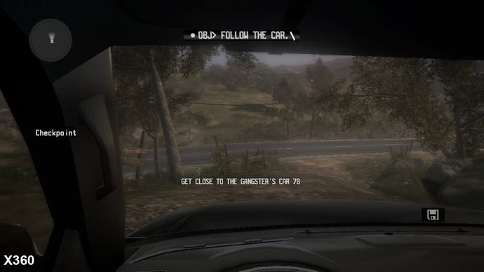
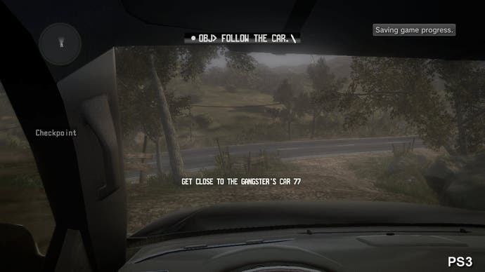
The basic graphical make-up of the game initially seems quite close between the two versions, and for the most part texture detail and environment modelling is largely identical. There are a few instances of lower resolution textures dotted about on the PS3, along with weaker use of normal mapping, but there's nothing particularly noticeable in this regard that's likely to impact the gameplay experience.
However, the inadequacies of the streaming system utilised by The Cartel is a real problem for both versions of the game. Regularly, we see some obvious and ugly detail transitions occurring close to the player: a good example can be found at 1.27 in the head-to-head video, and in the screens dotted around this page - often you'll see transitions between several detail levels on many environmental objects as higher quality assets pop into view. Both the Xbox 360 and PlayStation 3 are affected, but it's clear that texture streaming isn't quite as solid on the Microsoft platform: there are times when higher quality assets simply fail to load, resulting in low resolution artwork being spread across the ground, while object streaming in general appears to be a tad behind on the PS3.
On the other hand, texture filtering on the other hand is better on the 360, with anisotropic filtering providing smoother transitions between mip-map levels leading to clearer art in the distance, compared with a blurrier bilinear implementation on PS3. That said, in terms of the impact on the game's visual quality, the 360 game's texture streaming issues are far more of an issue - detail is lost and a distinct blur is cast over parts of the environment when the art assets don't load, or take their time manifesting on-screen.
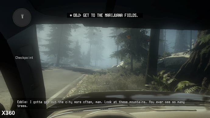
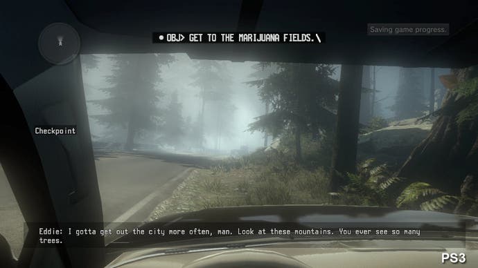
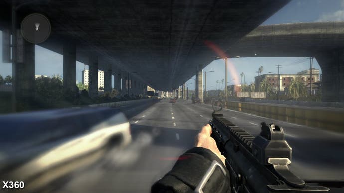
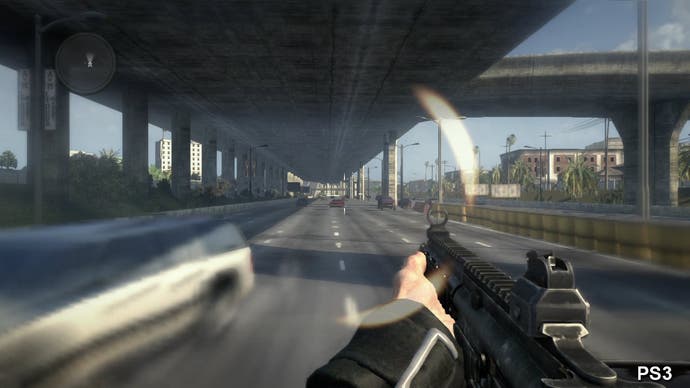
Elsewhere, other differences are relatively minor, such as the shadow penumbras looking a touch smoother on the 360, or the casting of lower precision shadows in many areas on the PS3. However, other elements are much more apparent during play: motion blur for example, is rendered in a lower resolution on the PS3, resulting in some unpleasant pixelisation artifacts. Additionally, the fall-off transitions between the layers of fog are also much harsher too; the 360 version features a smooth blend between layers as elements of the environment become engulfed in the effect.
