The Making of PlayStation 3D
How WipEout HD and MotorStorm gained an extra dimension.
Back in the original presentation for the 3D tech that Digital Foundry attended, WipEout HD was only represented in video form and it was clear that the game's frame-rate was somewhat compromised. However, Super Stardust HD looked similarly cut-down but ran as smooth as silk in the playtest. It turns out that what we saw of WipEout was indeed indicative of the final product. It works, but there is the sense that WipEout HD has lost one of the key factors that made it special.
Benson looks on the brighter side when addressing the advantages of what 3D brings to the table in the Studio Liverpool classic.
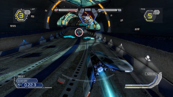
"Immersion: there's a better sense of being part of the world, and that goes for most titles converted to 3D," he says. "But also we found that understanding the flow of the track at distance was a very strong benefit. Often in 2D games you look into the distance and you haven't got enough detail to see where the track is going and 3D gives you that."
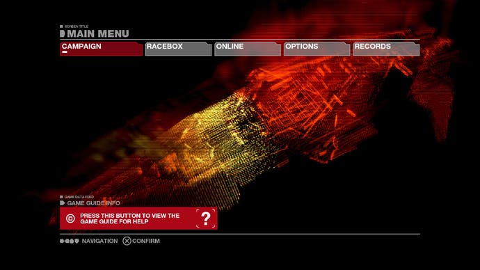
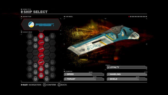
Interestingly WipEout HD posed a challenge to the developers in creating a good-looking 3D user interface.
"When you're immersed into the 3D world, the minute you come back to a UI, it's just 2D and you really notice it. You're wearing the 3D glasses but it's not giving you a payback. You're very conscious of it," Benson explains.
The challenge then takes the form of addressing the interface so it works in 3D space, keeping the player immersed and rewarded.
"Originally we tried that by retrofitting it. We said 'Let's just use the 2D system and insert some depth between some elements.' That didn't really work," Benson continues.
"You end up with some areas that have pseudo-3D effects and things like that, and in some places it breaks down. It's quite tricky to retrofit 3D into a UI. What we did instead was target the background, pushing it back a little, we put something in the background that had some depth and left the rest of the UI elements on the plane of the screen. It looked great and kept you immersed."
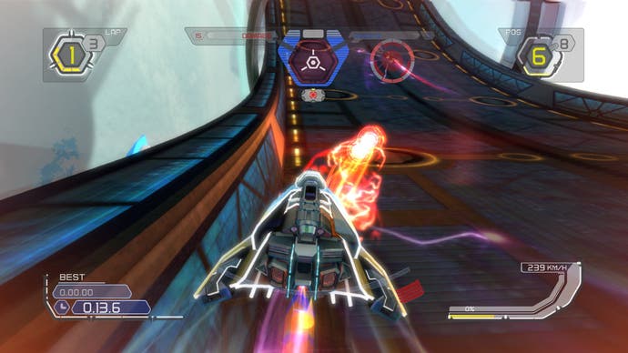
Interestingly the issues raised by integrating the user interface into a full stereoscopic 3D experience also extended just a touch into the game itself.
"With the UI in-game we had the issue of the missile marker," Benson says. "We had the case where the marker was drawn on the plane of the screen but it was locking onto a target in the distance and you couldn't look at the two things at the same time. With that one, pushing the UI element into the scene... push that into the right depth and everything's fine. That was the only UI element we had to change."
Moving onto the next major SCEE 3D conversion, MotorStorm: Pacific Rift, the performance challenge proved to be even steeper than with WipEout HD. The game already ran at the default 720p30, meaning no overhead in pixel-throughput and no compromises possible in the frame-rate. In our original coverage of the 3D reveal, our impression was that the Evolution Studios team had shifted to sub-HD in the manner Ian Bickerstaff suggested earlier on, with the hardware scaling making up the pixel quotient. It looks like we got it right, but the tinkering done was even more extensive.
"First of all we took our split-screen mode... effectively, 3D is very much like making a split-screen game," Benson reveals. "It's two views in one world, so let's just put the two cameras on the one player."
Split-screen modes work by lowering detail levels so the engine can effectively deliver two game instances running simultaneously from the one console. Even with the scaled-back image, it's a big technical challenge and it's the reason why so few games run with split-screen modes in the current console era.
"Our geometry was already fine and we had lower resolution/lower fidelity models that would render at 30Hz for the split-screen mode, so we started with that," Benson continues.
"All we need to do now is find some pixels, so we turned to the hardware upscaling and again tried to squeeze as much as we could from optimisation. But given that the game was already finished, there wasn't much headroom to find there. The compromise of some hardware upscaling and some more optimisation managed to get us to the point where we could get the game working. But the important point was to avoid the frame-tearing."
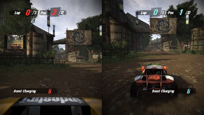
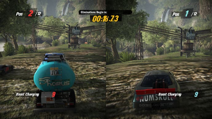
While MotorStorm in 3D may not have all of the visual finery of the traditional game, it turns out that some of the additional effects included in the game are disabled, simply because they are no longer needed.
"In the original game we varied field-of-view a lot to give speed cuing and acceleration cuing to the player," says Benson. "But in the 3D you don't really need that any more - you get it for free. 3D gives you that regardless. So we just made the field of view more natural."
