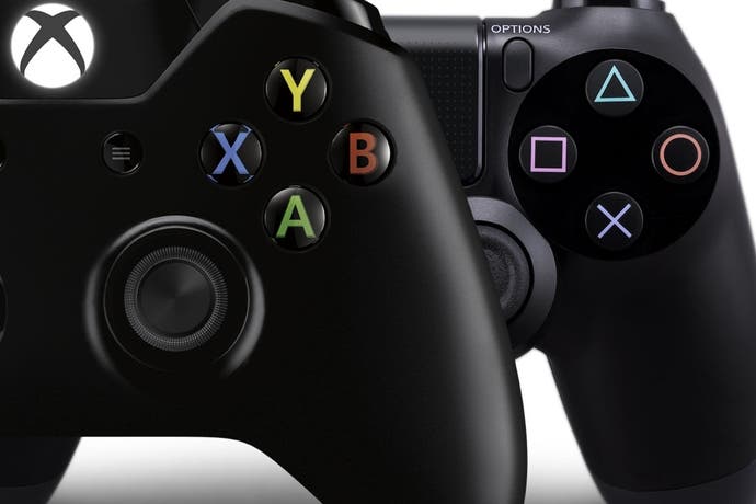
The next-gen joypads: a true evolution?
A game of two controllers. Digital Foundry goes hands-on with the Dual Shock 4 and Xbox One pad.
Are we satisfied with the current-gen controllers? After a generation defined by the most varied sequence of peripherals in decades, taking us from motion-sensitive wands, to infra-red cameras and a conveyor belt of plastic instruments, it's clear that - if done right - innovating your control system paves the way towards some equally innovative games. As the next-generation approaches by carriage of Sony and Microsoft, nailing the finer details of its next-gen gamepads is a crucial foundation for success. This is an unenviable task for their R&D departments, of course: while resisting change leaves both companies prone to falling behind the technical curve, meddling too much with a working formula carries a surefire threat of consumer backlash.
It's a difficult line to toe, especially as we've been using the Dual Shock 3 and Xbox 360 pads for the best part of seven years now, where both are well respected standards. However, it's safe to say there are design quirks for each of these pads which bewilder gamers to this day. Neither is perfect: the curious convex trigger design on Sony's pad still has many gamers resorting to the R1 and L1 shoulder inputs for primary FPS controls. Meanwhile the block d-pad design on the 360 pad remains a thumb-sore for casual fighter fans - despite several minor revisions over the years.
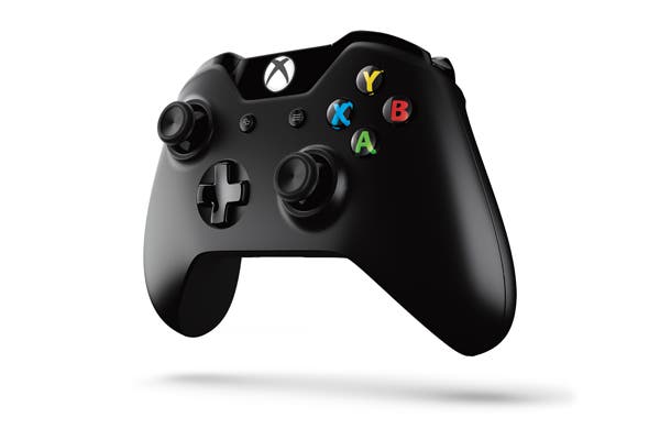
During this year's E3, we spent some quality time with the finalised controllers for both Xbox One and PlayStation 4, each set to form the bedrock of console control for the course of the next generation. Microsoft clearly hasn't taken this precedent lightly, reportedly tossing over 200 prototypes iterations to the side before achieving its final design, amounting to 40 key changes from the 360 pad we already know. Our very first experience with the controller is during a booth demo of Crytek's action title, Ryse, and the fit in our hands is immediately familiar in weight, mould and texture to the 360's. However, prolonged play reveals some very key differences in the way its inputs function.
To start, Microsoft's new analogue sticks are smaller in diameter and shorter in height, with textured rims around their concave indents. Previously we had four rubber spots to guide our thumbs, but this recess creates a closer lock on our digits as we tilt the sticks in circular motions. The down-sizing of these analogues had us worried at first, but control ultimately feels just as tight as before, while the claimed decrease in dead-zone parameters is acutely felt in games like Forza Motorsport 5. This is a measure of how far the stick needs to move before actions start to register on-screen, and the reduced travel definitely helps here for gentler nudges to the car's direction.
"The Xbox One pad is similar in weight, mould and texture to the 360's. However, prolonged play reveals some very key differences in the way its inputs function."
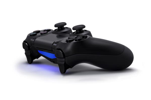
It's a similar scenario for the analogue sticks on Sony's Dual Shock 4. Tightened dead-zones make games like DriveClub eminently easier to control, but the bigger change here is in the friction of the sticks - increased to bring it closer to the pressure needed on the Xbox One's. The old PS3 sticks with their convex grips are often criticised for feeling a little too delicate in travel, and with a purchase that could be lost a little more easily without an indent or groove. This is now squarely put to rights with a dimpled recess to the topsides of each new stick. Overall, it's striking how similar both controllers feel in this department, as if the houses of PlayStation and Xbox both independently honed in on the very same sweet-spot for grip and required pressure.
Looking to the buttons, the Dual Shock 4 boasts a more tightly packed d-pad than usual, using a silkier matte texture that tapers off towards the centre point. It's slippery to the touch which takes some getting used to - to be expected after three generations of using rougher d-pads for quarter-circle motions in fighters. On the right side of the pad, the 8-bit precision analogue face buttons of the last controller are swapped out for digital versions, largely due to their lack of practical use in games, but also to improve communication speeds with the PS4 console. This change in latency isn't appreciable in practise, but the buttons now sink with a more tactile click when our input registers.
As for the Xbox One controller's d-pad, we finally get a long-overdue revision over the current-gen's block design, and there's no looking back. A Nintendo-style cross lays over a gentle inward bend in the pad's mould, with each point depressing in every which way without their edges tapping against the contour. The E3 Killer Instinct demo sadly only has arcade sticks hooked to up it, ruling out a proper litmus test with 2D fighters. However, quick-switching between the offensive and defensive play styles in FIFA 14 by tapping left and right shows fudged, misinterpreted inputs should now be a thing of the past.
Looking northwards on the Xbox pad, its two triggers are cut to a more angular design than before, creating a natural bending point for index fingers wrapping around it. Easier depression on triggers is also a major plus over the very resistive spring-loaded feel of the 360's counterparts. Comparatively, Sony's stock controller gets the bigger overhaul in this area though - the design sports a gentle outwards tilt that catches the bend of each finger, narrowing to a finer point. It's difficult to eulogise the effectiveness of this approach; while not quite a full hook in the style of the rival pad's, it works wonderfully well in securing each finger, and the tension needed to drive it down once again feels equitable to Microsoft's solution.
"Tightened analogue dead-zones make games like DriveClub eminently easier to control, but the bigger change here is in the friction of the sticks - increased to bring it closer to the pressure needed on the Xbox One's."
Both platform holders add extra features to help distinguish two otherwise homogenising standards of control. The "impulse triggers" on the Xbox One are a particularly inspired choice, which have an extra motor linked directly to each shoulder button. While there are no FPSs on the show floor to bear this out, games like Forza Motorsport 5 are well optimised for it, sending a bizarre mixture of vibrations - both bass and treble, if you will - simultaneously to your palms and fingertips as acceleration is modulated. The effect is electrifying, but with four motors firing off at once you'd be forgiven for thinking battery life may suffer as a result. Some of these concerns are allayed by promises that the controller features a low-power battery mode, turning off parts of the controller - rumble included - when the controller is idle, and without the need to constantly re-sync.
Sony's gamepad also has some tricks up its sleeve. At the Dual Shock 4's centre is a capacitative dual point touchpad, lodged between the mono speaker and home button below, plus the share and options buttons to either side. Helpfully, these two function buttons are placed closer to the natural arc of your thumbs during grip - though we don't get the use of any of Sony's touted community features during E3 demos. The light bar on top is also scarcely used during E3 demos, but for multiplayer its colour-coding works as an effective alternative to the LED indicators on our current wireless Dual Shock 3s.
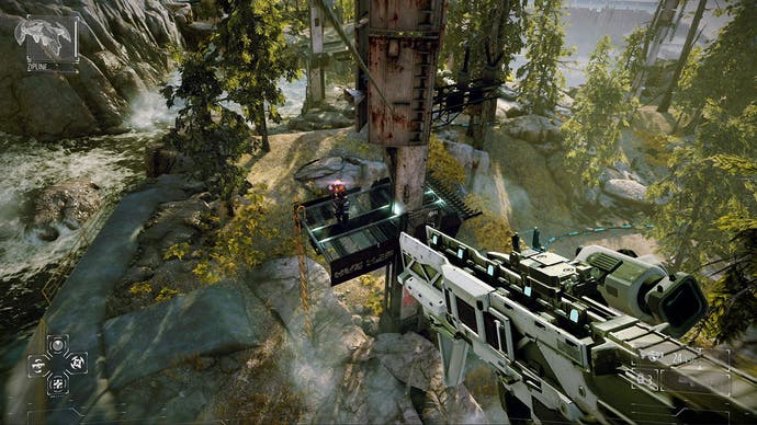
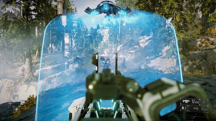
The touch interface is unique, and presents a more nuanced way to interact with game worlds. It's clickable like a regular laptop mouse pad, and even light touches to its surface are quick in response - in theory, an RTS game based around pinch-to-zoom and panning gestures could find a comfortable home on the platform in future. Even so, the most effective use for these controls in games available so far involves swiping in cardinal directions to activate hot-keyed moves in Warframe and Killzone: Shadowfall. Unlike the gyrometer controls also packed into the device, this input is an unknown quantity in the console space, and so we'll have to see what unfolds.
"The most effective use for the Dual Shock's touchpad so far involves swiping in cardinal directions to activate hot-keyed moves in Warframe and Killzone: Shadowfall."


Dual Shock 4 and the Xbox One controller: the preliminary verdict
All in all, both Microsoft and Sony have clearly taken note of the shortfalls in their current-gen controllers and make amends without over-stepping the mark - inevitably arriving at a similar middle-point in ergonomic design. Microsoft is no stranger to the process of evolving its pad design with every generation, going from the mighty Duke on the original Xbox, to a minimised S version which formed a basis for the more streamlined 360 pad. The Xbox One continues that tradition of refinement with gentle tweaks across the board - plus the addition of rumble features which make a surprising difference - though the result is one that should be warmly familiar to existing Xbox fans.
Meanwhile, Sony's DualShock 4 shows a more radical departure from the Dual Shock form factor it's held onto for the last three generations. With the revelation that neither the PlayStation 4 or Xbox One offer compatibility for current-gen pads, it's just as well that these new controllers bring enough incremental tweaks to every facet of their designs, each adding up to a broader sense of overall improvement than we'd expected going in. Certainly, controller comfort will always be a strict matter of personal taste, but between the two, the balance between conservation and evolution has been judged with care.
