Face-Off: Ninja Gaiden 2 vs. Sigma 2
One game. Two platform exclusives. Which is better?
Scenes with additional overdraw due to alpha effects such as explosions, also blatantly remove polygons in the Sigma edition in order to maintain frame-rate. This particular example shown below exemplifies how dramatic that impact can be in terms of the make-up of the overall scene.
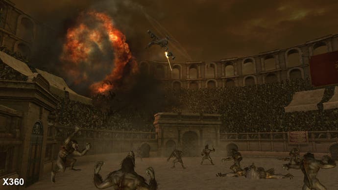
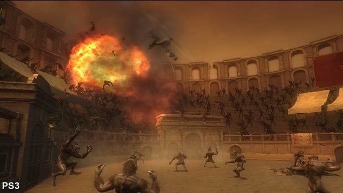
Another unique architectural feature is Xbox 360's unified shader set-up - a "next generation" GPU feature at the time of launch, and not found in the RSX, even though PS3 was released a year later. In general, unified shaders are a great thing - they allow developers to use all the available GPU shader power for whatever task they want. However, there is by no means an infinite amount of resources available here.
Ninja Gaiden 2's extremely heavy use of vertex shaders means that there are less available pixel shaders to hand in the unified setup (another reason perhaps why the game is sub-HD on 360). While RSX might not be as flexible as Xenos in overall structure, the reserved pixel shaders have been put to good use by Team Ninja. In the shots below (and in the bonus ones found in the gallery), the Sigma edition shows a lot more detail, with added bumps on just about every corner.
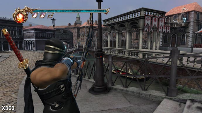
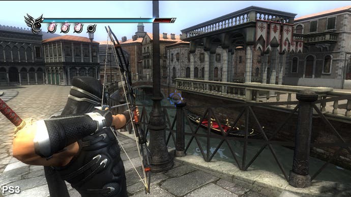

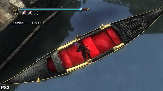
The real bonus for PS3 owners comes in the form of palpably more impressive-looking lighting, as you can see by checking out the full gallery. By comparison, the Xbox 360 game looks a little flat in many scenes. The Sigma version's excellent use of pixel shaders produces more effective lighting and highlights, making the overall look that much more attractive.
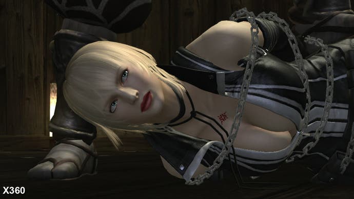
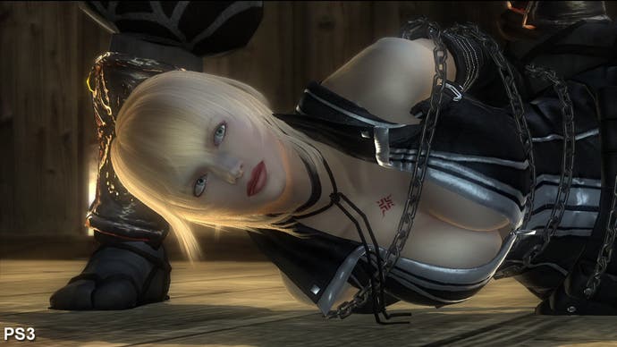
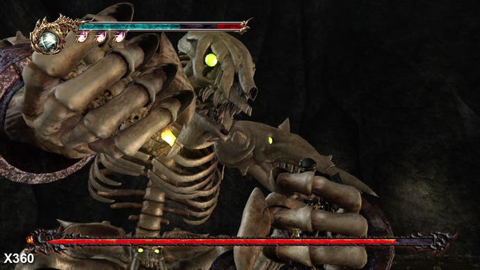
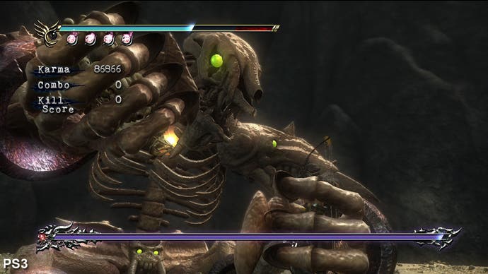
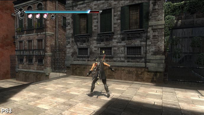
Also interesting to note is that the Xbox 360 version of Ninja Gaiden 2 effectively has static lighting, whether you're in the shade or not. Compare and contrast with the PS3 version...
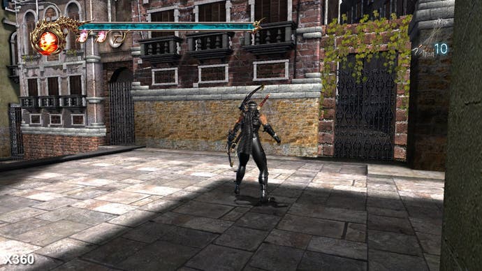
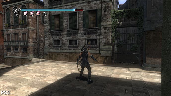
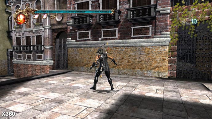
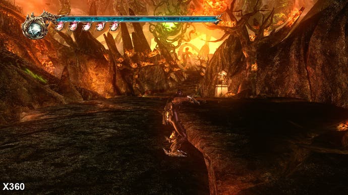
Perhaps the only area in which 360 comes out better overall in terms of lighting is in the use of bloom - the fiery mountain level in particular benefits. However, that said, the Sigma team used bloom in a more subtle and dynamic manner on PS3, as can be seen via more examples in the gallery.
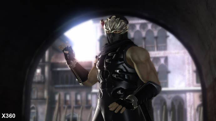
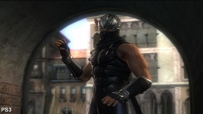
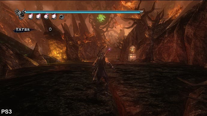
The pixel shader difference extends to the use of wet materials in-game, and despite the lower detail level, the Xbox 360 version doesn't hold back. In the cave level, Xenos's point-filtering in combination with the wet shader produces one of the most visually impressive levels in Ninja Gaiden 2 (to clarify, point-filtering is a pretty cheap form of texture filtering on Xenos... however, the shimmering artefacts it produces simply work well in this setting). In comparison, the PS3 looks less polished with less shader detailing and lower levels of geometry.
