Dr Mario World is lovely, but it can't find a cure for mobile gaming's business model
Infected.
Dr Mario World, which releases later this week, perfectly sums up Nintendo's compromised adventure in smartphone gaming. It's a supremely polished, easy-to-enjoy game that meets the Kyoto company's famously high quality bar. It takes one of Nintendo's classic games - a block-matching puzzler that dates back to a 1990 Nintendo Entertainment System original - and reworks it for touchscreens with imagination and care. And for its business model, it resignedly copies what everyone else does, at a cost to the design and balance of the game that has been minimised, but is still there.
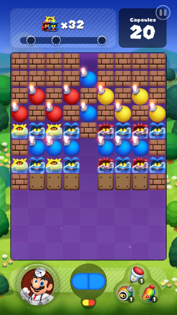
In Dr Mario, the goal is to clear the screen of "viruses" by matching them with blocks of the same colour, in the form of the coloured pill capsules that are sent into play. It's a perfect fit for the platform ruled by Candy Crush, of course, but Nintendo and its co-developer NHN haven't been lazy in reimagining it for phones. In fact, they've literally turned the game on its head. In classic Dr Mario, capsules rain down from the top of the field, Tetris-style, but in Dr Mario World they float up from the bottom, the better to be positioned with a pleasing sweep of the thumb. Control feel comes first and dictates design: classic Nintendo.

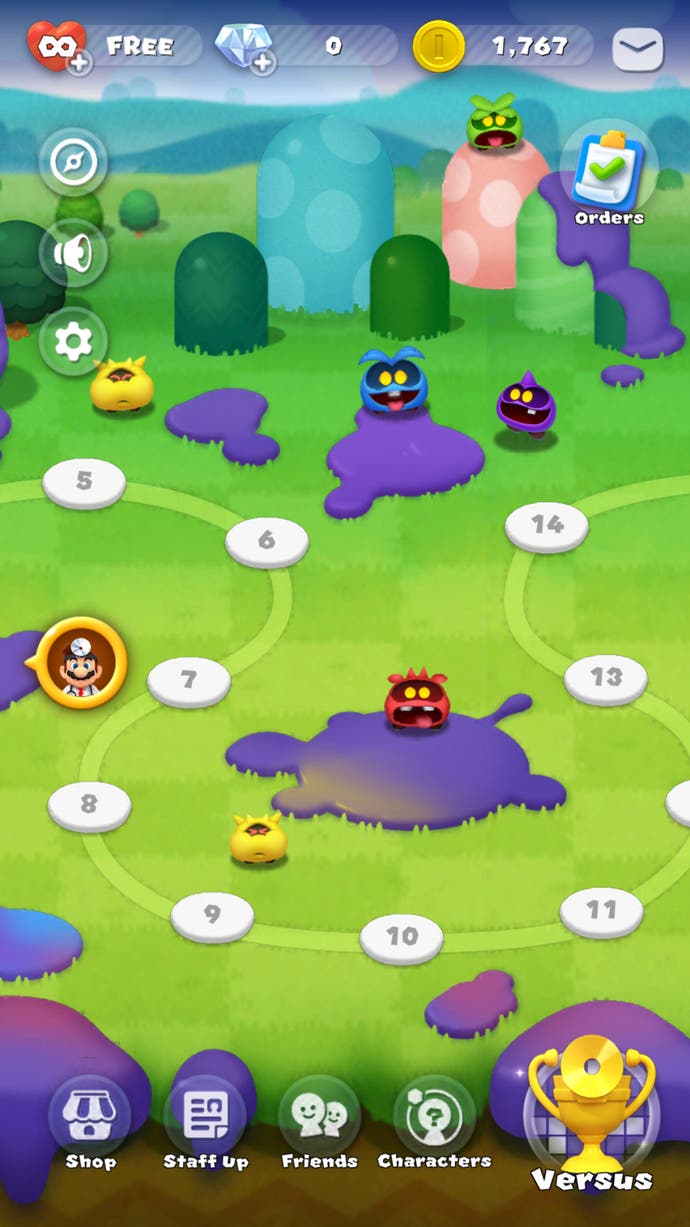
What's more, while the original game sets a relentless pace, World's puzzle stages allow you to pause and ponder, making your next move only when you're ready. (Timed challenge stages and the frantic, fun multiplayer are a different matter.) You're limited not by your reactions or by a ticking clock, but by the complexity of the puzzle and the number of capsules you have to solve it. Even the order of the capsules has not been left entirely to chance. This is a very intentional, designed game, and it's a pleasure to puzzle out the most efficient solutions to each stage. There's a lot of it, too: five worlds of 40 stages each, with more to come.
Pure and simple it isn't, though. This being a modern mobile game, there are characters to collect - doctors, like Mario, Peach, Luigi and even Bowser, and assistants, like Piranha Plants and Goombas - who come in blind randomised packs. Doctors have skills that charge up over time, while assistants (you can equip two) confer a passive buff, like a score boost or a chance to spawn a line-clearing shell. Get the same character more than once and you'll increase its character level.
These vintage Nintendo characters are fun to collect in their own right - look at Bowser in his cute white coat, or the insouciant way Peach wears her stethoscope! - but of course, this being a modern mobile game, there is a cumbersome, grindy metagame behind them. You buy blind character packs with coins earned by playing or with diamonds, bought with real money. Either way, the cost is steep: with coins, you'll only be adding a new character every couple of days, whereas the 40 diamonds it takes for a single roll of the dice at the staffing desk has a base price of almost £4.

It's classic free-to-play mobile game monetisation, hovering in a hazy grey area between egregious and pointless. New characters only add incremental bonuses, and Dr Mario World isn't really a numbers game anyway, being more about forward planning and careful reading of the game board, so you don't need to worry about them too much. But they give you that nagging sense of missing something, an acquisitional impulse that is only vaguely related to the game you're playing. There's an energy system too, of course; it costs a heart to play a stage, hearts replenish over time, you can buy more. Since you get a free heart for clearing a stage, you'll rarely bump up against the limits of it and it feels fair, as these things go.
Arguably worse are the boosts you can buy blind with coins, or with diamonds if you're after something specific. These are mostly harmless, but the items that extend the number of capsules you have to solve a stage or the time limit in the rather tough challenge stages can only ever be a cheat. They put the designers in a bind, too, because they can't challenge the player in a fair, consistent environment; if they make the level hard, it will always feel like they're pushing you to a purchase.
This is the established reality of mobile gaming, and I suppose it's only fair that, after the glorious failed experiment of Super Mario Run, Nintendo stopped pretending that it could change that. And of course, every way of commercialising games inevitably influences their design in some way. It is so very un-Nintendo, though, to allow the rock-solid foundation of the design to be chipped away at, the player's trust to be eroded, to introduce even the vaguest doubt about its parameters or fairness. As careful as Nintendo and NHN have been, there's no way you can apply this business model to a game as thoughtfully put together as Dr Mario World and not do that.
None of which should necessarily put you off. This is a classy, fun, clever puzzle game, beautifully adapted for phones. Play it - it's free, why wouldn't you? But it will leave you wishing that it didn't always have to be this way.

