Edna & Harvey: The Breakout
Out of its mind.
I'm in two minds. Which means I fit in well with the world of Edna & Harvey. An adult woman and the toy rabbit she talks to are trapped in a padded cell, with little idea why they're there. And as the title suggests, it's all about trying to break out.
Naturally, this sets you up for a classic style of point-and-click puzzling adventure: trapped in an ever-growing series of locations, surrounded by peculiar characters and collecting every object you can find with the intent to click them on every other object you can find.
In many ways, Edna & Harvey not only revels in the classic LucasArts games, but more importantly, also understands them. And in many other ways, it's a clusterplop.
Edna Bricht Aus, as it was named in its original German form, manages to be at once entertaining and frustrating, funny and bemusing, well written and incoherent gobbledygook. At every point where I thought, "You know, this might actually be quite good," five minutes later I was inevitably thinking, "This deserves to be torn apart by rabid wolves."
On the most basic level, it's a terrible piece of software. There's no option to adjust the miniscule screen resolution, and no option for a windowed mode. Task-switching led to some spectacular crashes of my graphics card. Saving and loading causes the game to freeze for a troubling amount of time, and it's glitchy all over the place, with twitchy graphics and characters walking through scenery. Most seriously, mouse clicks only work about 50 per cent of the time. Which is, obviously, infuriating.

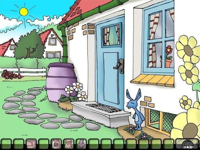
On top of all that, while it's proudly a 2D cartoon adventure (something we could do with seeing a lot more of), it's a tacky one. Edna & Harvey began life as a university project and the final product never shakes off its amateurish design. The characters look like the doodles that one kid in your class who could sort of draw would do of the teachers, which you thought were incredible at the age of 11, until you realised he'd copied them all out of the Usborne Guide To Cartoons (Alex Garside – yeah, I'm calling you out.)
But something about it survives all that. Which means there must be something pretty decent going on in there, too.
It's not the interface, that's for sure. Incredibly – and, the game's site boasts, deliberately – it goes back to the pre-1994 SCUMM-style interface, where you click on verb buttons at the bottom of the screen and then click on the item to which it applies. Except it manages to do a worse job that LucasArts' ancient menus, lacking even keyboard shortcuts for those who don't want to click four times to ensure it selects "Use" before it loses that when it doesn't click on whatever comes next. There's no option to scroll through mouse cursors, so you're stuck with a degraded retrograded setup, laboriously sweeping the cursor all over the place.
Nor is it the localisation, which is painfully close to decent – meaning that, while it's mostly intelligible, you more often interpret what the characters meant to say rather than just hear it. Jokes tend to lose their edge when put through that mangle.

