EG techs explain new gamepages
Access things with greater ease! Ahem.
Hi folks! Often when we alter the site in some fundamental fashion, you, our beloved readers and users, have queries about what we were trying to achieve, such as "What the bloody hell have you done you stupid morons?" and "Do you even understand how to walk? How do you not fall over and axe-murder yourself with your legs whenever you exhale?" So it's high time we started blogging about the things we do, starting with our next site update, the new gamepages, which go live today.

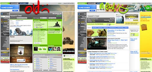
The old gamepages had grown out of date. There wasn't enough content at the top of the screen, so you were having to scroll down past a huge community data block and advert to get to a list of content before you saw more than a single article entry. Even when you finally got to the content, it appeared as overwhelming lists, which often set fire to nearby pets and small children. Gamepages also suffered either from having too much information or not enough. When there was very little content, the page was almost useless, but when there was too much, the page would stretch off into the distance uselessly.
Our solution involves breaking content down into more easily digestible blocks, and highlighting the freshest or most important content. We then keep archives of all the other content available in tabbed category pages. The benefit with this kind of solution is obvious: the most relevant content is smack-bang in front of you, but you can also dig deeper if you choose. The editorial team also has a degree of control over what appears on this summary page, allowing them to create a far more comprehensive home for that game within Eurogamer.
We've also integrated the actual community tools (game collections and ratings) into a community toolbar, and moved the rest of the data to an "Opinion" tab. The thinking behind this was that while often interesting, community statistics are unlikely to be something that people searching for information on a particular game want to see right away. Coupled these changes with other niceties like proper news and article archive tabs, and a full EGTV video archive that can be previewed in-page, and overall we feel it's a suitable evolution for what's previously been an overlooked and underused area of the site. Hopefully once you've had a bit of a play and explore, you'll agree. Let us know what you think in the comments.

