Celebrate the different design eras of Eurogamer with our theme switcher!
Explore Eurogamer designs through the ages.
When was the first time you visited Eurogamer? Do you remember what it looked like?
In the 25 years that Eurogamer has existed, it has had at least six major design revisions. Thanks to archive.org's wonderful Wayback Machine we can perform digital archeology and revisit those designs to see what was trendy in web design at the time - whether it be 11-point Verdana in the late 90s, rounded corners in the early aughts, or Proxima Nova becoming fashionable in the early twenty-teens.
But... what if we could go one step further - and instead of looking at frozen examples from the past - enjoy any Eurogamer article using a working version of our older designs?
To celebrate Eurogamer's 25th anniversary, that's exactly what we've done!
If you are using the desktop version of the site you'll notice at the top of the page a theme switcher, which allows you to experience Eurogamer articles as they looked at various points in history.
Want to get a sense of how the site looked and felt in the very first days of the site? Switch to version one. Want to experience a lighter, more colourful (and the actual best) version of Eurogamer? Switch to version three!
For those of you that dabble in web development and are curious about what's going on under the hood, here's a quick explanation. We've taken inspiration from the "CSS Zen Garden" and have produced different CSS themes that restyle the site. None of the HTML changes between versions - which was a limitation we had to get creative about when recreating some of the old layouts! - and we've used a few neat little tricks like img::content to change the logos without touching any of the markup.
We've tried to recreate all of the designs as closely as we can. They may not be pixel-perfect, but they give a sense of the style that was in use at the time. And seeing as the majority of these designs predate modern smartphones you will notice a lack of mobile support! (Anyone remember the WAP version of Eurogamer?!)
Huge thanks to Erin Young for leading the implementation, as well as the rest of our product and engineering team for testing, feedback, and support.
As for how and when the different designs all came about, here is my rough Eurogamer design timeline.
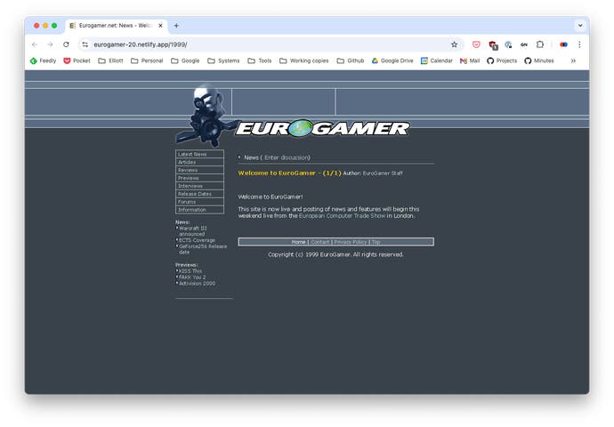
Version one - 1999-2000
The first version of the site implemented dark mode before it was cool.
At the time 800x600 monitors were common, and only core web fonts were available, so Verdana was the font of choice. Slate blues and yellows provide a nice contrasting palette. Note the italicised logo, and accompanying artwork from Unreal Tournament. A beautiful start.
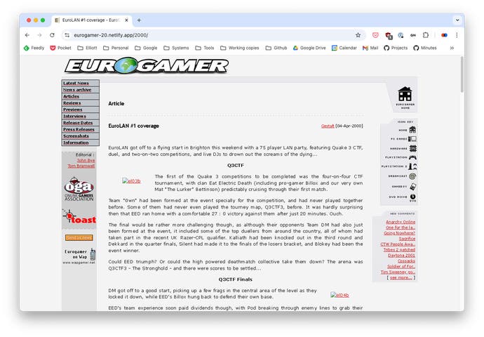
Version two - 2000-2003
What's black, white, and red all over? Eurogamer's second design.
It's not my favourite - I'm getting from it a slightly serious, newspaper-ish vibe, but the pixel-art icons on the right gives the site a certain charm. From memory this version had colour-coded headers depending on the content type or platform the article was about? I am glad the use of "Trebuchet MS" as a headline font was short-lived.
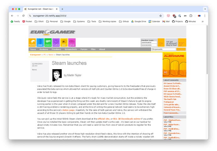
Version three - 2003-2005
The best looking version of Eurogamer. I love it.
Look at that tasteful use of Arial with tight letter spacing for headers. The double colons in the breadcrumbs. The classy greys and oranges. The expertly designed pixel art. The chunky primary navigation. Absolutely gorgeous. Fondly referred to internally as the "puddle of wee" version due to the weird yellow shadow that sits below the globe in the logo.
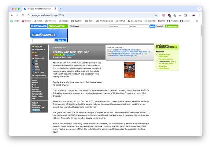
Version four - 2005-2011
A very stable period in terms of design changes - this version was around for six years, which is a long time in internet years. This is the version of the site that a lot of the current Eurogamer team first worked on - myself included.
In this era rounded corners were all the rage - but the border-radius CSS property wasn't widely supported, so lots of the little rounded corners were manually created using little spacer images which was fiddly to implement. This design uses my favourite variation of Eurogamer blue - hex code #0069F4. And note the sidebar promoting "Eurogamers" - our attempt at a social network for gamers.
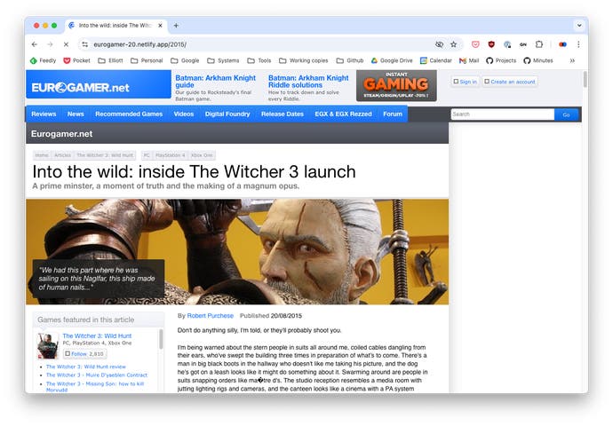
Version five - 2011-2018
This design really had a lot going for it.
Full of small details that are easy to miss like textured backgrounds, double-edged borders, and inset shadows. Critics might say maybe a little visually unstructured and noisy? The widest version of the site yet - 1280 pixels! - due to the average monitor size getting bigger.. It also introduced the use of Proxima Nova as our main font - a choice that was very on-trend in this era of web design.
Version six - 2018-Present
Modern day Eurogamer, and what you're looking at today. It debuted in 2018, and now six years old - and probably due for an update!
This version is more visually austere and less textured than previous versions of the site. Designed to be a bit more serious and mature - I remember us discussing ideas like "wot if The Guardian, but games" when working on it. Built to make it easier to maintain the site across mobile and desktop versions, it uses Gibson as its typeface. In this version the Eurogamer blue was slightly darkened to help with colour contrast levels.
It has been our absolute pleasure to revisit and recreate the old versions of Eurogamer - and I personally can't wait to see what other designs we'll be able to revisit in another 25 years time.
Thanks to anyone and everyone that's been involved in Eurogamer's various design over the years. In no particular order: Mark Kennedy, Martin Taylor, Karl Cox, Lucy Grimwood, Jacob Jones, Sam Hayes, Erin Young, Chris Ward - and countless more.
Give our theme switcher a go - and tell us in the comments which is your favourite design and why!

