Enemy Territory: Quake Wars
Breaking out on consoles.
"Quake Wars sets out to provide a totally different experience, and does so very well - with a set of well-designed, expansive levels and great vehicles being the stand-out factors." That's what some handsome fool wrote about Enemy Territory: Quake Wars on PC back in September. We liked most of it, but the combat lacked the punchiness we'd hoped for in a Quake game, and we weren't fond of the steep climb up the learning curve.
The mathematically-minded among you will note that this was almost six months ago - time enough for Nerve and Activision Underground, developing the Xbox 360 and PS3 versions of the game respectively, to weave a little magic over the console versions. The timescale alone raises hopes that this won't just be a straight port with strapped-on joypad controls, so we're certainly watching closely as Nerve designer Greg Stone walks and talks us through the Xbox 360 version - under the watchful eye of id Software's business development guy Steve Nix.
The earth moves

What's immediately apparent is that although the heart of the game - its maps, weapons, classes and vehicles - remains intact, the console version is indeed different. "We made a decent amount of changes," Stone tells us. "Mostly just little tweaks, but a lot of tweaks, actually. They were fairly minor, but they added up." Nerve, a long-time id Software collaborator who worked with British studio Splash Damage on several of the maps for Quake Wars, was a natural choice for the 360 version, and seems to have been given an open hand in how it approached the changes needed in the transition.
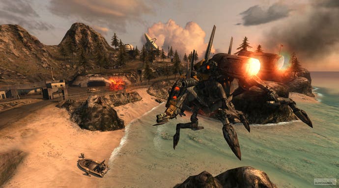
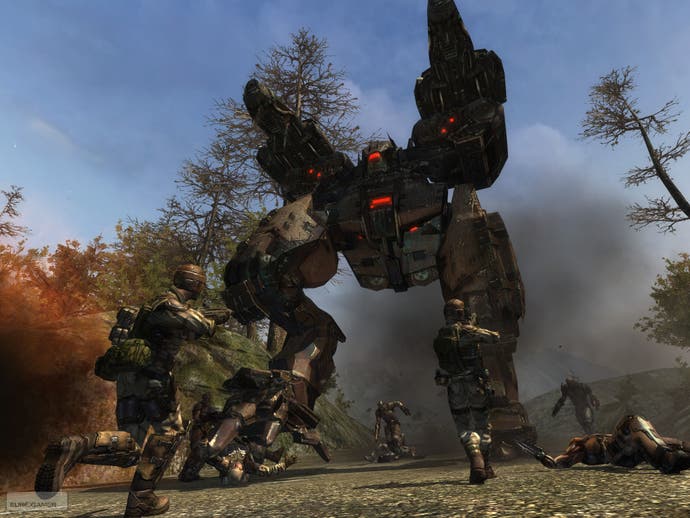
Enemy Territory: Quake Wars, for those too lazy to go back and read the original review, is a multiplayer, team-oriented, objective-based first person shooter. The two sides (humans with fairly conventional modern-day weapons, and biomechanical alien Strogg with more sci-fi weaponry) must either complete a set of objectives, or prevent their completion, depending on their role on the specific map. Along the way, they have five character classes to choose from apiece, each time they respawn, and can also use both aerial and ground-based vehicles and deploy items like turrets to assist in the battle.

None of those things have changed in the console versions, which support a healthy 16 players online - with surprisingly intelligent AI bots filling up any gaps on either team. You can also play offline. There's no single-player mode, as such, but you can run through the game's various three-map campaigns with 15 bots, which at least gives you something to do when your friends list is mysteriously devoid of life.
So what has changed? The user interface has had a complete overhaul, partially in order to facilitate the change from mouse input to joypad input, but also to streamline the whole process of choosing classes, weapons and so on. The HUD, too, has had a rethink - it's far less complex than the PC version's display. "We really wanted to boil it down to the essentials, to communicate the most information while using the least amount of screen," explains Stone. Less obvious, but much more important, are the subtler tweaks. For instance, when you walk up to an objective you no longer have to flick through your inventory (you cycle through tools with the left bumper, and weapons with the right bumper) to find the right item to activate that objective. Instead you just hold down the X button, and a dial fills up until the objective is complete. After all, if you've chosen the right class to finish the objective, why should you have to mess around finding the right tool?


