Five of the best: Buttons
Click.
Five of the Best is a weekly series about the bits of games we overlook, those poor old things. I'm talking about crowds, potions, mountains, hands - things we barely notice at the time but can recall years later because they're so important to the overall memory of the game.
Now is the time to celebrate them - you and me both! I will share my memories but I'm just as eager to hear yours, so please share them in the comments below. We've had some great discussions in our other Five of the Best pieces.
But this week we're all about...
Buttons! Where would we be without them? It's easy to forget that not too long ago the video game industry waged a war against the things with the short-lived age of motion control, but the buttons rose up and conquered. Buttons will not be subjugated.
So let's celebrate some of the best of these things; these little pieces of plastic that act as a tactile portal into countless virtual worlds, that are pushed into action to shoot, to jump, to talk and so much more. They're ubiquitous, and it's hard to imagine gaming without them, from a well-worn left mouse button to a creaky old analogue trigger. Buttons! Here's five of the best.
The GameCube's big green A
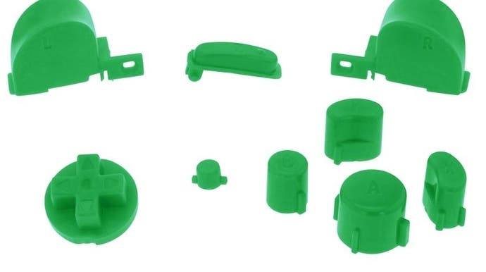
There is so much to love about the GameCube controller - particularly if you spent extra and got the Pumpkin Spice variant. But perhaps the best thing for me is that the face buttons have broken free of their neatly ordered spaces, and assumed strange shapes and positions so that it almost feels like there's a little solar system of pressable doodads on one half of the pad.

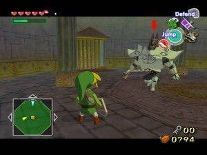
And at the centre of the solar system is the Big Green A. What a beautiful thing. To press a button like this is surely to do something of real consequence? I remember it shimmering and flashing on the screen in The Wind-Waker, keeping me out of danger. I remember jabbing at it in Billy Hatcher. I remember just staring at it when the machine was turned off because it had such charisma, such gravity!
One of the sad things that has happened over the last few years - sad might be pushing it somewhat - is that the face buttons have sort of fallen out of favour. All the big stuff seems to be going on with the triggers. But back in the GameCube era, those face buttons were so dominant that one of them got really really big. Let's hear it for the Big Green A!
The space bar
For a mild sort of person, I have broken a lot of keyboards over the years. Weirdly it's always the space bar that goes. The space bar! What a beautiful thing, and how useful for games, whether it's pausing the action, committing you to a decision or just paging through text.
Let us get real for a second. The space bar is not like the other buttons. It's so long and ungainly and it has what feels like a sort of Wild West Saloon bounce to it. There is a honky-tonk springiness in there, perhaps because on some keyboards it is affixed at both sides but not in the middle.
This means there is something dashing, something roguish about firing off this jalopy of a button. Do it now! Give it a go! Give yourself some space!
The Super Nintendo's eject button

Probably the most abused of all buttons, at least in my own personal experience, the SNES's eject button was a fine thing. Oversized, convex and placed front and centre of the console, it screams out 'HIT ME'. Screw the fact that doing so means the game you're playing is forcibly removed from the SNES.
It also plays into the SNES' secret mini-game. Everyone knows that the Master System had one of the all-time great easter eggs with its snail game built into every console, but did you know the SNES has one too? Smash that eject button as hard as you can and see how high you can make that cartridge fly - it's a mini-game that kept me and friends rapt for hours.
The Vita's floating triggers
What a marvel the Vita was! How noble in reason, how infinite in faculty! And what's with that touchpad on the back of the unit?
Yet for me, the best thing about this wonderful machine was also the weirdest. Those perspex triggers that seemed to float. How were they attached? What were they up to? What could this all mean?
There is a little mystery to all buttons, just because there is a mystery to a glimpse of the ocean. It's because, right, you're only seeing the top of it. What happens beneath the button's surface? Who knows! Who knows? The magical thing about buttons is your proximity to mystery, I would argue. You know the top so well, you know the surface! But beneath that, so close, is a world that should remain hidden.
So how are the floating triggers attached? No idea. Why do they feel so wonderfully spongy? No idea. Who thought this was necessary? No idea. But I love them all the more for being so strange.
The L3 button

Just as we might celebrate the Vita for its many options, let's not forget what it omitted. The L3 button is so beautifully subtle that it's easy to forget it's there at all. Until it isn't, and then you realise how integral it is to so many modern games.
The Vita was precursor of sorts to the Switch if you ever were bold enough to experiment with remote play, streaming PS4 games to the handheld with relative ease. If you thought playing Diablo 3 on portable with the Switch was impressive, let me tell you us Vita veterans were doing that years ago thanks to this frequently overlooked feature.
But remote play exposed one of the Vita's key weaknesses - the lack of an L3 button meant most first-person shooters were almost unplayable, and it only hammered home the importance of an almost invisible button the first DualShock introduced. It's hard to imagine modern gaming without it.


