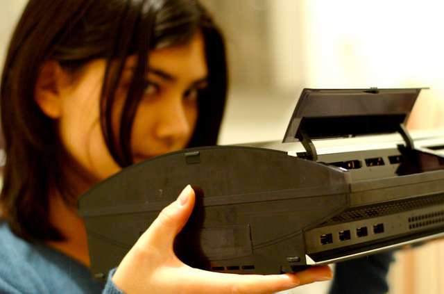
PlayStation 3: First Look
We've got one. S'quite nice, actually.
The wait is over! Actually, let's rephrase: elements of the wait are over! For example, we've got a PlayStation 3. Yes it's quite nice thanks. But what we've actually got is a 'debug' unit, which, while it looks exactly like the 500,000 final units Sony will be shipping out to US and Japanese retailers next month, is designed to let us play unfinished preview code, and at the moment lacks a number of key interface features. Sony would want us to be very specific about that. Otherwise that's what their phone call in half an hour is going to be about.
Arriving in a nondescript cardboard box yesterday, our bundle consists of a PlayStation 3 console (stamped with a hefty "prototype!" sticker on the back), one of the wireless Sixaxis pads, a few cables, and copies of some games in development, including launch titles Resistance: Fall of Man and Genji: Days of the Blade, and Evolution Studios' racing title MotorStorm.
Gawping at the unit
Immediately imposing, very shiny and quite heavy, the consensus first-impression of the PS3 unit is that it looks like an expensive piece of multimedia equipment ought to look, and with respect to our friend the Xbox 360, the comparison is unflattering on Microsoft's toddler; the slick, curved, reflective front of the PS3, with that Spider-Man-font logo, beams at anybody standing next to it, while the silver gleam of the slot-loading Blu-ray disc drive stands out in amongst refined features on the front bezel, including the familiar swivellable little 'PS' logo, and new, touch-sensitive power and eject buttons, located on a sort of glossy mantle beneath the Blu-ray entry point. Interestingly, when illuminated from behind, there's a sort of translucency that's not apparent when it's under the gaze of a strong light source. It's weird and sort of ghoulish. The chunky aesthetics of old are completely gone; this would look at home next to high-end hi-fi equipment or a ludicrously expensive flat-screen television - and that seems to have been the point.

Sticking with the exterior for a bit, and moving down toward where the PS2's controller ports and old-days USB slots used to be, we find four USB 2.0 ports in a column, while above the dividing shelf there's a flap that folds neatly up and sticks in place, revealing slots for Compact Flash and SD cards and, of course, Sony Memory Sticks. The front of the console also sports a couple of LEDs - one for Wi-Fi, since ours is a premium unit, and one for hard disk activity.
Flipping the console over (gently now), the base features the hard disk slot, where the 60GB drive resides, while the reverse is home to the hard on/off power switch, a slot for the PC-style kettle power lead, and video outputs for HDMI, the PS2's traditional Multi-AV-out (we've used existing component and composite cables with no problems), and an optical audio output.
Joy at the pad
So then to the wireless Sixaxis pad, which is extremely light, but doesn't feel flimsy - just a bit weightless. We're not sure what all the "it's too light" fuss is about, actually - at what stage does a pad's lack of mass have a negative effect? And surely if you're trying to play tilt games the lightness is going to be beneficial - I wouldn't have fancied playing a tilt-sensor game with the original Xbox pad. Anyway, for the record, it's a bit lighter than the Dual Shock, much lighter than the Xbox 360 pad, and heavier than a Wii remote. It's solidly constructed, which is surely the important bit.

Many elements - directional pad, analogue sticks, start/select buttons and face buttons - line up much as they used to, although close examination reveals that the plastic base of the d-pad and face buttons is actually slightly translucent. The main aesthetic difference, though, is the inclusion of a 'PS' button in the centre, similar to Microsoft's Xbox 360 'Guide' button, which allows you to turn on the console by tapping it briefly. Press and hold it during a game and it loads a menu that shows you the pad's charge-level (still perfect after several hours of play, incidentally), allows you to quit out of the game, reassign controller points, or turn the pad or the system off completely.
A quick side by side with our old pal the Dual Shock reveals slightly thinner analogue stick trunks, while the reverse of the Sixaxis is flat, rather than indented by the analogue barrels. It's really on the roof of the pad that things change. First of all there's a little row of indicator lights, which show you your player number 1-4 (PS3 supports seven Bluetooth pads at once), along with a little USB connector port for charging, with what looks like a three-metre cable supplied.
Also up top, we find the rejigged shoulder buttons. L1 and R1 appear unchanged, but the L2 and R2 buttons are now hinged triggers much like the 360's, but smaller. They may take some getting used to, and fingers can slip from them when they're hammered, but developers will doubtless adapt - there were similar concerns about the 360's arrangement of bumpers and triggers, I seem to remember. As we'll hear a bit later, using them for analogue acceleration in MotorStorm isn't the least bit awkward, while Resistance uses R1 to fire, which is equally reasonable.
Anyway, let's turn it on.

