How Unpacking's art combines beauty with clarity
What is a mug?
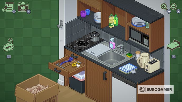
It was a pair of nail clippers that got me. In a game about seeing a person's life through unpacked items, there's so much that can strike you. Those clippers came out of a box in the bathroom, and I chucked them in a junk drawer alongside some perfume, a shaving razor, and a couple of hairbrushes.
What surprised me was just how clear the clippers looked - how clear everything looked. It's vital to the game that this bundle of pixels needs to be recognisable as nail clippers at a single glance. The way the pixel art stays out of the way of the world the story builds and manages to look wonderful made Unpacking such a success.
So, how did this mix of aesthetics and realism come about? I was lucky enough to speak to Angus Doolan, the lead pixel artist on Unpacking. He lives in Brisbane, Australia. And he tells me it all started with a mug.
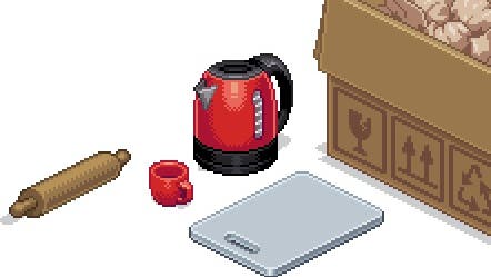
Initially, creative director Wren Brier had created a simple mug. The entire scale of the game is based on how small she could make the mug. It's played on a grid after all - one item can only go in one square.
"The art style is designed so that you can represent a mug, so what happens if I need to draw something that's smaller than a mug handle?"
For Doolan, this meant that things like the nail clippers had to be designed in an abstract way.
"If you really look at the nail clippers, they're absolutely giant, and very short. Not the same dimensions as real clippers," he tells me. There was a double challenge in Unpacking - the team had to make the items look like real, recognisable objects whilst also being functional as a block in that grid structure.
"The first thing is representationally deciding, what is a mug?" Doolan says. "What did people recognise as a mug - basically a cylinder with a hole in the middle, and the handle. Having a mug with no handle might require you to put in context for people. The less it looks like the thing they must recognise as the more you have to infer what it is through other methods.
"If you pull out a mug with a handle, you'll easily recognise it as a mug," he continues. "Then you pull out another mug that doesn't have a handle, you're gonna realise that it's also a mug. So the process is, just thinking about the thing, about this object that people recognise, and then trying to draw that. Because, with pixel art, you have limitations about what aspects you can really represent."
The different states of each item were also a significant challenge for Doolan and the art team, given the isometric nature of your perspective as a player. With his experience as a pixel artist primarily working on platformers, having to adapt to this perspective was actually the most satisfying challenge for Doolan, since you can't just change the angle of a drawing and expect it to look just as good as the original.

"Isometric is non-intuitive for me. Things needed to be correct, because the player can just click to turn an item, kind of like they can play an animation of the item spinning. So if things were inaccurate, it would become immediately obvious that the object was wrong."
It required a lot of technical knowledge on Doolan's part to get the drawings rotating convincingly with the game's perspective, which is more important than you'd think when you're trying to visualise squeezing a toaster into your boyfriend's apartment.
It's done brilliantly. You can learn more on Doolan's site where he created a tutorial on isometric measurement in pixel art. The amount of effort is astounding, considering just how natural everything looks in the game.
Unpacking looks so simple, with its cute little pixel versions of basic household objects. But it's so much more than that, and the challenges overcome by Doolan and the whole art team are an unsung element of Unpacking's runaway success.


