In praise of cel-shading
Toonstruck.
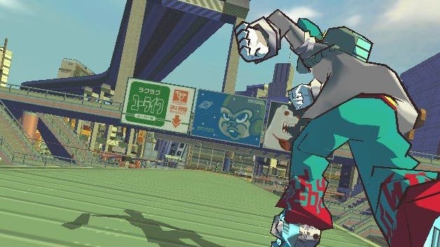
I've been playing some of my old games recently, handling scratched and aging discs with great care. What I've found is that, for me at least, the best games to revisit years after they first came out tend to be those with the unique art style known as cel-shading. This look is sometimes referred to as toon-shading because of the flat, high-contrast colours which are employed along with black outlines around characters and objects, giving everything the appearance of a cartoon. As I remember it, cel-shaded games burst into the public consciousness with Jet Set Radio all the way back in 2000. At the time it was so jolting, so attention-grabbing, it felt like it might be a gimmick - but it doesn't feel like that anymore. In fact, cel-shading now seems to have a rather timeless quality to it.
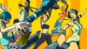
Funny how it works. You'd think games with colours that pop so brightly onto the screen might seem garish, but that couldn't be further from the truth, probably because of the muted, grey look of many blockbuster games from the last decade. This may make the cel-shaded worlds of yesteryear even more emotionally involving and transformative. I had no idea revisiting the ambitious 2002 sequel Jet Set Radio Future last weekend would turn out to be the most fun I would have playing games...since the first time I played JSRF.
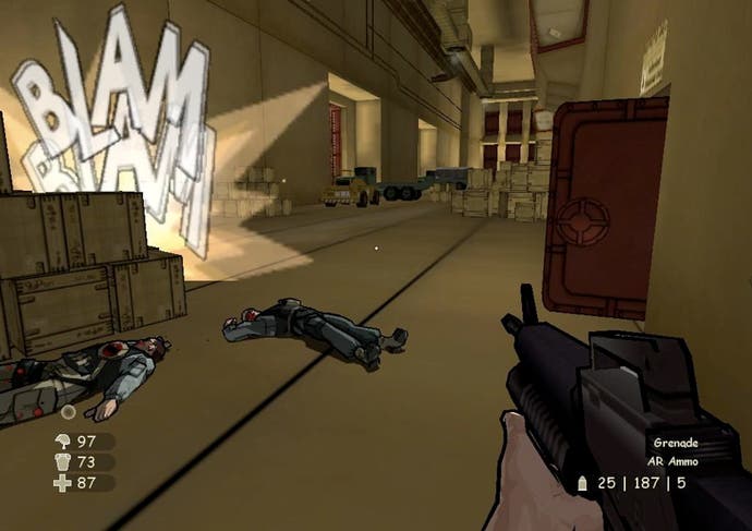
Aside from JSRF, many other cel-shaded games during the last decade made a similar impression on me. Ubisoft's carelessly abandoned XIII, based on a Belgian graphic novel that started in the 1980s, still feels fresh today. Comic-style panels appear over the cel-shading during pivotal moments in the story, and onomatopoeic words splash onto the screen just as the sounds kick in, as if we're reading an interactive novel. Because of this, I have no hesitation comparing it to other famous shooters like GoldenEye or Half-Life, especially with voice acting provided by David Duchovny, Eve and the late Adam West. It's a classy product. Capcom went all in on cel-shading during this period too, with Killer7 (now thankfully available on PC), the Viewtiful Joe series and the cel-shaded racing game Auto Modellista.

Cel-shading does strange things to games. Everything somehow feels both more convincing and even spiritual. For example, the 2008 edition of Prince of Persia is inspired by the ancient Zoroastrianism religion that's rooted in the belief of a single, transcendent god and the presence of an opposing, chaotic force. It's hardly massively inventive stuff for video games, but because every frame looks like a beautiful painting, it all feels far more emotive: the game feels like it has one toe in the world of abstraction, of metaphor.
And it sounds silly to say this but playing JSRF with its sprawling cityscapes delivered in sharp lines and splinters of brightly coloured textures? It made me believe in the reality of a certain kind of Japan - the Japan of my dreams. The vivid colours and tones capture aspects of Japan I find the most fascinating - the urban illuminations and dense architecture, the sheer complexity and range of different influences crowding in and becoming something unique. JSRF takes all these tourist dreams and combines them with an energised and detailed imagination: you get the fantasy of the place alongside a hint of the reality.
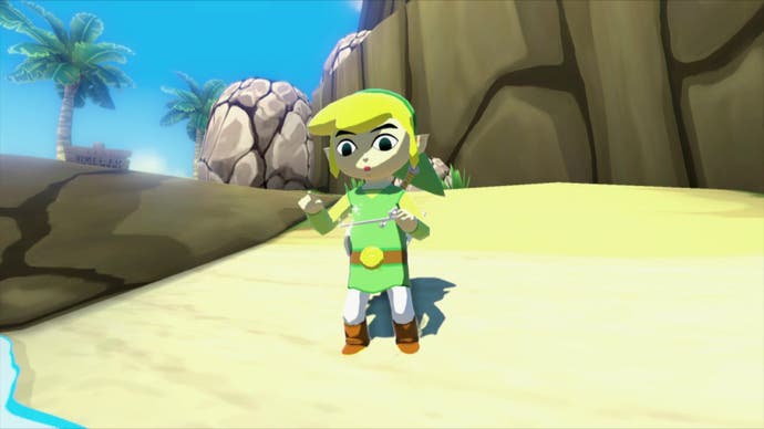
But the transformative impact of cel-shading might best be exemplified by two Zelda games: the Wind Waker and Breath of the Wild. It's hard to imagine how much fuss the Wind Waker's art style caused when it was first revealed. Zelda games were embracing the abstract brilliance of Japanese art - simple lines and bright colours The small, bobble-headed characters in the game were styled after famous Japanese animations, such as the Little Prince and the Eight-Headed Dragon from the 1960s, and they seemed very strange to people used to the Link of Ocarina of Time.

But Wind Waker captured Link's world even more powerfully than the earlier, slightly more realistic games. Its simplified world allows you to lose yourself in it a little more easily. Everything becomes an idealised version of itself, the brightest, bluest ocean with the brightest white caps, torches that feel like the sharpest pinpricks of light in the darkest fairy tale night.
Zelda would return to cel-shading with Breath of the Wild, but the effect could not be more different. If Wind Waker used cel-shading to abstract nature to the point of fairy tale, Breath of the Wild uses it to make nature leap out at us again. Its swaying grass and distant mountains, its flat colours dithered with shadows suggest a cel-shading that is rubbing shoulders with impressionism. This is the world filtered through perceptions and perhaps memory. It's proof that cel-shading, which is still so often associated with Jet Set Radio's urban spray-painting skaters, has range and depth as well as surface beauty.
Over the last few years, cel-shading's probably been most prominent in Telltale Games, but there are signs other developers are returning to it. It's why the upcoming Sable, Void Bastards and Manifold Garden look so endearing to me, as it seems we could be in for a new wave of cel-shaded games that aren't simply translations of comic books.
Until then, I'm going to play JSRF as much as I can. It contains buckets of pure joy. But it also tells us that these aforementioned classics still influence our games today, despite how hard it can sometimes be to find and play them. As the industry steadily becomes more aware of the need to appreciate the artistry and history of games - and more aware of their ability to inspire future creations - cel-shading is a vital reminder that some ideas that seem very rooted in a specific time are capable of leaving that time behind and remain fresh and exciting.


