Mario in the museum
The Barbican's new Digital Revolution exhibition captures the awkward brilliance of an entire medium.
Chris Milk has made music videos for Kanye West and Arcade Fire, and if you go to the Barbican's new Digital Revolution exhibition, he will turn you into a bird.
The Treachery of Sanctuary is located towards the back of a long, curving and somewhat disorientating gallery. Milk's taken over a narrow room, high ceilinged and dark, and at the far end he's created a bright white wall and a reflecting pool, so still that the water looks like glass. The water is not glass, though. and that wall is actually a screen of sorts, a digital canvas where flocks of tiny birds thread back and forth at the top.
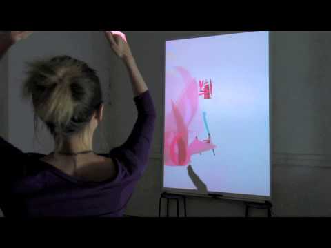
Approach the screen, and your shadow's projected onto it, black and fidgety, anticipating magic. Reach up and watch as your fingers, your hands, your arms start to fragment, turning into birds that scatter into the sky. Walk to the left - this is an exhibition after all; there are probably people shuffling behind you - and your shadow's waiting once more. Now when you move, the birds swarm down in a single hungry mass, efficiently pulling you to pieces. Then you're back again, but transformed. Spread your arms and you grow wings. Shwoom! Silhouette wings with depth, with articulation, with individual feathers fanning out sharply from your wrists to your armpits.
It's astonishing stuff, shocking and sombre and delightful. Despite the almost religious ambience of the high room and the single bright light, people invariably laugh when they see their own wings, even if they've been queueing patiently for a few minutes to get here - even if they absolutely know what's coming. That's just how it is with wings, I guess. In the darkness of the gallery, I stand by the far wall and witness dozens of visitors going through Milk's quick changes, being dismantled first euphorically, then horribly, and then finally being transfigured. It's surprisingly moving. This is digital art at its most immediate, and like a lot of digital art, there's a bit of a game to it.
Seriously. Eyeball the crowds long enough, and you realise that you're watching everyone swiftly and individually learning the rules of the thing and how it behaves, before moving outwards to test the boundaries of the simulation. It's a process you might recognise from playing GTA 5, or from Tetris. Meanwhile, Milk himself is slouched in the shadows at the back, scowling critically at his own art, and muttering to a friend. The massive screen's too small, so the first sections are narrower than they should be. Kinect 2.0, which powers the whole thing, is much harder to work with than the original Kinect. A low barrier that would stop people from touching the screen and spoiling the trick never turned up - it just never turned up.. Small matters, but still... Last night, apparently, Milk spent a few hours hacking in a quick Easter egg. An Easter egg. Here, amongst these screeching birds, amongst all these people learning the rules and trying, inevitably, to bend them.
To get to Milk and his brisk transformations, you first have to navigate an exhibition that is a fascinating kind of muddle. Digital Revolution has a dauntingly wide brief: it's an immersive exhibition of art, design, film, music and video games, to cite the blurb, and it explores the many mutations brought to art through digital technology since the 1970s. I visited for an hour last week, and left dazzled, but I also left with the pleasing impression that I'd overlooked as much scattershot brilliance as I'd actually seen. Four decades is a very long time in technology, and I suspect it's a very long time in art, too. It certainly feels like it. Divided into seven sections tackling everything from vintage tech to code art, 3D printing to Lady Gaga's TechHaus, Digital Revolution drops you into a terrifyingly dense space, then: a chain of rooms packed with artefacts that tell the wayward and disparate histories of digital technology, with all of the tinkering, the borrowing, the fascinating cul-de-sacs and the glorious mis-steps.
It's appealingly agnostic throughout. For the first room or so the exhibition feels like a boot-salesy mass of clutter, in fact - one that lands a pristine Speak & Spell, say, within spitting distance of the clinical bulk of a Commodore PET. If there's an initial problem with this approach (and it's hard to imagine another that would work any better) it's a slight tendency towards cyber-clichés. Here's a PONG cabinet! Here's a clip (did I see this or just assume its presence?) from The Lawnmower Man looping overhead.
There's also the distinct possibility that the really interesting stuff blurs out in your peripheral vision. On a tiny screen near the entrance of the exhibition, for example, I spot the flashing, blinking, organic masses of the Game of Life, a cellular automata created by John Horton Conway in 1970 and that uses simple rules governing the behaviour of individual cells in a grid to create shifting, spasming, stuttering shapes.
Conway's work is often referred to as a zero-player game, and both mathematicians and stoners have devoted entire lives to finding patterns within it - trying to work out why something that is, on a simple level, a jumped-up Excel spreadsheet, can create outputs that feels so organically biological. Miss its low-key display in this busy room, though, and you'll walk right past it, as you might walk past Builder/Eater, a 1977 generative artwork by Paul Brown, which seems to slowly fill its own tiny screen with spidery pathways. In its wrestling with rules and their emergent possibilities, it's of a piece with Conway's work, but it's a few feet away, a little adrift.

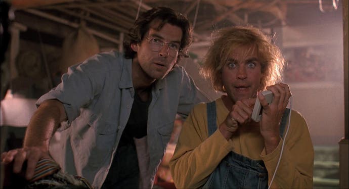
Still, it feels like a strength of the exhibition - a peculiarly appropriate strength - that you're encouraged to make your own connections and build a non-linear understanding of such a linear arrangement of objects. As for the clichés, even they can be quietly illuminating. Over on the PONG cabinet, I'm surprised to find that the classic: AVOID MISSING BALL FOR HIGH SCORE, a piece of pure and compact engineer's poetry, is actually the third line of the instructions, folk memory long having removed DEPOSIT QUARTER and BALL WILL SERVE AUTOMATICALLY just as it once reworked "Play it, Sam," in the movies until it sounded exactly as it should. While we're on movies, The Lawnmower Man, in its stoic determination to look less like the future with each passing year, serves as a Brosnanian cautionary tale for tech soothsayers of any era. This digital stuff is complex and unpredictable, it warns. Too unpredictable, even, to be captured by the spectacle of Jeff Fahey strobing around in a stupid jumpsuit.
The deeper, more specific problem for the exhibition is that digital art is still so new, and its art so different from other art, that it often rejects the gallery setting wholesale. When it plays along nicely, as with bright displays regarding effects for movies like Gravity or Inception, it merely becomes a little anonymous, but Minecraft? The Linn LM-1 Drum Computer? This stuff was not designed for a museum, and for the most part it does not seem particularly delighted to be there. Museums are too often about nodding through exhibits one at a time - about cruising politely down the ol' cultural highway until the off-ramp dumps you into the gift shop. Digital art can't help but encourage you to sit down and lean in, to get lost in a single pursuit, perhaps for hours and at the expense of everything else. When you can't do that, what you often get is surface, superficiality - the stuff of the very prejudices digital art already faces. Even Super Mario Bros. 1-1 seems somehow diminished here. Free of the chummy CRT blur that gave it a certain Valium dreaminess back in the 1980s, it looks clinical and angular and sanitised on a small grey monitor. Stick Mario in a museum and you basically kill him.
But if this exhibition is initially a disconcerting jumble, that's also perhaps the single sharpest point it's making - that digital art is wilful, awkward, indiscriminate and omnivorous. It's endlessly reaching out in strange directions to tackle strange things. Try and capture that without making a glorious mess.
And crucially, it's been the limitations of digital technology over the years that often make it so brilliantly interesting. Early Mario's nothing without his CRT blur, as people have pointed out repeatedly in the past. Similarly, Vuk Ćosić's Instant ASCII Camera could be a smirking comment on the implausibility of technology's desire to retain a single moment with any real sense of authority - a reminder that it's stupid old us with the actual desire in the first place. When I step in front of the camera's lens and push the button, I receive a scrambled square of text on a small piece of silky fax paper. Then the interpretation begins. Are those bunched exclamation marks meant to be my ear? Is that semi-colon an eye? It's as fumbling and compromised as human memory; I love it for its mocking naffness.
I love it all, actually: Digital Revolution is a thrilling sprawl of unlikely brilliance, where Rovio's villainous pigs snort away near Pinokio, a surprisingly expressive animated desk lamp, and where the guy who directed the video to John Mellencamp's Walk Tall wants to see you eaten alive by birds.
Speaking of Milk, the stuff here that looks most comfortable in a museum is, inevitably, installation art like The Treachery of Sanctuary. As the exhibition moves deeper into the contemporary with its code art and its interactive sculpture, you get things like Les Metamorphoses de Mr Kalia, by Cyril Diagne and Beatrice Lartigue. A riot of colour and pared-back animation, Diagne and Lartigue's work allows visitors to watch Mr Kalia wobbling around and steadily evolving as he's projected onto a sloped black cloth - his stick man body sprouting branches and bird houses, locks and keys. Or else you can step behind the cloth and actually take control of him.
There's something enduringly Victorian about the screens and the music hall vibe here, but there's also something enduringly of-the-moment. Like Milk's piece, it's not hard to understand how it all works in a removed, non-techy kind of way (spoiler: it's Kinect again!), but it is hard to stop watching people's dazzled reactions and interactions, and it is hard to stop thinking about on your way back to the tube. (And as for the matter of understanding how something is made to work, incidentally, creativity has always been a bit of a black box, so for a non-specialist viewer like me, digital technology is just another black box to line up next to it.)
These pieces, and much of the wider exhibition, speak to something that everybody who plays games will understand already. They say that art has the power to transform you, and that digital technology, throughout its short, endlessly distracted history, has become the ideal medium for this kind of transformation. From speak to spell, from Jeff Fahey to the gurning goop-metal horrors of the Lawnmower Man, and regardless of whether you're ghosting through Super Mario for the millionth time or indulging in the abstraction of an ASCII polaroid (or even a megapixel holiday snap), this is the medium that changes the people who engage with it. And - hopefully, for the century it's helping to define - it's the medium that encourages a welcome kind of empathy as it does so.
Digital Revolution is at the Barbican until 14 September, 2014.


