Metro Politics: What Xbox's New Dash Means
Rummaging in the guts of Microsoft's latest update.
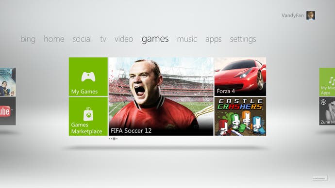
"Ch-ch-ch-changes," sang David Bowie, "Turn and face the strange". 360 owners around the world switched on their consoles this week to discover that the Xbox experience had indeed ch-ch-ch-changed and turned very strange indeed, as the latest dashboard update rolled out, bringing the Xbox in line with the Metro front-end used by Windows phone.
So what's changed, what works and what has been a terrible error that we'll grumble about for the next year?
Integration is the main driver for most of the changes - and not only the corporate need to enforce consistency across Microsoft's growing suite of media hardware, but also in the dashboard itself. Since the introduction of Kinect and the addition of services like Sky television and Last.fm, the old dash was becoming a sprawl of conflicting navigation options, with no two sections sticking with the same format.
That's all been brought into line now. The need for a separate Kinect dashboard is gone, while the media player applications have adopted the broad strokes of the Metro navigation. As a result, you'll have to reinstall these services if you had them before and login afresh.
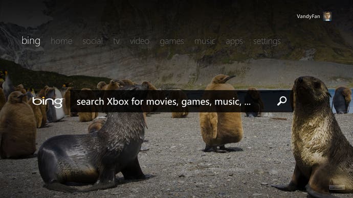
The keywords for this update appear to be "Bing" and "Kinect", as Microsoft pushes its search engine and motion sensor to the forefront. To be fair, the Bing search is pretty impressive, if skewed in favour of people with only a vague idea of what they want to do. Type in "Looney Tunes", for example, and it returns every bit of related content available on the console, from the Looney Tunes: Acme Arsenal video game as well as movies like Back in Action and Space Jam. Kudos as well for listing every available viewing option. I can rent Space Jam via Microsoft's Zune player, but it also tells me that, as an existing subscriber, I can also watch it for free through the Sky app's On Demand playlist.

These really are all encompassing search results, returning content from the indie games channel, individual music tracks and more. Search for something less specific, such as "RPG", and the first page of results suggests Dragon Age Origins, Tales of Vesperia, Lost Odyssey or Nier. Sweep through the results and every RPG of note is there - or at least the ones that are available for immediate download. It can be hard to work out what ranking criteria Bing is using though. Oblivion's highly praised Shivering Isles expansion comes way down the search results, several pages after a music track called "In Your Face!!!" by Rpgio and an indie game called Pimp RPG.
This is symptomatic of a general smushing together that finally realises Microsoft's not-so-secret goal of transforming the console into that Holy Grail of home electronics: the little box that does everything.
Looking at the new home screen, it's hard to avoid the feeling that the Xbox has now completed its transition from a games console that doubles as a media player to an all-in-one streaming media box that also plays games.
How else to explain the fact that you have to flip through four tabs of friends lists, social networking and TV content to reach the section marked "Games"? Why else would the first thing you see be a gigantic advertising space prompting you to give Lovefilm or Sky TV a try, while the game in the disc tray is shunted into a smaller icon in the corner?

This problem reaches its nadir when you attempt to navigate the marketplace, where one-time stalwarts of the Xbox front end like Live Arcade have been all but buried. Navigate to the Games tab and hit New Releases and (at the time of writing) you're greeted with Child of Eden, Transformers: Dark of the Moon, UFC Personal Trainer, Rock Band 3 and Michael Jackson: The Experience. None are new releases. Nor, bizarrely, are any of them actually available to download and play. What you're looking at is the featured games that, presumably, have some new content available somewhere.
If you're looking for actual games to download, you need to dig deeper. Head to the Games tab (yes, there's another Games tab inside the first Games tab) and the New Releases window here at least features the most recent On Demand and Live Arcade titles.
If you want to just view Live Arcade games, you need to navigate further still, hitting an unintuitive Game Type icon (illustrated for some reason by a woman dancing in a green hoodie) and only then can you choose to browse the different games channels separately. That's five steps to reach a shop window that was once a major selling point for Xbox Live.
Yet even once you burrow down to the Live Arcade section, there's little rhyme or reason to the list. Joe Danger: Special Edition and Sonic CD are at the head of the Live Arcade queue, even though they're not out yet. Nor can you pre-order them. All you can do is watch a video preview and rate a game you've yet to play.

Where shopping is concerned it's a confusing long-winded mess of a user interface, and one that seemingly goes out of its way to bury content behind as many button pushes and tab swooshes as possible. The only way to cut through the clutter (and this is probably not a mistake) is to use the Bing search to go directly to the game you want.
Thus games with low visibility have become even more invisible, and any download games that don't benefit from one of the small advertising windows spattered about the dashboard will no doubt suffer from lower sales as a result. The Indie Games channel, always a half-heartedly tolerated runt in the Xbox Live litter, has essentially been put in a sack and thrown in the river. With smaller developers already vocally disappointed with the terms and conditions of Xbox Live Arcade, the move to bury the service so deep that only the most heavily promoted games will strand out seems wilfully perverse.
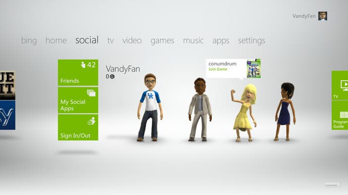
And that's a real shame, as the new dashboard offers some truly excellent features that the core gamer will appreciate. Achievements can now be posted to Facebook, cloud storage allows you to access your profile and avatar from any console without the need to ferry your Xbox identity around on a USB ark, while Gold members can also store around 500Mb of game saves in the cloud for easy access. Combine that with the superb official Xbox Live phone app, and managing your Gamertag just became an absolute pleasure.
Ditto for the new social features, such as beacons that act as broad game invitations even when you're not playing the game in question. Simply set a beacon saying you like to play, say, Halo: Reach and it'll alert both you and your friends when the conditions are right for like-minded friends to have a session. It's not doing much that you couldn't already do with simple messages and lobbies, but as a way of offering an open invitation to your favourite games it adds a nice touch to the thriving Xbox community.
There are benefits here, but it's also an unwieldy update that feels designed more as a way to dazzle and seduce with a deluge of indiscriminate media content than as a concerted effort to craft an intuitive user interface for gamers who know what they want, and just want to get on with it. It works better as a media browser than marketplace, and feels more like a cutting edge TV hub than a games console. As a step towards a unified entertainment offering, it's very impressive. Yet for the core gamer, always an audience sensitive to fears that platform holders no longer have their best interests at heart, this may well prove to be an evolution too far.

