Microsoft Flight Review
Highs and lows.
Flight Simulator used to be scary. In days of yore, you'd wait for the loading screen to fade, squint at the various incomprehensible menu screens, become bewildered by the sheer amount of options thrown right at your face, then spend an hour or so accidentally crashing a Cessna into various parts of Chicago using the default flight options before loading in your home town and trying to see if the developers had modelled your house.
There was so much to a Microsoft Flight Sim title. The world was your playground. Every class of aircraft you could think of was yours to sample. And not one part of the entire experience was ever welcoming, user-friendly or attractive to anyone who didn't already know how the combustion chamber on a turboshaft engine works.
They were never really games and, to be fair, nor did they ever try to be. They were simulators, first and foremost. You got them because you wanted to see what flying a plane was really like, down to every last switch and knob in the cockpit. They were staggeringly complex, frustratingly off-putting to the outsider and scary, scary beasts of programming achievements. And they were magnificent for it.
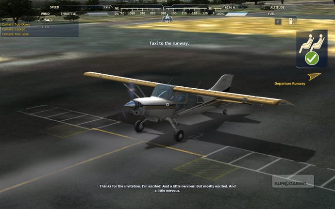
But a limited, faithful audience of hardcore flight simmers does not a profitable bank balance make, so now we have Microsoft Flight and everything is different. From the ground up this has been built to be a game. You have missions, career modes, challenges, achievements, trophies, XP levels, cut-scenes, unlockable rewards. In short, everything we've come to expect from our gaming lives.
Everything that would (and already is, if you look at most dedicated Flight Sim forums) make the aforementioned hardcore crowd scream in horror. Everything necessary to make the experience of playing a Microsoft Flight Simulator title warm, approachable and friendly to the larger, untapped market of casual virtual pilots.
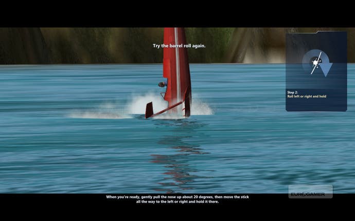
This it does with aplomb. Right from the start you're being led by the hand through the flight menu options, trying out the different types of activities, being encouraged to explore this new world of aviation. Your tutorial in the ultra-modern, car-like Icon A5 runs you through basic manoeuvres, in-game iconography and how to actually land a damn plane intact. It's right here, in your first flight, that you realise just how different this is to what's come before.
For a start, controls are all highly geared towards mouse jockeys - something that was almost unheard of in previous editions. It's been designed that way in order not to put off the casual pilot that doesn't own a replica 747-cockpit in their spare room. This has the twin effect of making everything comfortable and playable, but also reducing the sense that this is in any way reminiscent of true flying.
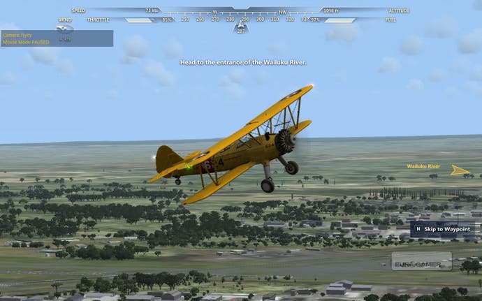
You can make use of joysticks, flight yokes and whatever dedicated control devices you may have should you want. While that will add to the sensation, even when you turn off the flight aids on the options screens you're never really going to believe this is anything more than a game about flying experiences as opposed to a true simulation of keeping a ton of metal above the ground.
Not that Microsoft is trying to claim anything but that. Pre-release build up has been all about 'experience', and the lack of the scary 'S' word in the game's title is the most obvious clue. With that in mind, all the various missions, challenges and other activities actually play out very well. There's a good sense of progression, each airport on the map can be accessed for 'jobs' (even if they are all mostly variations on a handful of basic themes), and specialist challenges at least nod towards a higher level of piloting skill being needed to win the higher-tier trophies.
By far the most interesting (and clever) additions are the Aerocaches. The world is dotted with hidden, floating gold icons, each worth a differing level of XP depending on how well they're tucked away or how dangerous they are to reach. These are always active regardless of which game mode you're in and can be found even while flying other missions or jobs or, most usefully of all, even just in Free Flight, adding a small sense of purpose to being up in the air at all times. It is good fun. You're just flying along when you suddenly notice a rotating gold icon under a bridge, and right away your leisurely trip into the clouds has become an impromptu stunt pilot challenge.
You can actively hunt them out, of course, and each Aerocache has an associated 'clue' that requires a small degree of internet research to help locate in-game. The idea is a boastful one from Microsoft, as if to say, "Our scenery is so detailed you can use real-world maps to navigate it." Which would be great if not for one small thing. The scenery (or at least the Hawaiian locale available at launch) really isn't that detailed when you examine it for any length of time.
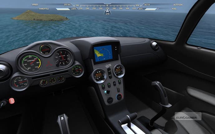
Flight is a very 'empty' world. The Flight Simulator series has always been much more at home in the air than when close to the ground. Whereas before the developers had the excuse of having to model the entire world thus necessitating a degree of corner-cutting, having reduced the scale so much here to just a single island state, it's hard to understand why Hawaii feels so badly replicated.
There's no sense of population - either airborne or ground-based. Even older versions of Flight Sim recreated traffic. There's no ATC at airports offering a feeling of immersion, no AI of any type. Everything around you is lifeless. Even multiplayer just opens your current airspace to a dozen or so other online pilots, but there's nothing you can do with them (other than pointlessly buzz the same runway as you try to 'build a community').
Worse, the old Flight Sim problems of buildings just dropped haphazardly onto generic ground textures is present and correct. Almost unforgivable when you've been able to narrow your development focus in such a way as Flight has. Even a cursory look at Hawaii on Google Maps shows so much ground detail that is just missing completely. The generic feeling of the environment quickly proves tiresome and you're rapidly longing for some of the variety in locations that the older games offered.
There's a sort of excuse for this, but it's not much of one. It's free. No subscription fees, no one-off payments, not even a Donate button. You can download Flight and take to the Hawaiian air without ever opening your wallet. Where the money comes in is through good old DLC in the form of new planes, mission packs and scenery. At launch you have the P51-Mustang and Maule M-7 to add to your hanger for $7.99 and $14.99 respectively (the price difference down to the Mustang not having a modelled cockpit view), as well as the Hawaiian Islands mission pack for $19.99, opening the rest of Hawaii to you and adding more missions, challenges and Aerocaches.
This feels like something of a misstep. As mentioned, one of Flight Sim's major appeals was always the fact you could fly anywhere in the world. Urban cityscapes, Amazonian jungles, Austrian mountain ranges - variety was the key ingredient. By the time you've exhausted flying around Hawaii's 'Big Island', the last thing you want to see is yet more of the same. Especially as the level of detail on offer by these packs really doesn't justify the price, being no better than the free scenery. When something like Test Drive Unlimited 2 offers a more realistic and immersive Hawaii than this, for much the same price, there's honestly no excuse for it.
Until now, the Flight Simulator series was really more of a flight-based OS, heavily supported by third-party add-ons that added rich layers of detail to the world. Everything from airport vehicle packages to satellite-imaged landscapes to improved engine sounds. Flight is operating, instead, on a closed market policy, with everything controlled by Microsoft.
At the time of writing, nothing has been announced about what future DLC is currently scheduled, which is a really bad move as it's this DLC that is really going to make or break Flight. There's been a cursory mention that it won't entirely rule out third-party support for the game, but it's clear that Microsoft wants to keep tight controls over it all. If the shoddy lack of scenery detail on show by its own development team is anything to go by, that third-party input is badly (and quickly) needed.
Microsoft is attempting to do pretty much everything the purists will hate with Flight, but everything that is necessary to save the IP. How well it's doing it is open to debate, and much will reside on what steps it takes next with the DLC. At present, it's not really a simulation, and nor is it fully convincing as a game experience. But it's definitely no longer scary and that, at least, is a step in the right direction.
