Mini Metro plays with the tube map in fascinating ways
Line out of joint.
One of the greatest tricks of the tube map is to take something elbowy and dark, a place of body heat and sudden gusts and narrow channels and sudden crowds, and render it airy, spacious, clean and elegant. I can hold these two realities in my head whenever I descend: Victoria is both a place of visible overhead cabling and those cream tiles, many pulled away to reveal stylised whitecaps of grouting beneath, and a perfect white bead threaded onto a blue line. The map and the territory are happy to coexist here.
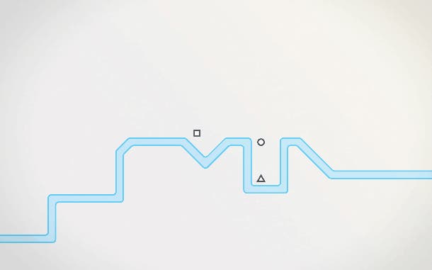
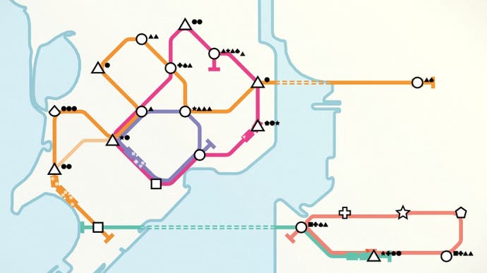
Mini Metro, which ate my weekend and I was happy to let it, encourages the two realities of the underground to mingle in new ways. The map is the territory. You start each game with a blank white space, perhaps bisected by a famous river or fragmented by a coastline, and then as stations appear you connect them with colourful lines. The stations come in a variety of recognisable shapes, circles, squares, triangles at first, and the lines you use to thread them together are railways, each with its own little carriages going up and down.
Passengers come next. These are recognisable shapes too, and your job is to get them to their destinations, triangles to triangle stations, circles to circles. The game doesn't need to tell you any of this, just as it doesn't need to tell you what the objective is. It is impossible not to want to grow these networks, bringing in new stations as they appear, chucking up new lines, spending your regular windfall of tunnels, carriages, interchanges on making things as neat as possible. The game doesn't need to tell you what to watch out for, either. It's obvious that if you leave people waiting too long, and if the numbers start to build up, a station is going to become congested. Lose one station and you lose the game. Your network has failed. Too inelegant.

There are many things to love here. I love the soundtrack, which is pieced together from your actions, pings of new connections, the shuffling of rolling stock, the angry chirping of potential problems. I love the way the game's campaign takes you from one famous city to the next, and allows you to save your work as a screenshot or a .gif, leaving you with the thought that one day you will compare your own work to the real thing - to see how you measure up.
Two elements of the game stand out, though. The first is that the abstractions of the tube map are rendered literal here. You need to think about how long a gap between stations is on the map, because that's the gap between stations in the unseen territory, meaning that trains may bunch together or arrive too rarely.
The second is that Mini Metro's message is ultimately one of diversity. I've spent all weekend pondering one of the game's essential questions: when to place a new line, and what to look for in its construction. Ultimately, a good line is one that has stations of many different shapes, because it will allow for the transporting of passengers of many different shapes. The strength of a line is measured by how inclusive it is.
(That .GIF was from a very early game. I have learned a lot since then. Well, maybe not a lot.)


