Modern Warfare 2 fan redesigns the game's awful UI
High art.
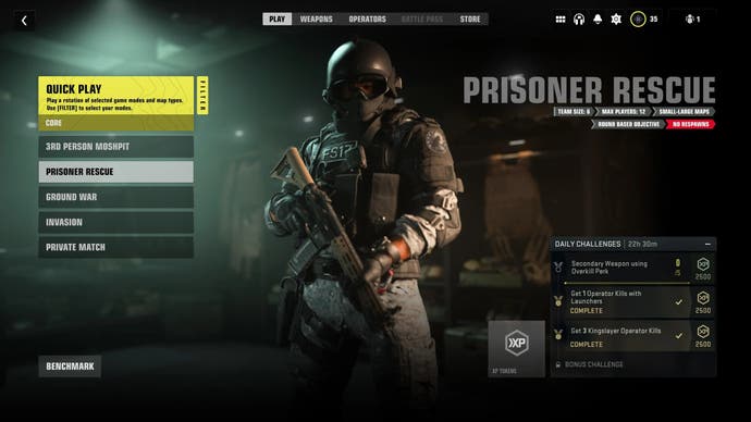
A Call of Duty: Modern Warfare 2 fan has redesigned the game's user interface, which has been heavily criticised since the game's launch last week.
Reddit user InterventX shared a mockup of what a more functional user interface would look like, which as it turns out just looks like the interface from Modern Warfare (2019).
Eagle-eyed fans have pointed out Infinity Ward got a new UX/UI Director following Modern Warfare's launch in 2019. William Faler joined the studio in October 2020, having previously been the head of UX at the American streaming platform Hulu.
The resemblance of MW2's interface to streaming platforms is uncanny.
Game modes are organised into separate tiles reminiscent of the way shows are laid out on the likes of Netflix. Settings are compacted into a separate menu with seemingly endless collapsed options.
The menu mockup quickly became the top post in the Modern Warfare 2 subreddit, with the top comments hypothesising that the game's interface was designed with mobile or tablet users in mind.
In other Modern Warfare 2 news, the game's ranked play mode won't be arriving until next year, Treyarch has confirmed.
