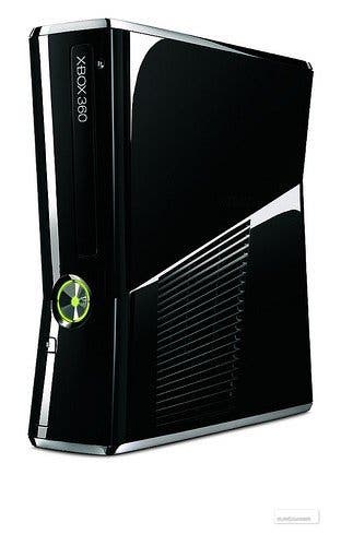
New Xbox 360
Quieter, cleverer, not much smaller.
Don't call it the Xbox 360 Slim - although it is about 15 percent smaller than the launch model. The complete console redesign Microsoft unveiled at its E3 press conference today isn't about weight loss, it's about refining and repositioning. Microsoft says it's listened to its customers and this is the box they want: smaller, yes, but more importantly quieter, and with built in Wi-Fi.
At a special staged unboxing ceremony in the upstairs meeting rooms of an LA hotel, I got to take a bit of time with the redesign: to prod, poke, and listen for the sound of the drive spinning and the fans humming.
The first thing worth mentioning is that it's an odd looking beast. If the original 360, with its famous "inhale" shape, looked a bit like an oblong holding its belly in, perhaps to impress a pretty passing rhomboid, the new model resembles a custom PC casing given the plasticised equivalent of a Manga haircut. The inhale is still there, but it's drawn in sharp, slanting lines, and the overall impression is that the console is trying to look like several different shapes at once.

The plastic is nice, though: glossy black that doesn't look too cheap, and there's chrome trim on the tops and bottoms. There's vents on the top and on one of the sides, too: the top is where the machine sucks in cold air, apparently, and that small slatted section on the side is where it blows it out again, using one large fan rather than two this time, for the delight of your cat.
And, yes, it's quiet. Really quiet. In a relatively muted conference room, I couldn't even hear the machine turning on, and even when there was a disk spinning, you felt it through the table more than you heard it actually humming to itself. The drive's still 12x, and the fans are still turning, but the development team has apparently spent a fair bit of time thinking about acoustics, and the result seems pretty successful - at least over short periods of time.
The hard drive is now hidden beneath a slot in the bottom of the machine - you pull on a ribbon to unclip it - and it's tiny - only slightly bigger than an old cassette tape case. (Ask your parents.) It's redesigned, so you won't be able to clip your old HD onto your new 360, but the old transfer cable will still work, and you can use a USB stick to move stuff across too.
The power brick is still present, but much smaller, and there's all the ports you might have expected. USB slots have been upped to five with three in the back and two in the front, and there's HDMI, optical audio, Ethernet, and all the other ports on the original that I've forgotten about. You'll still be getting a component rather than an HDMI cable in the box, though.

There's one final new port: a bespoke slot for the Kinect peripheral. If you've got an old 360, you'll still be able to plug Kinect in, of course, but you're going to need to run a separate plug to a wall socket to power it. The new 360 manages to power and run the device through a single port.
The in-built Wi-Fi didn't get tested, but it's 802.11n if that means anything to you, and the controller remains the same in shape, but has a glossy strip of black along the bottom and shiny rather than brushed metal on the Guide button.
My personal favourite parts of the new console are the new touch-sensitive buttons for turning the unit on and opening or closing the disk drawer. The latter comes with a delightful microwave-style Ping! too, possibly to please that expanded audience the new device is going to bring to the videogames party.
What there's no way of telling, of course, is whether Microsoft's wizards have put the insides together properly this time. Spokesmen at today's event admitted, a little sheepishly, that they'd learned a lot about building consoles from the RROD years, so there's every reason to hope for the best. Either way, this is an interesting update: a refinement, certainly, but with a little of that charming homeliness which defines the Xbox brand.

