New Xbox Experience
Xbox 720 in all but name.
Needs change, and for this reason, six months ago, Xbox Live was in trouble. Once the brave, slick and - yes - innovative centrepiece of Xbox 360, it began by offering so much that developers struggled to do it justice. After three years, they had caught up and, in some cases, overtaken it, and the Live team was forced to start making concessions. Rock Band was allowed its own Music Store. Halo 3 was allowed its own matchmaking and party systems. Major Nelson's catalogue of notifications was no longer a hobby, it was a corporate imperative. The plasters and stitches of biannual dashboard updates were unable to contain a once-brilliant interface, voluntarily haemorrhaging uniformity to satisfy developers and gamers for whom it had crossed over from an obstacle overcome to an impediment to fun.
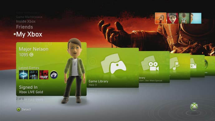
Time for a reboot, then, and following a brief download, that's all it takes to get up and running with New Xbox Experience. Five minutes after being shovelled the download and watching an attract sequence, you're staring at a new horizon - the curved plateau of the new dashboard, home to a series of rectangular panels showcasing new content and expected functionality, with simple menus, prompts and widgets sprinkled over the screen.
It's new, but it's familiar: there's your gamercard in the top-right, flashing up the number of messages and friends you have online, and then your gamerscore, while a rolodex of stick-activated options in the top-left explains what's on the central panels, and your new Avatar stands to one side, tilting his head and waving as your thumb brushes against the right stick. You have no choice but to make an Avatar. It's the first thing New Xbox Experience does. You can pick from any of ten pre-rolled models, or flush them for another ten randoms, or start customising. We picked the first one that didn't look like it had stumbled in from a Gap advert and vowed to come back to him later.

We were more interested in the interface, and anticipating this the New Xbox Experience includes a series of introductory panels under the Welcome banner, showcasing each new feature in brief: the Avatars, the Party system, Community Games, installing games to the hard disk, and accessing Marketplace through your PC web-browser. This What's Hot screen will be used to explain future dashboard updates, too, and elsewhere on the Welcome pages you can view basic information about Xbox Live's existing features (the Guide button, online play, family safety, profile, games, movies, wireless peripherals, privacy), review the flashy intro movie and, thankfully, tell the channel to go away until it changes again.
Do that, and the main entry point until that day - the new Xbox Live homepage, if you like - is Spotlight. Spotlight shows you what's in the disc tray, and provides access to your gamercard, while your Avatar steps closer and emits your motto through a speech bubble. Dig further into this and you can explore Achievements in a manner similar to the boxy Games Library panels of the old dashboard, hovering over each for an explanation rather than having to click through, and each game's panel is topped with bars illustrating your Achievement progress. Spotlight also does as its name suggests, and advertises content like the recent Pro Evolution Soccer 2009 demo and Age of Booty. Xbox Live product unit manager Jerry Johnson told Eurogamer that these will be a mixture of paid-for and extra-curricular placements designed to show you around (you can hear more from Johnson in a separate interview).

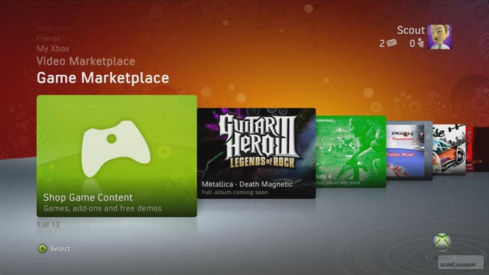
Moving up the rolodex with the d-pad brings you back onto the familiar ground of the Game and Video Marketplaces, and both have been reorganised to fit the NXE framework. Most agreeably, you can now browse by alphabet, genre and collections (Arcade, Demos, Originals, etc.) and move between these options, and the well of content beyond each stab of the A-button, at a pace that the old dashboard never matched. Head to a specific game and a series of panels allows you to try, buy, visit the full per-product content catalogue, or flit between featured downloads, a screenshot slideshow and Xbox.com-style product information. It won't be possible to access Marketplace via the internet (presumably) until launch, but when you can you will also be able to remotely instruct your Xbox to start downloading the content - free or premium - that you want.
Jerry Johnson insisted that a central tenet of the New Xbox Experience is "serendipitous discovery of content" - in other words, giving you stuff to do rather than expecting you to fire up the box with a plan already in mind - but after a few hours' use it's hard to shake the feeling that, among the more useful rows of panels showcasing the latest and most popular downloads, the new channels are simply a new wave of adverts that push beyond the old dashboard's capacity.

