Off the Map
Our tribute to the levels designed to confuse rather than guide.
In these heady, three-dimensional times where players are expected to move not just from left to right but also backwards and diagonally and sometimes in strange new directions they may not be comfortable with, level design takes on an all-new meaning. Levels now need to be both playgrounds and delicately constructed pathways. To stop their players wandering around aimlessly like children lost in a supermarket, developers must build their games so as to lead the player with an invisible hand.
This hand is usually made up of colours and other visual cues hinting at where to go next, or sometimes it's just a bloody hand or some breadcrumbs. Under someone like Valve, however, it becomes an impossibly complex thing involving the same mastery of sound effects and pattern tightness you'd see in a Las Vegas casino. In any case, the job of the modern level designer is clear.
Or is it?
We say: Enough of this crap! We're not children, and if we are for the purposes of an analogy then maybe it's fun to get lost in a supermarket for a little bit. There are good things in the supermarket after all, such as dirty magazines and chocolate and bleach.
The following is an analysis of the levels designed to confuse us, worry us and throw us off our game. These levels are the bumps in the luge, the cardamom seeds in the curry, and whether you love them or hate them it's impossible to deny just how interesting or brave they are.
Thief: The Dark Project - The Sword

The placing of this one's important. With the player having knocked over their first few levels and escaped with a tolerable amount of puncture-holes and bruises, they'll have started to get comfortable with their role as a thief. What began as nerve-wracking will be becoming... well, only marginally less nerve-wracking. But all those ice-cool cut-scenes and completed objectives followed by clean escapes will have given the player a bit of an ego. They'll be getting comfortable. And Thief, at its heart, is a game about discomfort.
Constantine's mansion is there to put the player back in their place. Unlike the Cradle in Thief 3, which felt from beginning to end like an abrupt and temporary change of tone, Constantine's mansion is designed to make the most of every assumption the player has been goaded into making in order to make them feel as scared and naked as they did on the first level.
It even starts the same way as the first level. You arrive at a vast nobleman's house with a mental shopping list of things to swipe. You infiltrate it, and begin the tense process of mapping out those guard-filled corridors, servant's quarters, lounges and kitchens. Everything's as you'd expect. Then, as you climb higher, you stumble across hints that something's wrong.
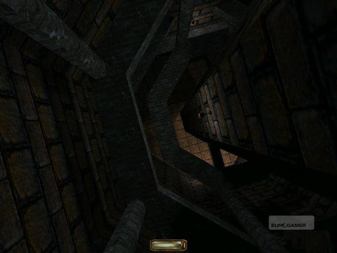
By the second floor the architecture's gotten weirder, and you start spotting unknowable vegetation growing up through flagstones. One floor higher and the house becomes a chaotic maze of curving corridors and slopes, with players having to push up and up to steal the sword they came for but always accidentally backtracking. Running from guards was scary enough back when you knew where you were going. All of a sudden you're a rat in a trap.
Constantine's mansion probably peaks with The Door. As you're poking your nose around the labyrinth there's one door most players will pass and open just to see what's on the other side, and the answer is... nothing. As in, literally nothing. A dark, gently spinning void with no visible floor, ceiling or wall and no explanation. All you can do is close the door, try to put the insanity out of your mind and continue down the corridor, lost as a little lamb. Just awesome.

