PKR
Shall we chop?
In the interests of disclosure, PKR put USD 50 (around GBP 25) of money into an account for us to use, so we could experiment with their software. Be assured that we'll be giving that USD 50 back now it's written. So this isn't a review, so much as a sort of critical preview, looking at what PKR does now as it continues to develop its engine.
Right, here's the most important thing I want from an online poker room: clarity. Clarity of menus, clarity of tables, and clarity of the screen furniture showing me my cards. And with that, if I'm honest, my ideal poker table is a top-down green circle with player's names, their chip-stack, and their bet. Anything else on top of that needs to be executed really smoothly, or it's inhibiting the game.
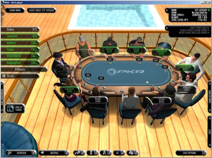
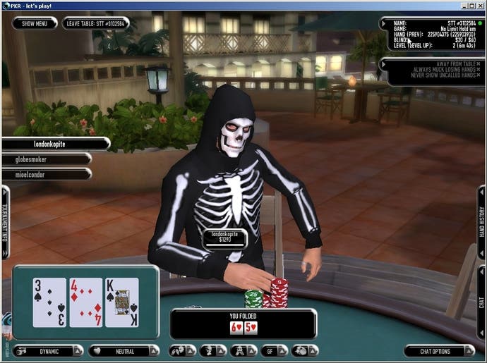
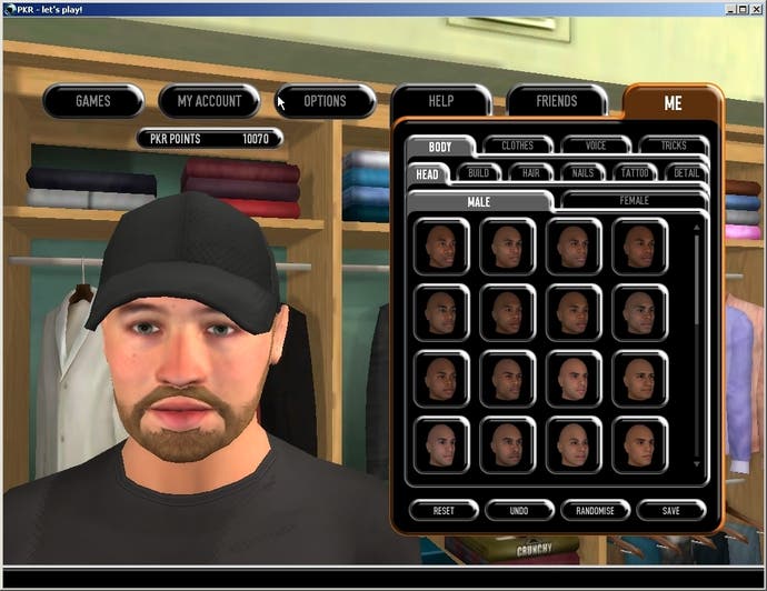
PKR puts itself in an interesting position between the ridiculously over-the-top graphical attempts of some poker games, which feel more like watching a cartoon, and completely stripped down minimalism. There's a character creator that allows you to approximate your own face and build in the game, as well as the option to choose clothing, or even "buy" it with the in-game points system. Just now, people are dressed up in Halloween costumes - I recently played a game with a vampire and a wolf. While a lot of this is purely decoration, and therefore to my mind quite unnecessary, I have to concede some of the animations add a decent dynamic to playing.
A lot of this is in the form of emotes, which have the useful effect of identifying who at your table is a bit of a dick. People who choose to laugh at bad bets they weren't involved in, or make strange waving, hooting actions at seemingly incongruous moments, are quickly marked as stupid-faced morons to bluff out of their chips. Those who choose to employ the more subtle animations, like chip tricks or drumming fingers, are thinking far too carefully about how they're coming across, and such actions can be neatly reverse-engineered into getting a read on their hand. But even for those who opt out entirely, there are still some giveaway moves that the characters will show.

In some online poker rooms, your hand is permanently visible. This might seem perfectly reasonable, but it's not very realistic. Sat around a real table, noticing when someone sneaks a glance at their cards is very revealing. Here you can do the same, with the cards only shown when the player clicks on a certain button, resulting in their avatar peeling back the cards on the table and checking them out. Raise someone heftily and see them take a peek, and you get a fair idea they're not too confident in their hand. Or indeed, they're bluffing you and you're about to look stupid. It's a nice addition.
I'd really like to see an option where you could turn all of this off, and just see the empty chairs and the numbers. But it's presented in such a way that you can pretty much tune it all out, and focus on the important details with little muddle. And there's some details that improve the atmosphere. Nicely, when you muck your hand, it continues to show you what your cards were, so you can groan and sigh as your 83o is revealed as a formerly winning straight, and even have your avatar weep (when the round is over, obviously - no giving details during the hand you awful sort).
The graphics are fine - simple, and sadly without any option for anti-aliasing, but as mentioned also unobtrusive. (Compared to, say, the recent commercially released poker game, Stacked, where the dizzying camera, over-elaborate graphics, and awful background designs made it painful to look at). And achieving something that seemingly all other poker sites are incapable of, you can resize the window to your desire, with it all automatically scaling. Also, if you're the sort to play multiple tables at once, it elegantly keeps them all in the same window, letting you easily switch back and forth between them.

Of course, one of the catches when offering complicated graphics and themed seasons, etc, is the need for updates. And these can be quite hefty. In response, PKR has introduced Poker Pal - an app that can run in the background and download updates as they're released, even when you're not logged into the site. Which seems both useful, and creepy. Exactly how much downloading does a poker program need, that it wants to be running the entire time? Call me Mr Paranoid, but I'd rather my applications only be active when I'm using them. Still, if you don't want to wait for a chunky update when you fancy a quick game, it is a simple solution.
So what about the games themselves? PKR gives a limited range of poker. It's Hold 'Em or Omaha. No Five Card Draw, no Stud. But then frankly, we're all really after Hold 'Em, aren't we?
There are, as you'd imagine, cash games, sit & go tables, and organised tournaments. When playing for cash, the biggest tables have the blinds at USD 10 and USD 20, but for the more modest player, it goes as low as USD 0.02/0.04 letting you essentially play for pennies. The buy-ins for the sit & go stay (relatively) low, with the highest tables at USD 200 (compared to the USD 5000 tables poker.co.uk and its affiliates offer), and begin at a friendly single buck. These numbers are probably a bit low to attract the hefty professionals, but that seems in keeping with PKR's more friendly tone.

Another peculiarity of the design is to require you to visit a table before you can register for a game. Finding a sit & go, it can be frustrating to see it listed as having, say, 8/10 players, only to find the seats all filled and the game already started by the time you've loaded the room. The ability to register at the main menu, and then choose your seat upon arrival, would be much preferred.
I'm still not convinced that avatars and animations can do anything to recreate the reality of playing in a room with other people. Behaviour, ticks and tells aren't the result of a chosen emote, and offering people the ability to select their physical behaviour somewhat defeats the purpose of anyone else's noticing. PKR does a decent job of intelligently applying its presentation, with lots of control over the camera's behaviour (you can force it to be completely still, go first-person, or even have it be a neat, top-down perspective while you're in a hand, but switch to a dynamic camera when I'm not, making the down-time more visually interesting). I think with even more options, and more intuitive menus, it would be that bit more comfortable. As it stands, it's offering everything it needs to give you a decent game of poker, and a lot more that you might or might not want on top.

