Homeworld 2
Rob investigates another 'world.
Remember the start of Star Wars? The chances are that you, like me, are too young to remember it from the cinema the first time around (and if not, sorry for making you feel old just there... granddad), but regardless; there's something inescapably cool and stirring about the moment when the bottom of the Star Destroyer creeps into view at the top of the screen, dwarfing Princess Leia's rubbish little ship and etching into the minds of a generation that if you're in deep space, being pursued by an outsized Dairylea triangle is a bad thing. More than all of NASA's best efforts, it's this scene in Star Wars that we have to thank for bringing a very important fact to the attention of creative types everywhere - namely the fact that ships knocking the crud out of each other in outer space looks mighty fine.
One bunch of creative types upon whom this message wasn't lost is Relic, the enterprising chaps who turned around several years ago and sprang upon us a game called Homeworld. Taking the basics of PC real-time strategy and transposing them into a fully 3D space environment, Homeworld was remarkable for achieving a system that allowed for 3D strategic thinking without becoming excessively complicated, and striking a superb balance between the realism of space combat and the realities of what it takes to make a fun strategy game - and it helped that the whole affair was stunningly gorgeous to look at, with a decent graphics engine, nicely designed ships and dramatic combat scenes.
A Space Odyssey
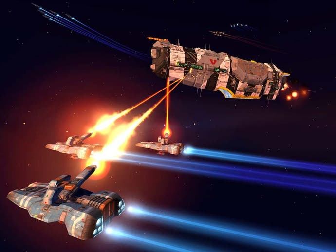
A few years down the line, and surprisingly enough, 3D space combat strategy titles are still every bit as thin on the ground as they were when Homeworld first arrived. In general, you'd expect a plethora of clones to follow in the footsteps of something as clever as Homeworld, but in fact the official sequel arrives on a market where the only real competition is its elder sibling - and the only real move forward for the genre (or sub-genre, or whatever you want to call it) is Cataclysm, a mission pack for Homeworld which introduced some nifty time control systems.
Given this situation, the chaps at Relic didn't really need to pour innovation into Homeworld 2 in the way that they did with the original. A lick of digital paint, a new plotline and some tweaks to the interface, and off you go - sequel by numbers, and just about enough to keep the devotees of the original game happy. This is pretty much par for the course with sequels, and we shouldn't really have expected much of a leap over the brilliance of Homeworld - but yet somehow it's hard to escape a crushing sense of disappointment when Homeworld 2 turns out to be exactly that, an almost direct clone of the first game with just enough touching up and modification to justify the sequel tag.
The story is a direct continuation of the first game, and charts what happens to the Hiigarans after they manage to find their home planet. Peace doesn't last long for the race (wouldn't be much of a game here if it did) and they're attacked by the warrior Vaygr race, forcing them to build a new mothership and get embroiled in yet another war. The story is solidly written and presented, and does have a real space opera feel to it - even if it does feel a touch contrived compared with the simple but emotive and beautifully narrated quest in the first game. Comparisons with the original title aside, however, the story is certainly interesting and it kept us going through the entire single-player campaign - which is saying something, given how keyboard-smashingly frustrating many of the missions in that campaign can be.
The Final Frontier
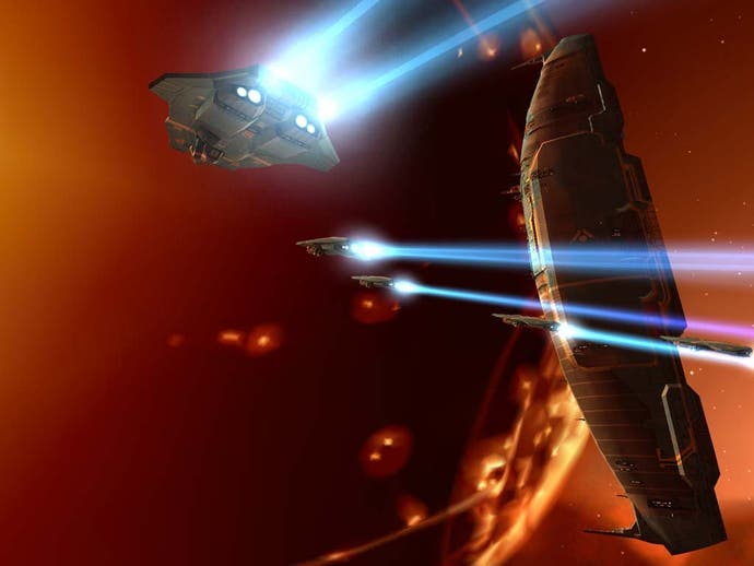
The interface to the game hasn't really changed significantly since the first title, although that's a good thing in our eyes. Homeworld's interface solved a basic problem regarding unit positioning and tracking in 3D space, and there was simply no need to reinvent the wheel for the second game, so anyone who got to grips with Homeworld will be right at, er, home. The remainder of the hugely stat-heavy interface comes in the form of panels which can thankfully be rolled away when not in use - although in order to navigate around quickly, you'll probably find it's best to keep a bewildering array of panels open on your "desktop". This does have the effect of obscuring the game's lovely graphics, sadly, and it's a good idea to run in a very high resolution if your system can cope with it, since this makes information management altogether more sensible. It's a bit of a shame that having come up with such an ingenious solution to the 3D movement issue, Relic were seemingly incapable of coming up with something as elegant and simple when it came to managing the massive wodges of information and controls the game seems to require.
It's not this interface which causes the frustration we referred to a moment ago, however. Although it can take some getting used to, the Homeworld 2 interface can certainly be learned, and once you're over the slightly steep learning curve and getting to grips with the keyboard shortcuts (many of which have changed from the original game, much to our annoyance) it's actually not a particularly difficult game to play in this respect. No, our frustration with the game arose entirely from the mission design, as each of the fifteen campaign missions seems to have been designed around the needs of the narrative rather than the needs of the gameplay - with the flow of strategy being constantly interrupted by scripted events, of which you generally get very little advance warning.
This can throw off even the most carefully thought out strategies, as your cunning plans for dealing with one massed group of enemies are foiled by the sudden appearance of a scripted event that turns everything on the map on its head. On one hand, you could argue that this means you have to plan for all manner of different contingencies. On the other hand, by about halfway through the campaign this has really, really started to grate, and it's the closest we've ever seen an RTS game get to the "quicksave and try again" mentality of some badly designed FPS games. Effectively the only way to beat many of the game's missions is to retry them with full knowledge of when and where scripted events will occur - hardly ideal for a strategy title.
No One Can Hear You Scream
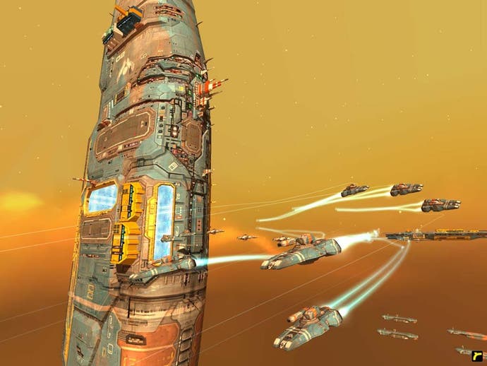
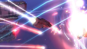
These flaws are annoying, but they're certainly not show-stoppers for the game - and it's worth bearing in mind that we're being very critical here since this is a title that sets itself up as a sequel to a truly superb game. Other aspects of the game almost go without saying - graphically, for example, it's absolutely stunning, with detailed ships, varied environments and great battle effects. Admittedly it's not quite up there with the likes of X2: The Threat, but it's an entirely different type of game and it's quite a spectacle to watch full-scale battles unfold in front of your eyes.
Other aspects of the game have also improved - such as the AI of your fleet, which has received a much-needed overhaul and is now far less likely than before to have you flinging your mouse across the room. The most basic change is that AI now seems to be aware of the simple rock-paper-scissors mechanism that underlies the combat in the game, and units intelligently select the targets that they're best equipped to deal with when they're left to their own devices - meaning that even if you're attacked by surprise (another damn scripted event, then), your idling fleet will engage the enemy in a fairly effective way without you having to micro-manage each wing or ship.
Of course, the game features extensive multiplayer options - and given the huge flaws with the single-player game, we were happy to note that multiplayer appears to be very much a case of "ain't broke, don't fix". Sadly, this does mean that playing Homeworld 2 in multiplayer isn't actually all that different from playing the original. The graphics are better, there are new units and new options to explore, etc, but this is very much an incremental upgrade rather than a complete overhaul. It's still a lot of fun to bash at on a LAN, but there's an inescapable sense of déjà vu about the whole affair.
Stardust Memories
Homeworld 2 is a good game. There's no doubt about that. It's extremely polished, very competently executed, and is based on an extremely well thought-out game design and some very clever interface decisions. The key problem is that just about all the good things about it are lifted straight from the original Homeworld, and there's really not a lot in the "enhancements" to this sequel which distinguish themselves above the first game. In some respects it's simply not as good as Homeworld; the single-player campaign in particular is a major disappointment, and although the graphics are very lovely to look at, they're certainly not as impressive for 2003 as Homeworld's were for 1999.
Taken on its own, Homeworld 2 is a game that deserves to be played, and it's certainly head and shoulders above the average PC strategy title. However, we can't simply assess the game on that basis. The fact of the matter is that Homeworld 2 is very disappointing; it's tall only because it stands on the shoulders of a giant, and while fans of the first game may be able to make do with what is effectively a second serving of the same game, we'd advise everyone else to go and track down a copy of the original game on budget instead. The law of diminishing returns has truly made its mark here.
