Zoo Tycoon
John dreams of building cages for all the EG readers.
And now, for your viewing entertainment, I’m going to come up with an exceptionally good idea. Take your phone off the hook, turn down your music, you’re going to want to concentrate.
If you’re going to make a management game on the DS, you could replace the traditional mouse interface with the stylus!
Pick yourself back up off the floor, dust yourself down, and close your mouth. I know, you don’t stumble upon genius like this every day. But please, you’re embarrassing me - I’m a modest man.
So, I learned today that chimpanzees have a bone density seven times greater than a human. It’s something of a shame that Zoo Tycoon developers Blue Fang respond to this by having been seven times more dense than a chimpanzee. They didn’t think of that aforementioned idea.
If a chimpanzee falls from a third storey window onto concrete, it will pick itself up, dust itself off, and bound away. In the interests of science, let’s drop a DS playing Zoo Tycoon from a third storey window, and see what happens.
...
Ooh, the interface improves.
Got no style

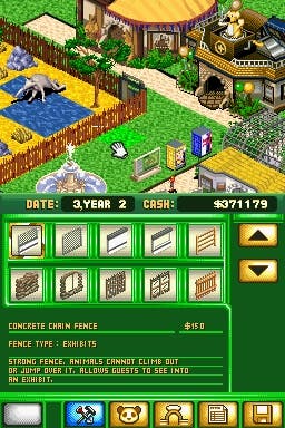
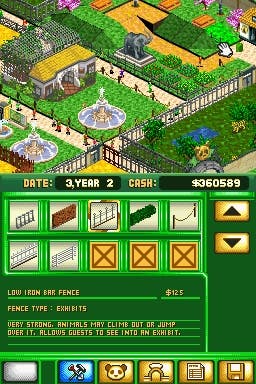
Zoo Tycoon DS puts the zoo display on the top screen, and various forms of interface on the bottom - immediately crazy. A management game, creating and running your own zoo, could be beautifully controlled with the gratifying immediacy of the stylus. When played in their natural environment of a PC, obviously the mouse is used to ‘paint’ the scenery onto the screen. It’s why management games are such an awful faff on a console. Given the wonder of the DS touch screen - the cleverest idea in non-PC gaming in over four hundred years - finally such games can be portable, unleashed from your desk. So what possessed anyone to not only fail to take advantage of this, but seemingly go out of their way to make the game as impossible to control as they could?
It’s kind of hard to describe this in words, so bear with me. Did you play Beyond Good & Evil to the end? That bit where the boss reverses your controls, so to roll to the left, you have to go right, instead of forward, backward? It was painfully confusing. That’s the only less intuitive control method I can think of than that chosen for Zoo Tycoon DS.
The game is displayed from an isometric perspective, all on the diagonal. So if you were to plot North, South, East and West, you’d have an X. The D-pad, responsible for orchestrating the majority of the control, contrarily would form a +. Let’s say there was no touch-screen, and this was your only option - all common sense says: ask the player to assume the D-pad operates at a 45 degree angle. I.e. ‘up’ goes diagonally up-and-left, ‘right’ goes diagonally right-and-down, and so on. Surely no one, ever, would have it be that ‘up’ goes bothdiagonally up-and-right and up-and-left, alternately. And indeed ‘right’ going both right-and-up and right-and-down... Confused? Imagine playing it.
And now imagine that the tile cursor is all but the exact same green as the grass, such that it’s mostly impossible to find it.
It beggers belief.
And gets more complicated. But first...
Time-lapse zoology

There are two modes of play. Firstly, a free sandbox mode, in which you begin with the most basic zoo-building elements, and build your park on any of a large selection of land types. This could be anything from a nice grassy field, to a lake surrounded by jungle, to a volcanic hill. Via funding research, new attractions become available, and a more elaborate zoo a possibility. Then secondly there are fifteen scenarios, pre-set challenges to be apparently completed within a certain time limit. A small amount of imagination has gone into these, following the usual variations on the theme - limited funding, limited animals, etc, more difficult challenges unlocked as you progress. Standard management fodder, sure enough.
However, these scenarios are peculiarly flawed. Say you’ve been given six months to create six enclosures for some rescued animals, shipped over from closing zoos around the world. The task would be to create six enclosures of varying types, emulating the correct conditions for the particular animals, presumably before time runs out. Except, well, the game can be played on pause. So unless you’re brutally honest, there’s no reason to fail. And then, even if you are brutally honest (as indeed am I), you’ll finish the task well ahead of the time limit, and expect your congratulation. Which, er, won’t come until the time limit’s up. Finish in three (game) months, and you’ll have to wait another three before the scenario will let you move on to the next. There’s no way to speed up time, so you just have to set the DS aside and go do the washing up or something. Should you have the common sense to pause it before you start the task, you’ll probably have time to get the hoovering done as well.
(I’ve left a six month scenario playing out while I type this. So far, January...)
The only reason you’d ever need the time limit’s further reaches would be thanks to that next stage of complication I so tantalisingly teased you with earlier. Sorry to go on, but look - the game would be at least comfortably playable, if still terminally boring, if only they’d thought to make use of the damn stylus. You’d have tabs on the screen for selecting which item you wanted to place, select it, and then tap the screen where you wanted to place it. Pick a tree, pop it down. It would be a pleasure.
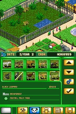
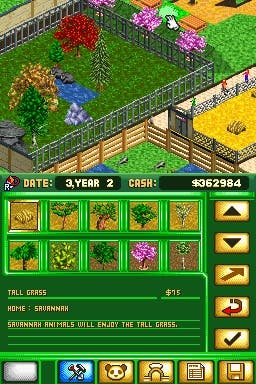
It starts off well - you use the stylus to select the construction tab (February, by the way), then ‘foliage’, and then the tree you’re after. The lion might want a particular African tree, so you choose that one. Annoyingly, nothing’s labelled, so the only way to find the one you’re after from the forty available is to click on all of them until the correct name is revealed in the dialogue box below. (No, they’re not in alphabetical order). Found, you then click on it a second time, and the in-game cursor on the top screen becomes that plant. Now, put the stylus down somewhere you’ll find it again, and with the D-pad, scroll around the screen by dragging the cursor to the edges of the top screen, discover that the frame rate staggers almost to a halt over any detail, and then reach the enclosure you’re after. Now play the mad-crazy dance of the + vs X, rotating the view in 45 degree chunks to see behind the non-transparent walls, until you find where you want to place it. And then press A.
Be strong

I really am sorry for these overly extensive descriptions, I’m aware what a dense read this all is, but I want to communicate quite what a massive pain in the arse this game is to play. And putting trees down is NOTHING compared to the shambles that is laying terrain types. For that task, the game replicates the selected region of the zoo on the bottom screen on a grid that bears almost no resemblance to anything, onto which you directly apply the type of grass/dirt/water you’re after, which then appears, counter-intuitively, on the top screen, probably about nine squares away from where you’d intended. My brain hurts. And don’t think I’m explaining this poorly - honestly, I’m over-simplifying the procedure if anything. Attempting to line the grass-green, almost invisible grid up with anything you can usefully understand on the touch screen is such a pain that... well, hopefully you’re beginning to understand the journey to the third storey window. (We’re in March!).
Sadly, the pain is not soothed by the pretty DS pictures. They’re shockingly bad. Animals are mostly unidentifiable, even at the most zoomed in of the three zoom options. I could not tell a cheetah from a leopard from a lion. The only way to work out what you’re looking at was either memorising which you dropped where, or by going through a bunch of menus until you find the option for leaping the camera to the highlighted animal. The animals, and humans wandering the zoo, are given, by my count, four frames of animation each, blocky and smeared. Clearly there are severe frame-rate issues, and the sheer amount of stuff on screen at once appears more than the engine can cope with. But this doesn’t change the fact that it looks rubbish. Compare it to something like Lost In Blue, with detailed backdrops, and while not overwhelming, a fair amount of animations for the characters - it’s clear that it’s possible to do.
Animal disclosures

(April). The micro-management aspects, possibly the game’s only hope for redemption, peculiarly bugger themselves up by giving you too much information. Bah! When over an enclosure, a zoo keeper will tell you which terrain types are needed, which there are too many of, and whether the animal would like some trees, rocks, shelter, or even a toy. But there’s no spirit of freedom to this. He’ll tell you down to the exact tile. One too many dirt tiles, and one too few rainforest floor tiles, in a grid of maybe 40, and he’ll tell you to switch them over. You’re not playing - you’re following menial commands. And this isn’t a case of over-relying on an extra feature. The same feedback is given, somewhat ambiguously, by smilies emitted from the animal as you add the features.
(Still April. And I already did the washing up). Other micro-management traditions, such as pricing burgers, hotdogs, or Theme Park’s best feature, cruelly charging exorbitant fees for the toilets, are completely absent. The only financial interaction is deciding the zoo’s entry fee - hardly an engrossing element. (May!). Terrain can be lowered and raised, and some animals will want this, but it’s so madly implemented that you can have a perfect square of water magically floating on a column above a lake. And hilariously, you can place a few tiles of salt water in the middle of a lake of fresh water.
Astonishingly, there’s only one save slot, which means should you be working on your own sandbox zoo, and then fancy having a go at one of the scenarios, you’d not be able to save any progress without losing your on-going project. Complete madness. How could it be more shoddy?
June. Almost over. Excited? No. What else? The sound? There’s almost none. Horrid blurpy noises accompany some actions, but nothing resembling a zoo. Otherwise it’s a spooky silence. Still June. Nothing else to say, really. But I bet you have some washing up to do. Go on, get it done. You’ll be glad you did.
...And July. We’ve won! We get the right to do it all over again. Which is... possible. If you’re willing to fight, and for some inexplicable reason, ridiculously desperate for a DS management sim, it is possible to build a zoo. But it’s not fun, and it’s certainly not worth the effort. The DS, as hopefully this constructive and helpful review will have shown, is the perfect medium for recreating management sims. Just not this time. Meet you on the third floor.


