Saturday Soapbox: Hollow Worlds - Looking for "Look At"
Cursory examinations.
Modern game worlds are built to be attractive, and usually succeed. When it comes to peeling back their facades though, it's depressing how often beauty turns out to be skin deep, with world after world existing to be admired rather than actually explored. Sets full of props rather than items, characters taking no interest in their surroundings - what should be immersive all too often feels hollow, no matter how realistic they appear.
Why? Because eyes only let you see so much. For scenes where they see enough, great, terrific. Continue! Not everything needs more depth. Increasingly though, I miss having the power to Look At things instead of merely looking at them - to scratch through the shiny surface, and start giving environments the interaction density they deserve.
"Look At" was primarily a creation of adventure games, starting in text adventures where typing that was the only way to find out where you were, and then evolving into a way of telling whether that blob of pixels was a matchbook or a falcon called Aloysius.
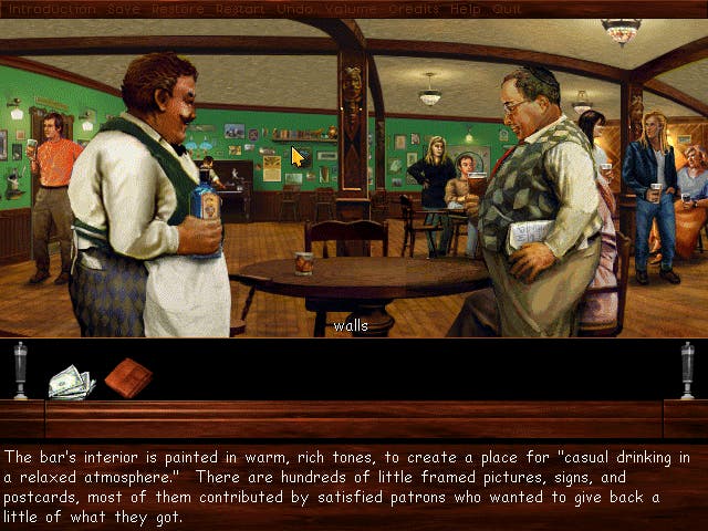
As those graphics inevitably became more recognisable, the number of hotspots became largely a matter of designer taste, still designed to tell you what things were, but also clarify, and in many cases, to tell jokes. Some, like Callahan's Crosstime Saloon, aimed to stuff something fun into every last pixel. Others, like Simon the Sorcerer 2, opted to simplify things by only including relevant bits of the screen. These days, comedies typically offer more, for the gag potential, while serious games are more likely to keep it focused.

Embracing Look At doesn't mean slavishly following adventure mechanics though, and doing so would usually be a bad idea. Certainly, no shooter would be improved by the ability to switch to a mouse cursor to click on a lightswitch and be told "It's a lightswitch." Nor does anyone want an exciting action sequence interrupted by the sidekick casually commenting on an ugly vase in the corner - unless it takes a bullet.
During quieter moments though, a "Look At" mechanic is worth implementing - certainly when you consider how many games limit interaction to throwing stuff at NPCs heads, or rely on techniques like books and audio logs that stop exploration dead in its tracks. The games that have tried doing this stand as proof that it can work. Mass Effect 2 and 3 for instance primarily take place in streamlined, low interaction density environments. Both the Kasumi and Leviathan DLC packs include dedicated adventure spaces though, and they're done very effectively despite being reliant on clunky RPG control systems.
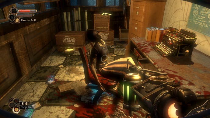
Such moments are depressingly rare though. In most games, environmental design is king, with the current trend being to convey story through world design and stick as close to the rule of "Show, Don't Tell" as everyone's tendency to leave their bloody diaries lying all over the place will reasonably allow. To be fair, that's a good general direction to head - infodumps are the enemy of drama, and this approach has allowed for some great set-pieces. Corpses frozen mid-poker game during Fallout: New Vegas. Eleanor's height chart in Bioshock 2. As a visual medium, games absolutely need to keep working on this.
Telling has its place too though, and shouldn't be overlooked. Our characters and sidekicks, for instance, will usually have more history and understanding of the world than we do, and the kind that you can't simply get from glancing at an item in a case. Coupled with the fact that a game's pacing can be far more fluid than any other narrative medium, and the benefits should come obvious. A Look At mechanic, implemented properly, is the chance to smell the roses without necessarily mandating it, and without doing anything as awkward as having to read an in-game book or switch to a lore database.
Any modern 3D game for instance could be rigged to detect you looking at something and triggering a response - ideally, something a little more interesting than the sexy sidekick complaining about you staring at her ass, as in Sin Episodes. A portrait on a wall can be used as a vector for a quick snippet about the owner of the lord you're off to kill. A quick line about a sword in a display case can quickly add historical context a diary would struggle to make interesting. A player who cares can drink it all in, then rush to TV Tropes. One who doesn't can simply steal the sword and go kill Lord Portrait, as instructed. The power of Look At as a mechanic is that getting this detail is your choice, not something the game forces onto you because the designer demands you get it.

Many games have dipped into this, though typically only in their early stages - in highly scripted intros to set up the fan the s**t is going to be thrown into, and then just the occasional showroom type area after that. The DuClare mansion in the original Deus Ex for instance, or the opening of Alan Wake; the abandoned Arthurian museum in Tomb Raider: Legend, and the Hound Pits in Dishonored. It's a chance for humour in the darkness, for plot at the player's discretion, and in many cases, to explain things more realistically than constantly stumbling into prepared tableaux that don't so much beg the question "What happened?" as "Why does nobody ever tidy up round here?"
Of course, there are limits. The hagfish diet of Dishonored's impoverished populace is quite disgusting enough in concept without Corvo clarifying "Yuck", just as its guard conversations often push things without having to include stuff like "You! Over there by the 14th century table the Lord Protector imported in a moment of pride but then scratched because he forgot to use a coaster! Stop or I'll shoot!" As with all narrative techniques, Look At interactions are only worth it when properly layered and integrated, not forced in with a crowbar just for the sake of having them.
Done right though, they add so much - to the environments, to the characters commenting on them, to the world they play a part of. "Show, don't tell" be damned. Games should show and tell. Looking At the world may see primitive next to other techniques in the modern design toolbox, but nothing beats it for adding context, and letting us dig a little deeper into the worlds we love. What better compliment can you pay a designer than wanting to do that? Hopefully, more and more of them will give us the chance.

