Sid Meier's Civilization Revolution
We'll be first against the shop wall.
Whether on or offline, there's more focus on combat than in Civ 4 - though it remains just one way to rule the world. While there was something grudging about Civ 4's giant marionette warriors swiping mechanically at each other, in Civ Rev the game zooms in to show a proper energetic fight, with a clear sense of who's winning. Underlying statistics inform it, but now shown as big friendly icons rather than teeny tooltips. Think something like Advance Wars - an ever-present numbered sword icon for attack, a shield for defend. It's a language anyone can grasp. Modifiers such as terrain type and veterancy (a unit gets a stat boost after three and six victories, plus a special power at the latter, like doubled movement) are essential to gaining the upper hand, but again it's all incorporated into those two big, friendly numbers. The affecting modifiers are shown too, in case you do want to know the maths, but essentially it's Me = Bigger Than You.
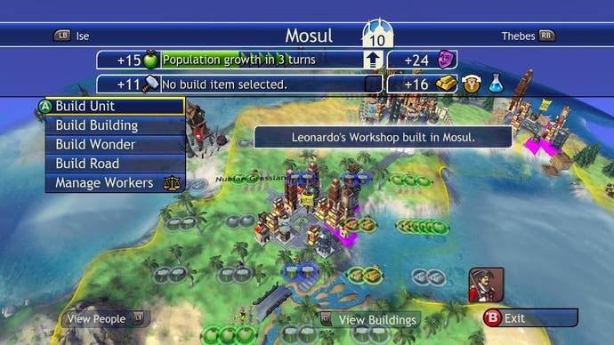
The same decluttering applies to city management. I've just compared Civ Rev's city screen with Civ 4's, and I started laughing at how cold and fussy the once-lauded latter seems now. Sure, some of the fine control is sacrificed and the truly devoted will lament the simplification, but it's immediately obvious what's going on - a picture of an apple with a big number next to it means this city is making a ton of food, while a shiny bar of gold with a low number means cashflow is poor. Two button-clicks have the city prioritising gold, not food, and you're sorted. In Civ 4, you have to squint just to tell the difference between the happiness and the revenue icons. Yes, some stuff - city hygiene, for instance - is gone, or streamlined as I'm sure 2K would rather say, but mostly it's just a matter of presentation, identifying how to make the most salient facts evident in a single glance.

The tech-tree too is stripped of some arguable deadwood, compositing multiple related inventions into one - bronze-working and archery, or animal husbandry and horseback riding, for instance. Religion is no longer a bewildering spread of different faiths, but rather one unified element affecting your cities' overall culture [oh if only - Ed]. If you're a long-term Civ player thinking this all sounds like a terrible sacrifice, you're not thinking bigger-picture, about how that crafts a faster game full of frequent thrills and new toys, not one that requires 40 turns and half an hour before you can make a bloke ride a horse. It's one much more suited to a couple of hours of sofa play than simply porting Civ 4's hunched-over, marathon sessions to a social circumstance they just weren't made for. This is, after all, an alternative to, not a replacement for, Civ 4.
Civ Rev has much in common with Catan, if you've played that. Both feel not like the cold hexes and hotkeys of PC strategy, but like social boardgames re-imagined expertly for console, replete with a chummy, toy-like physicality that belies the satisfying complexity underneath. It's Civ made simpler and quicker, but no stupider. Most of all, it's Civ made specifically with multiplayer in mind - a key difference from merely a Civ game with a multiplayer mode. While the build I saw suggests there's a lot of code-buffing to go before the June release, I'm pretty confident Civilization Revolution will prove a online megahit. If it isn't, then clearly the people don't desire freedom from the tyranny of dodgy strategy ports and look-alike shooters after all.


