Silent Hill 2's remake dares to modernise a classic, and is largely succeeding
Pyramid ahead at the final release.
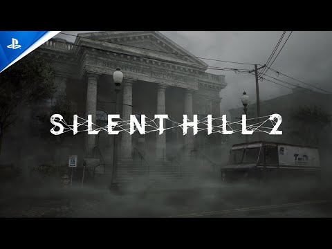
Silent Hill 2 remains one of the all time survival horror greats - and its story of grief, framed by fogged streets and flashlight lit corridors, remains as haunting today as on its initial release. All of which is to say, there's a lot riding on developer Bloober Team to nail the details of its remake's atmosphere when it arrives on 8th October. To be blunt, the team has had an uphill battle to inspire confidence in long-time Silent Hill fans, not helped by a poorly pitched 'combat trailer' at Sony's State of Play in January that completely missed the brief. Since then, later gameplay showings have put the remake's intentions in much better light. And thankfully, in playing its opening three hours at a recent Konami event - from the start right up to the first Pyramid Head boss - I am now much more positive about it. Despite my worries going in, I'm glad the remake does even dare to make key changes to the game, complete with new puzzles, updated combat, plus the promise of new, additional endings.
Before we get to that, a quick Digital Foundry-style aside. On booting the game there were two graphics modes on PS5: a 30fps quality mode, and a performance mode that targets 60fps. Dynamic resolution appears to be used more aggressively for the latter, but I happily stuck with the 60fps option, which ran Silent Hill's south vale region and later Wood Side Apartment block smoothly. The only problem spot was an early graveyard area - with its obvious sub-60 drops in the build shown - but that might improve by release.
Speaking with the team at Bloober directly, it's also confirmed that both modes use Unreal Engine 5's Lumen technology on PS5 - enhancing its reflections with a software-based approximation of ray tracing. The result being that the rain-slicked streets reflect every shop sign crisply, even if they're out of your camera's view (a problem for the SSR method, which is still used as a fallback behind Lumen here). Added to this the team confirms that Lumen is also used for ambient occlusion, albeit only on the 30fps quality mode. Also, for a bit of fun, an additional 90s filter toggle is included in the remake's menus to change its colour grading to more closely match the fade of the PS2 original's - if you're that way inclined.
The headline change for the remake though is, of course, that we now have a more modern third person control setup. It takes a page out of Resident Evil 2 Remake's book, essentially, and here it enables us to see the full extent of Silent Hill's decay from every angle. Adding this player agency is a major proving point for Bloober Team, too: it's all at once a huge creative opportunity for its art team - but also a responsibility to faithfully paint around the edges of Konami's original 2001 vision, where certain parts were only shown at fixed camera angles.
I'm glad to say that the remake does this with some tact, letting new details (and even extra areas) emerge to create a rich, more fully updated backdrop. You'll now see the crisp detail in the mud tracks, the moss creeping up the side of the church, the mannequins, peeling wallpaper and upturned rugs of the apartment block - all lit within UE5 in close up. In the town itself, traffic lights dangle in the wind high above - and the game's distinctive volumetric fog is pulled forcibly close to the player, thickened for effect.
Some parts necessarily stay the same. The strict boundaries of the town are a key part of the game's challenge, with so many residential houses still blocked off. Silent Hill 2 is often a game built around narrow straits, the search for missing keys, displaced door handles, and antique coins - and we're still funnelled through the same route in search of each. The key difference is that loading screens between regions are removed, to make way for more seamless transitions. Added to that, we have more interactivity within each area: CRTs shatter, and shop windows break through for a swift escape - though Bloober's take on Silent Hill ultimately fits within the blueprint mapped out by Konami. Likewise, every cut-scene closely mirrors the source with updated visuals and voice work. The PS2's original, pre-rendered opening scene - with James looking into the bathroom mirror - is now pleasingly remade almost shot for shot here. Even its sound design is on-point, where a mix of grungy industrial pulses, radio static, squeaking wheels, and drills serve as yours eyes beyond the fog.
Let's talk on the new puzzles for a second. Simply figuring out where to go next - which key be- longs to which door and how to get there - remains a big part of the game's overarching meta-puzzle. Thankfully this is aided by maps detailing which rooms are left unchecked, all laid out in a clean and accessible way much like in the original. Within one early sprawl of apartment rooms, you'll bump into familiar, cryptic clues, nudging you to the whereabouts of coins, the position of clock handles - and also brand new puzzles devised by Bloober Team.
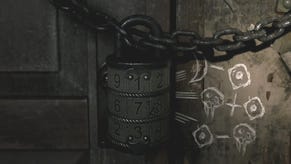
One particular new sequence tasks you with figuring out a three digit lock combination in a moth-themed room, where the answer (which I won't spoil here) makes a full use of the remake's full camera control. The solution rewards close attention to every inch of the scene - while the team at Konami were keen to point out how its complexity scales with the difficulty setting. Change is a word often met with caution here: in my experience, this puzzle genuinely added a rewarding moment, a new hurdle to jump that fits neatly within its world, and a reasonable way to keep fans old and new engaged.
Speaking of changes, the remake's new combat system is also only additive. The crucial point being that the remake's upgraded movement - plus a dodge mechanic - does not appear to encourage more combat simply for the sake of it. Every encounter is a tense, abrupt exchange, from the Lying Figures crawling the town's streets to the four legged-mannequins in the apartment. Where the remake does differ - where it takes some fun creative liberties - is in the first boss battle with Pyramid Head. This is an iconic enemy to the series that, with 23 years of hindsight, is now morphed into a more spectacular event to suit. It's a battle that plays across a larger basement area, filled with a grid of metal cages that shatter to the cleave of his blade. His attack options are wider, more varied, each one forcing you to master the timing of the dodge button (mapped to circle) - and then to follow up with as many strikes with a metal pipe as you can muster. It's beautifully presented, with lights swinging overhead to cast detailed shadows from the cage slits, and proves a much more dynamic battle than was originally envisioned.
It's still a remarkably eerie experience all round, and all of this remains true despite the new free dom in its controls. There was a concern, perhaps, that the tension of Konami's original might be lost in translation - where the game once forced a harder limit on your range of attacks, and even the camera's view in parts. Restrictions only added to its fear factor in 2001. Good news, then, that the remake does still find a source of terror in keeping its secrets doused in shadow - and so much of its monstrous threat veiled by the fog.
In rebuilding such a beloved classic with upgraded visuals and controls, the new combat style fits in surprisingly well then. The puzzles, too, find a natural place in its world. A remake project is a delicate balancing act for any developer, it's fair to say: stray too far from the source at your own risk, while a failure to innovate defeats the point of the whole endeavour. What I've seen so far of Silent Hill 2 Remake, though, shows a team determined to stick to the original blueprint first. It provides the game a comfortingly familiar structure - while allowing new detail to flourish around it like a trellis - and I'm looking forward to seeing where it grows past its first three hours.


