SimCity
Streets of beige.
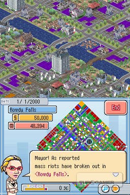
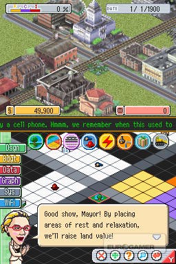
Even so, for the first few hours, it's almost exactly what you were hoping for. SimCity. On the DS. Crikey. The dual-screen set up works surprisingly well, with the city proper on the top and the parallel colour-coded building zones on the touch screen, but the longer you play the more you realise that while the recognisable surface mechanics have made the transition, the legendary depth and tinkerability (it's a word, shut up) have been shortchanged. The tiny screens are cluttered with important looking icons and menus and buttons, but you eventually realise how few of them are useful. Even worse, the larger your city gets the more of a chore it becomes to navigate, with the urban sprawl turning into a murky brown fractal at the highest zoom, an unworkable close-up at the lowest.
And then there's your chirruping advisor. Much like the irritating Microsoft Office paperclip mascot, they're great at interrupting you and dragging you into inane conversations about pointless details, but when you actually need them to, you know, advise they show their true worth. An example: a large portion of my city wasn't developing as it should. I'd followed all the SimCity rules regarding which zones should go where, and had provided ample road links, power and water, but had no idea why my progress was stalling. Turning to my advisor, I'm told that people like zoos. Very useful. Thanks. But, you know, city not growing. Advice please? Your road system is working well. Really? That's just wonderful. Tell you what, I'll work it out for myself, OK?

Time after time you get these generic titbits in lieu of useful and dynamic information about your situation. The ticker tape news headline (which scrolls so very slowly) keeps informing me that the local university is failing. What am I supposed to do about it? Who knows? The game isn't telling, and the instruction booklet simply parrots the same non-information. When things go wrong, as they inevitably do, rather than having data at your command you're always forced to use the rather clumsy two-stage zoom and jerky scrolling to get into the nitty gritty of the city and click on each building to find the source of the problem. Bizarrely, half of the water towers across my city had simply vanished, causing my mass exodus. Easily fixed, but as for finding out how this happened, or how it could be prevented...forget it. In the meantime, here's wacky Professor Simtown! He's invented a monster defence system that you can't afford! And now here's your incisive end-of-year economic breakdown: "Woohoo! Awesome! A 50,000 surplus!"
Sigh.

And there's the rub. For all the faithful zoning and road click-dragging you'll enjoy, there'll be more moments where you'll butt heads with the limitations of the format. Sometimes it'll be a moment of forced zaniness which pulls you away from city planning for no apparent reason. Other times it'll be a restriction of the hardware - such as the just-too-small squares, the skittish stylus, an inability to undo accidental demolitions or the way the solitary save slot means you can only ever have one city on the go. The Save A City mode is a familiar addition, in which you must rebuild an existing city after some disaster or solve some pressing urban problem, but with only eight short (and needlessly restricted) challenges it's a miserly side dish rather than a hearty bonus. Victory unlocks new buildings, which you can swap along with messages to fellow mayors over WiFi. But only if they're in range, running SimCity, and have left the Post Office screen open. In other words, only if they're sitting next to you and you've told them to get ready for a letter. Verily, the future of wireless communication is here. For every big plus point, there's a gang of small but unruly minuses holding it back and spitting in its hair.
Again: SIGH.
I'm aware this all sounds horribly negative. That's not how I intended it, but this is one of those games where minor complaints snowball into annoying niggles and, before you know it, you've grumbled on for over a thousand words about the bits that don't work. In the interests of balance, there are actually bits that do work, often quite well, so long as you approach it more as an open-ended puzzle game than a strategic simulation. If that's you, and you're happy with nothing more involved than making city-shaped patterns, then feel free to pretend the number below is a seven. For the rest of us, while it's obvious that, in theory, SimCity can be done on the DS, in practice it could have been done a lot better with a lot less wackiness and a little more depth.

