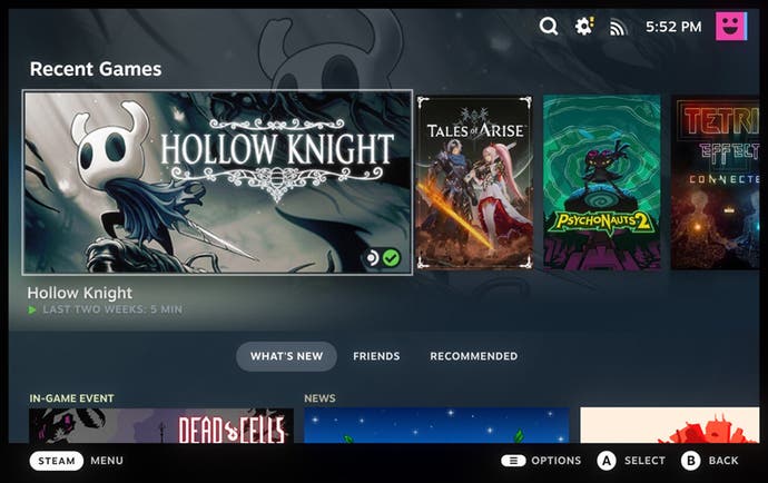
Steam's Big Picture mode finally gets its long-promised Steam Deck UI overhaul
Open beta testing now underway.
10 years after its introduction, Steam's Big Picture mode has received a long overdue overhaul, with Valve finally making good on last year's promise to replace the ageing UI with its decidedly more modern Steam Deck interface - albeit initially only for testing prior to a general release.
Steam's Big Picture mode first surfaced back in 2012, introducing an optional new UI for Valve's storefront specifically designed for use with televisions and controllers. It's changed in barely noticeable increments since then, lagging far behind Valve's recent major overhaul for Steam's desktop mode, but as of today, it's out with the old and in with the new.
Just as it promised last July, Valve has now replaced the old Big Picture mode with the far more modern UI created for its handheld gaming PC, Steam Deck. "This controller-first interface was designed for Steam Deck in handheld and docked mode," Valve explains, "and is perfect for all the scenarios Big Picture mode currently handles."
This new Big Picture mode - which can be tested by anyone opting into the Steam Client beta - features an updated home screen providing easy access to recent games, a new universal search (spanning the library, friends list, and Steam store), a new controller configurator, optimised controller navigation for the store, plus various other interface refinements.
Valve will be gathering feedback on the much-needed Big Picture overhaul as it continues "polishing rough edges". Hopefully it won't be too long before it's ready for its general release.


