Tech Analysis: Final Fantasy XIII
How the game changed from demo to PS3 retail, and what we can infer for Xbox 360.
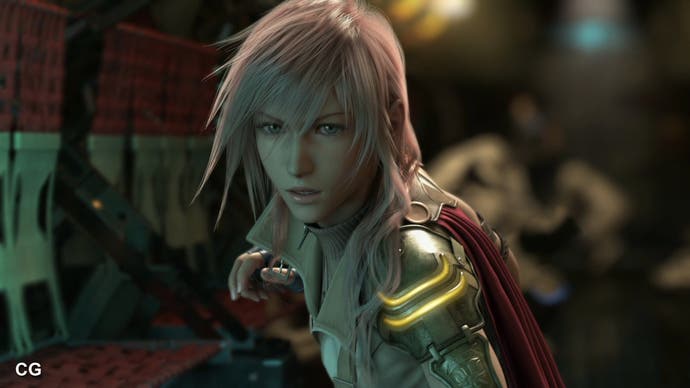
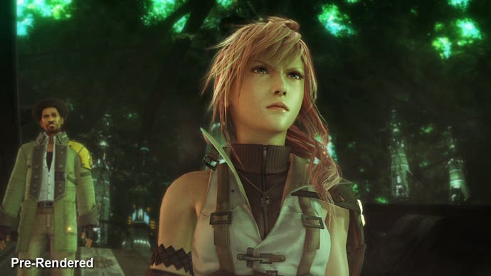
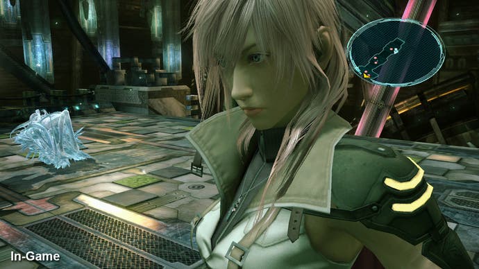
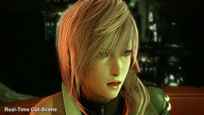
A2C also serves one very useful function for tech analysis purposes: Final Fantasy XIII switches between CGI, pre-rendered cut-scenes based on game assets, real-time engine cut-scenes and of course fully playable "field" elements. Moving from scene to scene, the transitions are virtually seamless, but the presence of A2C tells us which elements are in-game and which are pre-rendered without recourse to searching for compression macroblocking. Here's an example of the game's leading lady, Lightning, rendered in each of these techniques:


To give some idea of how good the characters look overall within the confines of the Crystal Tools game engine (incidentally also showcasing some of the best depth-of-field we've seen), here's an edit showing the principal characters of the game.
Characters drive the Final Fantasy games and it is interesting to see the approach that the team has taken here. The player's focus is on the head of each character, so you can see that the detailing the face in particular is given has much more evident bias when compared to the rest of the body. Check out the upward-panning shot of Lightning at 00:04 in the video, and especially her hand at 00:30. It's the very definition of "low poly" but then all is forgiven when you check out the details in skin-shading and on the characters' lips.
Facial animation is also exemplary: eyes and mouths are beautifully animated: it would be great to see them in wire-frame as the amount of control points must be quite extraordinary.
There are still frame-rate issues when the characters are close up, or when multiple characters are in play in the same scene. At this point it appears that Square prefers to factor in pre-rendered sequences based on game assets. This guarantees a 30 frames-per-second update.
One of the most noteworthy elements concerns the overall lighting scheme. In many games there is a jarring inconsistency between the overall scene and the way the characters are lit within it. It leads to a sense that the cast are almost cut-out and overlaid on top of the scene. Not so in Final Fantasy XIII: the lighting scheme combines all elements believably and is gorgeous to boot.
The same kind of care and attention has gone into the environments too. The early demo raised some question marks here: actual 3D elements were not as rich as expected and much of the scene make-up was down to a 2D skybox over which 3D objects were super-imposed. This technique is employed throughout the game (and the quality of the skybox art ranks alongside the best we've ever seen), but later levels ramp up the 3D aspects significantly.
One of the game's strongest elements is the way in which the player feels compelled to see the next level: the overall quality of the artwork is simply sensational and is consistently superb throughout the game. It's also self-evident that the proper HDR lighting really makes a difference. Overall presentation is improved not just through the use of the 2x MSAA, but also from glow and bloom lighting.
While there is texture filtering in effect, one of the only real disappointments with the visuals is the lack of anisotropic filtering. Wikipedia will not only save time in explaining it, but also gives you an extremely good graphical representation of what AF offers to overall image quality. Its omission is a disappointment bearing in mind the sheer attention to detail in the visuals, and it's most evident in the battle stages - a part of the game you'll be spending the majority of the time in.
Overall, the leaps made by Final Fantasy XIII over its predecessors are mostly visual in nature and that's clearly been the focus of this tech analysis. However, bearing in mind the four-year gestation period Final Fantasy XIII has had, it's disappointing that all the key improvements have been in the audio-visuals.
Of course, these are hugely important factors in FFXIII's make-up, but gameplay-wise this feels like it could've been done on PS2. Clearly, there's much to enjoy in the nature of sumptuous visuals and what is clearly the best-quality CG we've seen on a Square-Enix videogame, but early importers of the Japanese version of the game are divided about the merits of the actual game underneath.
Final Fantasy XIII has 13 chapters in all, and 12 of them are quite linear in nature: progress from point A to point B, exploring dead ends and off-shoots on the map in order to find new treasures. Early on in the game especially, there is more than a little sense that the game structure feels somewhat backward: going from cut-scene to cut-scene, with little in the way of puzzling, but plenty of combat.
There is a sense that enemy encounters increase in density simply to get in the way rather than present any kind of new gameplay challenge. Combat can be avoided in many cases, but Square has been wily in making it the key to powering up weaponry and equipment as opposed to boosting your characters.
