Watch: Scorn may look fantastic, but its gameplay is utterly archaic
Beauty is only skin deep.
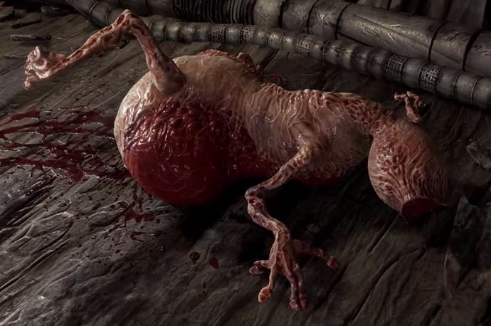
Scorn grabbed plenty of headlines when it was announced last year, mainly thanks to its deeply unsettling aesthetics. At the time of writing this, the official Scorn trailer has had over 23 million views and the game's Kickstarter campaign has been funded with a week still to go, proving that gag-reflex inducing graphics certainly have an audience.
The twisted locations in the trailer might look like they've ripped straight out of one of H.R Giger's sketch books, and the weapons made out of wobbly bits of flesh and stringy sinew are certainly eye-catching, but how well do these grim graphics translate to gameplay?
I spent 30 minutes with the Scorn's Alpha demo this morning, and honestly, my first impressions aren't great. The clunky puzzles, coloured door locks and frustrating insta-kills feel archaic and completely at odds with the innovative visuals. Even more bizarrely, for a game that sells itself as a horror, it's just not scary at all.
You can see 20 minutes of footage from the Scorn demo in the video below, where I swear my way through its trial-and-error gameplay and make lots of childish jokes about bodily functions. Because of course I do.
Did you back Scorn on Kickstarter? What did you think of the demo? Share your thoughts in the comments below.


