2D Boy's Ron Carmel and Kyle Gabler
The history of World of Goo.
I'm not sure there were any big evolutions. Or revelations. It was a very slow process, like... evolution!
It took an obscenely long time to figure out how the levels would be laid out. It took a wall of Post-It notes to figure out that the game should be divided into "islands", and then each "island" would contain "levels".
At some point we're going to put out some early versions of World of Goo. They're hilarious, and really not right. A lot of small steps. We were still adding and changing stuff up until a month before the release. OCD didn't make it in until the last second. Last night I played an old version where all the islands and all the levels in each island were laid out on a single screen.
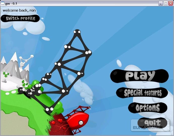
With the giant rocket ship?
You'll see how much the art evolved, if I remember right. At that point, I think the whole game was a giant joke about international outsourcing.
Oh, that was another one. We didn't know there were pipes in World of Goo. At first, the end-of-level goal was a glowing vortex thing which would have been horrible. Then pipes seemed to make a lot more sense. And of course, a giant global pipe system must be connected to a giant corporation. The corporation helped tie the islands together. But the real glue that brought everything together was the Sign Painter.
I remember the day Kyle had the idea.
That little guy (or girl) was a life-saver.

I didn't give it nearly the credit it deserved. I just wasn't seeing it. And it turned out to be one of the things that people really love about the game.
I try to think, "What level will look good in a trailer?" Since we have no marketing budget, the videos and screenshots have to sell the game, so the game should try to be as interesting-looking as possible
Kyle, I didn't know you were such an evil marketing mastermind.
Fisty the Frog got posted around the internet a lot. It made him so happy! So I tried to make more levels that had humanity, or at least giant eyes or vomiting creatures. So I would sketch on paper, take photo with my cell phone camera, and trace over it in Photoshop. And for the level gameplay, it's similar. Sketch out geometry, try playing and see if it's fun using just squares and circles, if so, then proceed with art. [There's a video of this process on the website. - Ed] The painful part happens, occasionally, if a level is made with full art complete, and it's still just not fun. It happened more than I'd like to admit, and they all had to get cut out of the final game.
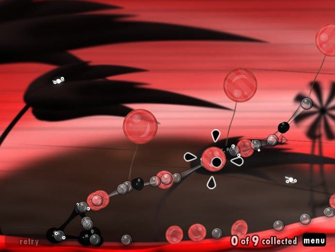
There was a level called Crash. Where there was a giant spiky ball, and you had to build a bridge with Skull Goos for it to roll across so it could plough into a tower of Gray Goos, destroy them, and allow a big level to fall, and more Goo slides down out of that. I just couldn't make it work. But the Giant Spiky Ball eventually became the Beauty and Ugly Goo Balls, with puzzles where you had to indirectly guide them through dangerous situations.
Project Runway?

I watch a lot of America's Next Top Model. And Project Runway.
One of my favourite characters is Norma Desmond, from Sunset Boulevard. She makes a bit of appearance through the Beauty Balls, and especially MOM. A silent film icon, who never let go of her former beauty and fame, ends up going mad. There is something really sad about beauty, and time passing. But the game isn't serious at all. It was really important for the game to never take itself seriously.
Poor Pokey. I so badly wanted to see him go into the pipe with the other Goo Balls.
Yeah, that horrible Pokey Ball. There was a limitation with that one, where we couldn't have two Pokey Balls in any one level. Or the game would explode.
No! I fixed that!
You did?! Well, that's why he's lonely. But apparently he could have been a social butterfly.
A perfect example of how technology influences game design.


