Sony discusses five-year journey to launching PlayStation Access controller
And the "upward trend" of accessibility across the industry.
I recently got to test out PlayStation Access at a hands-on event in London, Sony's new customisable accessibility controller. I was one of a handful of people attending, some with disabilities and some without. With the device before us all, we prodded and poked, we customised, we compared our setups. And we were able to play a number of games ranging in complexity.
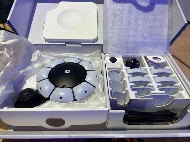
Sony recognises that disabilities are different for everyone and the Access isn't a universal solution. What works for one player may not work for another with the same disability. But that's why the Access is so reconfigurable, and Sony has carefully considered so many options. Even the packaging is accessible: evenly weighted and opened with one hand.
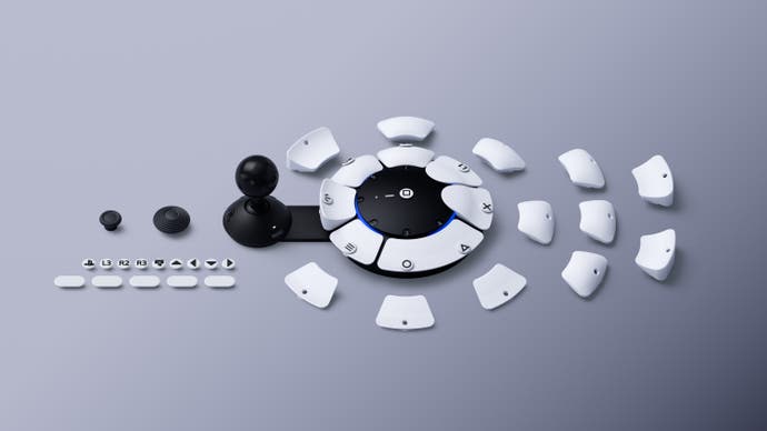
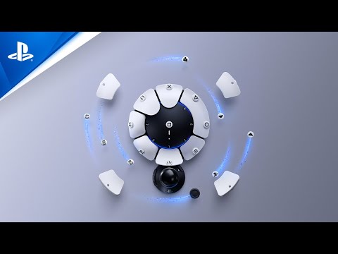
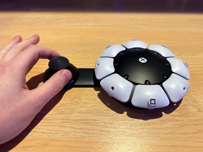
So how do you design an accessibility controller with so many variables? Sony looked at three major areas that informed the design: how people will hold the controller, how they will be able to accurately press buttons, and how they will be able to use the sticks effectively. It can be held, used on a surface, or screwed into a tripod with no set orientation, its large magnetic buttons are reconfigurable, and the stick has a flexible position with swappable caps.
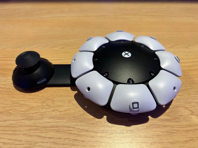
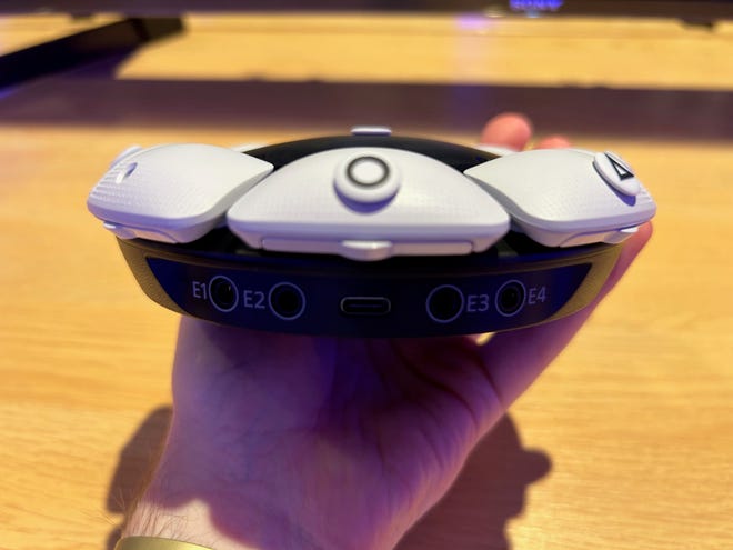
The Access is surprisingly small and compact. There are multiple button types - round, flat, curved - and four expansion ports for third-party options. There's a toggle mode to hold down buttons, a bit like a caps lock. Indeed, the whole controller was somewhat inspired by mechanical keyboards, both for tactileness and customisation. I can also confirm the Access is compatible with PSVR2, at least whenever a DualSense can be used (it doesn't include gyro motion controls). I asked about PC compatibility but Sony isn't ready to discuss this yet.
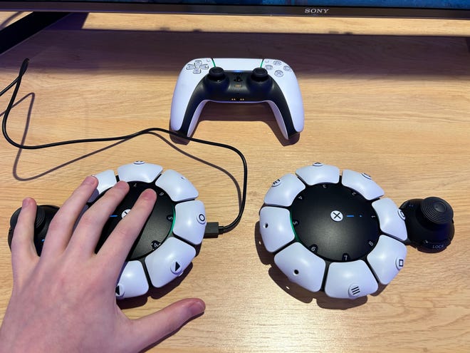
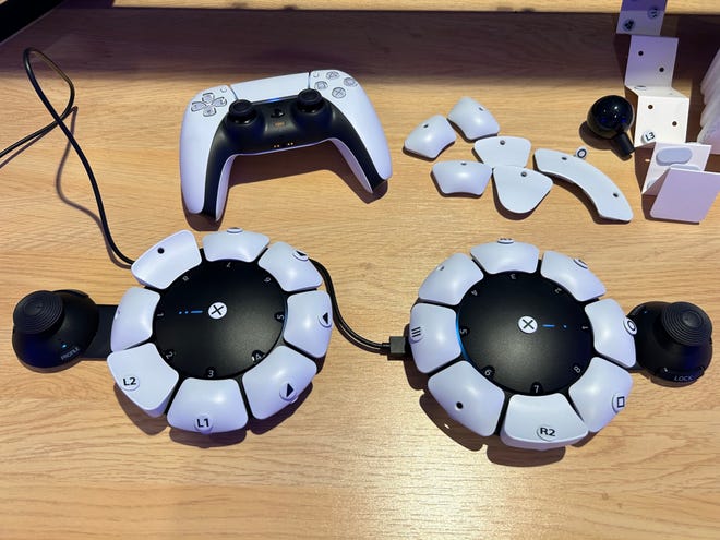
The Access has nine buttons, plus the stick and a click press. The DualSense has 18 inputs. That's important, as it means (game depending) the Access alone isn't enough without also using the DualSense. It's possible to use two Access controllers together, though this of course doubles the price - which is already £79.99. Each of those inputs has to be mapped to the controller one-by-one, as well as deciding on a button style, a stick style, and adding on the little labels for the symbols.
There's an element of trial-and-error to finding the right set up for a game. For instance, swapping from Gran Turismo 7 to The Last of Us Part 1, I realised that certain regularly-used buttons were suddenly out of reach and I needed to remap many of the controls. Later I used two Access controllers to play God of War Ragnarök, which meant physically reconfiguring two controllers, remapping buttons on the software across two controllers and two profiles, and then ensuring it all worked smoothly.
Sony itself suggests a one to two week immersion period. But by the end of the session, I could competently play Ragnarök with an entirely new setup. And its clicky buttons are definitely satisfying to use; playing Street Fighter 6 was almost like using an arcade stick. This setup, though, was in tandem with in-game accessibility options. That's important: a physical controller alone may not be enough without developers including accessibility features in their software.
To find out more, I spoke with Alvin Daniel, senior technical program manager at PlayStation.
You mentioned earlier that work started in 2018. What was the main driver behind it? What was the starting point?
We have studios doing the cutting edge work, they had leapfrogged the rest of the industry in some sense, and they're doing cutting edge stuff. Then there's the console and with each system software update we added new accessibility features. And then you came to the controller, and we quickly identified this as the potential weak link in the chain, in that if you have trouble using this, chances are even accessibility features in the game or the console wouldn't necessarily help you. And so that's what the Access controller is: investing in addressing those specific challenges.
We were given a clean sheet of paper with the mandate of making a broadly impactful accessibility controller, whatever that means. We did a catalogue of all the existing solutions to market, we did a catalogue of all the different conditions and with the help of experts, ultimately settled on this design, which is kind of radical. We can now take the three largest impediments potentially for someone using a standard controller, and remediate it with all the different options we have with an Access controller.
What did the testing process look like?
Actually, one of the first focus days was here in the UK where we would give someone a piece of styrofoam and ask, how does it feel? How would you get on if this was your controller? Ultimately, we picked a very radical design. I think we set an internal record in terms of player testing, because it was very important we get as wide a spectrum of players with disabilities. So on three continents - in Japan and Europe, in the US and here in the UK - we had as many players as possible with disabilities try to use the product. We really wanted to do deep ethnographic studies and ship units into players' homes. At the time, it was in the middle of the pandemic, it was a very high hurdle to clear in terms of, first of all, medical privacy and then we're shipping units to players' homes. We think it's deeply important that we got this in players' homes, in their home environment, with their home equipment, with the setup, with their carer, all interacting to see how is this working?
At what point was the design finalised?
There were tonnes of revisions. We were taking feedback from the team at Special Effect, we had a lot of individual contributors with disabilities as well. We called it from mild to wild. One of the mild ones was the DualSense and there was a stand, and you clip the DualSense on the stand and ta-da you don't have to hold it to use it, we've solved accessibility! This was too mild and not up to what we wanted to do at PlayStation. And then there were very wild designs, which effectively took the controller and cut it in half. Now you've got a split controller, which ultimately turned to this design. Even this design, there were square shapes, there were circular shapes. We settled on a circular shape because there are more options and there's no preferred orientation. From that point onwards, it was maybe two or three years of what problems do we need to solve? What shapes? What are the buttons? What goes in the kit? How big are they? What shapes are they? What textures? What you have here is, ultimately, the curated set of the button caps that players love the most, that felt most comfortable, had the most utility - not just pushing them, but maybe pulling them or nudging them with the side of the hand.
It's completely black and white, which matches the DualSense design. Was there discussion about colour coordination for people with visual impairments?
We started with black and white, classic PlayStation colours. As far as low vision is concerned, the tags have tactility on them. So there is some element of feel. The kit comes in different shapes and sizes. To that extent, it's customizable. Colours: not yet.
If players want to use haptics or the touchpad, they still need the DualSense right?
There are some elements of the DualSense we intentionally decided not to preserve in the Access controller based on playtesting, based on what expert consultants told us. Gyro is a good example. It seems wrong, or incorrect, to have an accessibility controller and then put in a feature that is known to be a challenge for players with accessibility. So if on the one hand we say you don't have to hold a controller to use it but it's got gyro, that didn't seem to make any sense. So we had a very deliberate design intent to not include known problematic inputs. I would say if your game requires a swipe, or requires a gyro, it's best left to the game to provide an alternate input for that. So even if you don't have an Access controller, it might make your game more accessible just as part of good design to have alternate input methods.
A lot of accessibility controllers can be incredibly expensive. How important was cost in coming up with a design? And how did you ensure that this is an accessible piece of kit?
You're right to make that observation and it's something we noticed ourselves. When we were doing a catalogue of what exists on the market, there was something called Accessibility Tax. It could be a very simple button, for example, but they will charge some exorbitant price for it, in part because I think in some cases this equipment is construed as medical and so insurance gets involved. So that automatically jacks up the price of something that is ultimately very simple. We very deliberately wanted to craft something that was broadly impactful, but also very reasonably priced to avoid Accessibility Tax. My strong recommendation was it should be priced as close as possible to our existing controller lineup, for the simple reason that we are telling players you pick your preferred input method, they are roughly the same price. We make no statement or judgement about what you need to game for longer and more comfortably.
Having played with it now, there are so many configurations, which may be a little bit overwhelming, initially at least. Have you looked at instructions or presets to make sure people have an idea of setup, especially for carers who maybe don't play games?
I can say you are going down the path I think everyone else in the room was going down, and we also saw playtesters go through: where do I start? After a tonne of user playtesting, we discovered a couple of very surprising results that inform why we are where we are today. The first was we initially thought we needed hundreds of profiles for every game, maybe profiles for different levels in the game, profiles for game genres, profiles everywhere. And we found that almost everyone was using one profile. It was super surprising. It turned out, during that adaptation period players would be really involved in customising the controls and making it work. They tried experimenting with different setups, but ultimately, at the end of that window, they would have a physical control configuration they had now tuned to be comfortable to them and had become their controller in the same sense as you use the DualSense. No matter what game, this is what they stuck with, their core foundation. If they need to make a change, they ended up overwriting just that one profile.
We also found out we didn't want to be too prescriptive with pre-seeded profiles, because then it was like us dictating this is the correct way to use the controller. We found we were constantly surprised by players very creatively exploring and discovering new ways of using the device that we didn't consider. Ultimately, we think it's a better experience if players discover it on their own. We also believe players will organically start sharing their setups and examples, and we didn't want to get in the way of that. I think what may end up happening is we curate good examples or spotlight good examples of setups. But I think it was best that we not get in the way of exploration and discovery for what works for you. The other thing I'll say is that we've found that players could have "similar disabilities", but ultimately prefer a different setup from one another based on personal preference based on past history. We didn't want to say this is the profile to use for this disability, because that simply wasn't true.
Are there any particular features you are most proud of? Or any features you weren't able to include that you wish you could have?
The button cap system is super cool. We had an engineer who was into mechanical keyboards and this was his idea. I don't think we've seen a mass market controller with this level of physical customisability. Another element I'm really proud of, there's the PS button here. We quickly identified this as a single point of failure. If you can't easily press that button, your accessibility controller is dead. You can't wake up the console. So I was like, we've got to make the PS button programmable. And it got "no we can't, it's a special button, it's branded". But ultimately we persevered, so if you notice in the drop down list, the PS button is actually a programmable button.
In terms of features we left out there, we had a tonne of features but it wouldn't be fair for me to say what we left on the cutting room floor. We think what we have here in the box on day one is solid. We've done a tonne of playtesting to evidence that. After five years, it's right to put this out and get community feedback.
What's been the reaction to the Access controller from PlayStation Studios?
Within PlayStation and even outside of PlayStation - we've shown this to select partners, third party game developers - broadly speaking they all have been super supportive and extremely pleased with what we have, in terms of what it's designed to solve and in terms of features and capabilities. I've worked on a lot of projects in my career; this is the one project that has had the most wind at its back. Everyone wanted it to succeed, including the studios, and I think everyone's really pleased with ultimately how it turned out.
Is there a danger with this kind of hardware that game studios start to assume they don't have to think about accessibility now because this controller exists? How do you engage with other studios?
We leave it to the studios to say what's best for the community. Our hope is actually the other way around: in a world where the Access controller exists, we hope it will cause game developers to consider accessibility, because you can't guarantee that there will be an Access controller connected to the console. And if your game has a section that is gyro only or touchpad swipe intensive or something like that, it potentially means some players won't buy your game, or won't be able to participate at all. So the existence of this thing might actually spark a conversation of inclusive game design.
Has working on the Access controller caused Sony to look afresh at other accessibility options?
There's this virtuous cycle of the studios doing cutting edge accessible game design and sharing amongst ourselves, and being software they could iterate quicker. Hardware took a while to catch up because it's hardware, it's a thing you have to make and you can't easily patch it. Insomniac, to give a concrete example, informed some of the features that exist in the Access controller. In Spider-Man there are two button combos for some of the spider powers that turned out to be well received in their game. And so they told us, you should include that into the actual controller itself, which we did [there's a button that allows for two inputs at once]. Other elements like the packaging, this is accessible packaging, this is a first for PlayStation as well. There are a lot of lessons learned here that potentially could be applied to other projects, because accessible design is good design.
What's your take on the state of accessibility in the industry in general at the moment? What's the next frontier that needs to be tackled?
I would say it's an upward trend. It seems like every week, industry-wide, there's a new title that drops that has accessibility options. And if it doesn't have accessibility options, people panic and there are complaints. It's definitely in the mind of game developers. And I think with the Access controller now in existence, it's also going to provide more momentum for that kind of movement. Now, there are even more options as far as a configurable controller, let alone in games themselves, and of course we're going to continue to add features on the console.
Where I think there are new challenge areas, I actually think VR might be one. On the one hand, VR could be an amazing experience for someone with a disability. If you're confined to a wheelchair, now you put this thing on and you're Superman, you can fly, you can do things that you couldn't do. So there's that amazing possibility. At the same time, there are design challenges with VR, like your control, for example, requires gyro. And that's problematic. VR in general is also very young, very new, evolving constantly. So I think accessibility in VR could be the next frontier.
Do you feel like we should have some sort of industry standard for accessibility in terms of options? Obviously, it's hard to be holistic, but perhaps minimum requirements?
I don't know about minimum requirements and that gets into interesting design philosophy. I can't speak for every game developer, but ultimately it's up to the game developer for the experience they want to create. I can respect a game developer having a very hard, brutal game that's very punishing if you don't get things exactly right. If they go into it understanding they are potentially limiting their audience, good on them, it's the art. So we don't make any statement about the games that are published on our platform. I think overall, the trends are changing. Inclusivity is such an important part of our hobby, that people are thinking about inclusivity and accessibility in particular. That's a good thing. Or at least making it an option: if you want to provide that brutal challenge, great, but have an option for players who perhaps can't quite hit that mark.
